


* Course outline "CSS Basics"
* What you will learn
* Web editors
- 1.1 Introduction to CSS
- 1.2 What is CSS?
- 1.3 Why CSS is important
- 1.4 Project 1 - Your First CSS
- 1.5 Summary Getting Started with CSS
- 2.1 Introduction to Building CSS Rules
- 2.2 HTML to get you started
- 2.3 Building a CSS Rule
- 2.4 Attaching CSS to HTML using Selectors
- 2.5 What is a property? Applying Styles using CSS Properties
- 2.6 Style Studies
- 2.7 Project 2 - About me page
- 2.8 Summary Building CSS Rules
- 3.1 Introduction to Targeting with CSS Selectors
- 3.2 Using HTML Classes and IDs
- 3.3 CSS Pseudo-Classes
- 3.4 Combining Selectors
- 3.5 Images and Forms
- 3.6 Project 3 - My Profile
- 3.7 Summary Targeting with CSS Selectors
- 4.1 Introduction to Layout and Positioning
- 4.2 The Alignment Property
- 4.3 The Float Property
- 4.4 Relative Positioning
- 4.5 Menus
- 4.6 Project 4 - My Resume (When to use what?)
- 4.7 Summary Layout and Positioning
- 5.1 Introduction to Designing Your Website
- 5.2 Basic Design Principles
- 5.3 Web Accessibility by ALL!
- 5.4 Historical Web Design Trends
- 5.5 Current Web Design Trends
There are 3 methods;
1) HTML & CSS in the same file
file name : index.html ~~~~~~~~~~~~~~~~~~~~~~
<html>
<head>
<title>Home</title>
<style>
p
{color:green;}
</style>
</head>
<body>
<p>Peter is a good man</p>
</body>
</html>
2) CSS code inserted directly in HTML tags
file name : index.html ~~~~~~~~~~~~~~~~~~~~~~
<html>
<head>
<title>Home</title>
</head>
<body>
<p style="color:green;">Peter is a good man</p>
</body>
</html>
3) CSS & HTML separated but in the same project folder
Html file: index.html ~~~~~~~~~~~~~~~~~~~~~~
<html>
<head>
<title>Home</title>
<link href="style.css" rel="stylesheet" type="text/css" >
</head>
<body>
<p>Peter is a good man</p>
</body>
</html>
CSS file: style.css p
{color:green;}
Hello,
Thank you for joining this course, where you will learn how to take your Web pages from bland to bold with the power of CSS styling. You will review historical and current design trends, and see how to apply the concepts in a beautiful way, use relative positioning, and much more. Bring your HTML knowledge, and plan to spend 5 to 7 hours on each of five modules, including lots of hands-on practice.


W3C provides a W3Cx Verified Certificate for this course that lets you demonstrate to employers, colleagues, and professional organizations that you successfully completed a course that increased your mastery of CSS. This certificate can be used to highlight newly acquired skills on your resume or LinkedIn profile.

Once you have a passing score (70% or higher), your certificate will be automatically generated and accessible from your progress page. Please write to [email protected] if you encounter an issue with the payment of your certificate.
W3Cx, as non-profit, relies on verified certificates to help fund future W3Cx courses for everyone globally.
"Front-End Web Developer" Professional Certificate

This CSS Basics course is part of the Front-End Web Developer" (FEWD) Professional Certificate program. To get this FEWD certificate, you will need to successfully pass all 5 courses that compose that program. Find out more on w3cx.org!
If you already have a verified certificate in one or more of these courses, you do NOT need to re-take that course.
We sincerely hope that you will enjoy this W3Cx course.
- The W3Cx team

This course is designed for anyone, no prerequisites required.
Professional Certificate programs are series of courses designed by industry leaders and/or top universities to build and enhance critical professional skills needed to succeed in today's most in-demand fields.

W3C has designed a “Front-End Web Developer” (FEWD) Professional Certificate where you will learn all of the necessary skills needed to build interactive and responsive user experiences on the Web. This program will deepen your knowledge of the 3 foundational languages that power the Web: HTML5, CSS and JavaScript. The W3C FEWD program is composed of 5 courses:
To get a W3C FEWD professional certificate, you must successfully pass and receive a Verified Certificate in the five courses above. Note that the dashboard link to Front-End Web Developer Program displays upgrade links to all of the courses in the program AND offer the option to "upgrade all remaining courses" in bulk.
IMPORTANT: If you already have a verified certificate in one or more of these courses, you do NOT need to re-take that course.
While any text editor, like NotePad or TextEdit, can be used to create Web pages, they don't necessarily offer a lot of help towards that end. Other options offer more facilities for error checking, syntax coloring and saving some typing by filling things out for you.
One caveat, you need to make sure that whatever editor you choose will save to a "plain text" format (".txt"). Some editors will save to other formats by default (.rtf, .doc, etc.) so you need to make sure you save your source code as plain text.

For my demos, I will be using a software program called Visual Studio Code. You can download it for free, and for any operating system.
VS Code supports a large array of different Web technologies, but for this course we will be using it to develop our HTML and CSS. It also includes a feature called intellisense which you might have used in other code editors. It will suggest code for you to use, highlight keywords and a lot of other cool features you'll see me use throughout the course.

In this course, we'll also use Codepen.
Codepen incorporates editors and a preview service into a single Web application. This is a great service to get you started quickly as it doesn't require you to download anything and you can access the service, along with your saved projects from any Web browser. Other than these two there are plenty of different programs you can use.
Here are a few possibilities for Web editors:
The W3C develops and hosts [free] and [open source] tools used every day by millions of Web developers and Web designers. All the tools listed below are Web-based, and are available as downloadable sources or as free services on the W3C Developers tools site.
The W3C validator checks the markup validity of various Web document formats, such as HTML. Note that you are automatically directed to the Nu Html Checker when validating an HTML5 document.
The CSS validator checks Cascading Style Sheets (CSS) and (X)HTML documents that use CSS stylesheets.
Unicorn is W3C's unified validator, which helps people improve the quality of their Web pages by performing a variety of checks. Unicorn gathers the results of the popular HTML and CSS validators, as well as other useful services, such as Internationalization, RSS/Atom feeds and http headers.
The W3C Internationalization Checker provides information about various internationalization-related aspects of your page, including the HTTP headers that affect it. It will also report a number of issues and offer advice about how to resolve them.
The W3C Link Checker looks for issues in links, anchors and referenced objects in a Web page, CSS style sheet, or recursively on a whole Web site. For best results, it is recommended to first ensure that the documents checked use valid (X)HTML Markup and CSS.
The W3C cheatsheet provides quick access to useful information from a variety of specifications published by W3C. It aims at giving in a very compact and mobile-friendly format a compilation of useful knowledge extracted from W3C specifications, completed by summaries of guidelines developed at W3C, in particular Web accessibility guidelines, the Mobile Web Best Practices, and a number of internationalization tips.
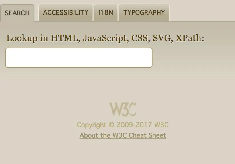
Its main feature is a lookup search box, where one can start typing a keyword and get a list of matching properties/elements/attributes/functions in the above-mentioned specifications, and further details on those when selecting the one of interest.
The W3C cheat sheet is only available as a pure Web application.
The term browser compatibility refers to the ability of a given Web site to appear fully functional on the browsers available in the market.
The most powerful aspect of the Web is what makes it so challenging to build for: its universality. When you create a Web site, you’re writing code that needs to be understood by many different browsers on different devices and operating systems!
To make the Web evolve in a sane and sustainable way for both users and developers, browser vendors work together to standardize new features, whether it’s a new HTML element, CSS property, or JavaScript API. But different vendors have different priorities, resources, and release cycles — so it’s very unlikely that a new feature will land on all the major browsers at once. As a Web developer, this is something you must consider if you’re relying on a feature to build your site.
We are then providing references to the browser support of HTML5 features presented in this course using 2 resources: Can I Use and Mozilla Developer Network (MDN) Web Docs.
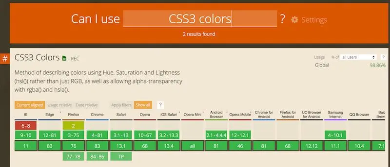
Can I Use provides up-to-date tables for support of front-end Web technologies on desktop and mobile Web browsers. Below is a snapshot of what information is given by CanIUse when searching for "CSS3 colors".

To help developers make these decisions consciously rather than accidentally, MDN Web Docs provides browser compatibility tables in its documentation pages, so that when looking up a feature you’re considering for your project, you know exactly which browsers will support it.
Hi! Welcome to the world of CSS or Cascading Style Sheets.
In this module, we're going go over exactly what CSS is, and introduce you to how important it is and making effective Web sites.
We're going to cover the Web before CSS, and how it came about. Show you awesome examples of all the powerful things you can do with CSS. Walk you through setting up your machine so that you can write and test your own HTML CSS Web sites.
And then finally by the end of the module you write your own first piece of CSS.

W3C's primary activity is to develop protocols and guidelines that ensure long-term growth for the Web. The widely adopted Web standards define key parts of what actually makes the World Wide Web work.

Tim Berners-Lee wrote a proposal in 1989 for a system called the World Wide Web. He then created the first Web browser, server, and Web page. He wrote the first specifications for URLs, HTTP, and HTML.
In October 1994, Tim Berners-Lee founded the World Wide Web Consortium (W3C) at the Massachusetts Institute of Technology, Laboratory for Computer Science [MIT/LCS] in collaboration with CERN, where the Web originated (see information on the original CERN Server), with support from DARPA and the European Commission.
In April 1995, Inria became the first European W3C host, followed by Keio University of Japan (Shonan Fujisawa Campus) in Asia in 1996. In 2003, ERCIM took over the role of European W3C Host from Inria. In 2013, W3C announced Beihang University as the fourth Host.


On 4 April 2017, the ACM, the Association for Computing Machinery, named Sir Tim Berners-Lee, inventor of the Web and Director of the World Wide Web Consortium, as the recipient of the 2016 ACM A.M. Turing Award. The Turing award is recognized as the highest distinction in Computer Science and is often referred to as the “Nobel Prize of Computing”.
Sir Tim is being given this award for inventing the World Wide Web, the first Web browser, and the fundamental protocols and algorithms allowing the Web to scale. The Web is considered one of the most influential computing innovations in history.
The Web is an application of the Internet. The Web is the most popular way of accessing the Internet, but other applications of the Internet are e-mail and ftp for example. One analogy equates the Internet to a road network where the Web is a car, the email is a bicycle, etc. Read this article for more details about the difference between Internet and the Web.
The W3C community is passionate about creating free and open Web standards. This course discusses one of these Web standards, CSS, in detail. The next video, created in partnership with Microsoft, explains why standards are important to maintain a royalty-free, Open Web Platform, as well as to help shape the Web of the future.
You can play games with friends on different continents, find answers to any question in seconds, see a live feed of our planet from space, translate languages with a single click, share a recent photo from a fun trip, or tell everyone you know about your cool, new job.
But it wasn’t always like this. It wasn’t always a beautiful, infinite world of knowledge and activity. It’s easy to forget how disconnected we were before the Web. It was a lot harder to find and share information. So many of our online experiences today are powered by standards under the hood, fruits of years of collaboration.
Without developers working together, we would need different browsers to view different sites, and search engines would be much less powerful, if the Web were split into silos. In fact, it’s safe to assume that without today’s connected tech landscape, we’d probably be in the middle of a zombie apocalypse, fending off maniacal desert gangs, and watching our civilization crumble into a seemingly endless vacuum of nothing.
A word of advice:
Nobody ever beat zombies alone. This glorious Web is our collective responsibility, and we need to treat it as such. It’s a rich, valuable digital world, but it wouldn’t hold together without the standards we use every day. How can we take care of it? By taking action. By coding, writing, designing, discussing, and defending the open Web.
Thank you for supporting Web standards. Please help us shape the next era. Join our efforts to build an open web platform for the future.
Before CSS, the appearance of a Web page was dictated by HTML, which had very few visual styling tools, meaning most Web pages looked simple.
Let's take the example of the MSN Web site. MSN is the web portal and related collection of Internet services and apps for Windows and mobile devices, provided by Microsoft and launched on August 24 1995, the same release date as Windows 95.
In 1996, see what it looked like (or check it online):
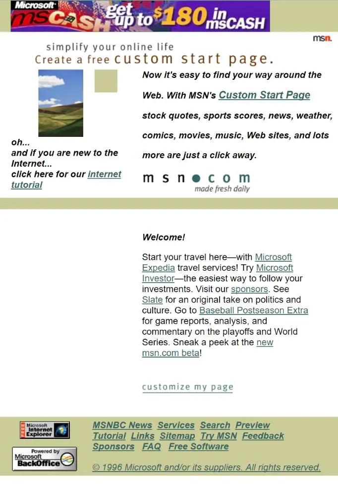
For a fun time, warp check out an archived version of that link above for anyone "new to the internet". See how this MSN Web site (made with lots of CSS) looks like now!
In the lesson below, you will learn about Bert Bos, the co-creator of CSS, about how he and Håkon Lie developed CSS.

In 1994, it was not possible for an author to style HTML documents. Several browsers had style sheets, but only for the user. On the one hand, that was an advantage: authors didn't have to worry about the style, unlike when they were writing in a word processor. They could concentrate on the contents. HTML viewers automatically laid out each document in a way adapted to the user's preferences. The author didn't have to know anything about screen size, or if the screen had colors, or even whether the device has a screen at all.
But then designers came to the Web, and they found it was also a disadvantage. A document from company A looked exactly the same as one from company B. They had to be a way for the author to add some style if he wanted to.
The new Netscape browser, which was quickly becoming the most popular browser on the Web in 1994, added some proprietary HTML elements for style and spacing. But most people agreed that wasn't the best solution.
When Håkon Lie and I decided to combine our two proposals, in October 1994, it quickly became the most popular.
We called it CSS.
A style sheet language for the Web had to be simple to write: everybody who could write HTML should also be able to make style for it. It had to be efficient. Users have to download Web documents over a network, CSS allows to style many elements with one rule, and many documents with one style sheet.
CSS also had to be efficient in the sense that it doesn't take noticeably more time to display a document with a style sheet. We had to try and make CSS easy to maintain. Style may change, so they should not just be easy to write, but also easy to read and to modify.
We wanted the language to be extensible: at the time HTML certainly wasn't finished yet and would probably not to be the only language on the Web, CSS itself also would not be complete right away. Maybe the most important characteristic of CSS is that it preserves the ability for the user to override or ignore the style of a document.
We didn't see CSS as the final solution, certainly not the final solution for complex documents. Although, already in 1996 we also wrote down some ideas for how to add layout templates and columns to CSS. Personally, I thought that CSS was a good start but would probably not be enough in the long term. I expected that after a few years of gaining experience with CSS, we would start writing a better, more powerful style sheet language. So, that maybe, in ten years’ time, CSS would be more or less forgotten.
Indeed, in 1997 within W3C we started the XSL language for advanced layout. But CSS proved to be so extensible and so popular that now in 2016 (or 2022), it is still the primary style language of the Web and we are still adding new features to it. We must have done something right. I'm especially happy that despite all the things we added to CSS over the years, the style sheets that people made with CSS in 1996 are still valid and still work the same.
CSS, or Cascading Style Sheets, is a style sheet language used to describe the way an HTML or XML document should look to a user. CSS is where you specify the color, size, spacing, font and other visual aspects of the content that you create in your markup language document.
Most often you will see CSS used alongside HTML to describe the way a Web page looks and feels. You can have a Web page without CSS, but it would be very difficult to make it look the way you want with just HTML. This is why almost every Web page is a combination of HTML and CSS.
Stands for "Cascading Style Sheets". A style sheet language for describing how to display an HTML document.
body {
  background-color: #d0e4fe;
}
h1 {
  color: orange;
  text-align: center;
}
p {
  font-family: "Times New Roman";
  font-size: 20px;
}
Stands for "HyperText Markup Language", and is the primary document format on the Web. It is a standardized system for tagging content on a web page so that a web browser knows how to present it properly to the viewer. It is a standardized way to describe a document's structure and the roles of the different parts of that document.
<!DOCTYPE html>
<html lang="en">
  <head>
    <meta charset="utf-8">
      <title>My HTML page</title>
  </head>
  <body>
    <p> This is an HTML document </p>
  </body>
</html>
A hypertext document connected to the World Wide Web.
Synonyms: website, home page, landing page
A global system of computer networks that connect to one another so that billions of different devices all over the world can share data. The internet is a collection of smaller networks that all combined create one large, all-inclusive global network.
A collection of documents linked together by hypertext links, addressed using Uniform Resource Locators (URLs) accessible on the Internet. The World Wide Web is an application of the internet.
Abbreviated as WWW or "the Web"
A software application for retrieving, presenting and traversing information resources on the World Wide Web.
Examples: edge, chrome, Firefox, internet explorer, safari, opera
Stands for "Hypertext Transfer Protocol". It is a protocol managed by the W3C to dictate the manner in which Web pages share data on the World Wide Web. You might recognize this from the start of many Web addresses.
Stands for "Hypertext Transfer Protocol Secure". It is the secure version of HTTP, the protocol over which data is sent between your browser and the Web site that you are connected to. It means all communications between your browser and the Web site are encrypted. A vast majority of Web site are now served by https.
Now it's your turn to do some exploration! For this activity, your job is to find examples of Web sites before and after CSS.
A great place to start is at archive.org (aka, the "WayBack machine") which stores copies of web pages throughout history. You can search for some of your favorite websites and see if they have stored copies older than 1996. You should find that any Web page made before 1996 will look very different than Web sites we typically see today. When you find a real retro gem, please share it in this week's discussion (see below).
Up until now, we have been discussing CSS's role within a Web site as the "presentation" component, but what is that and why is it so important?
From the history of CSS, we learned why CSS came about, but the short answer is simply because HTML was never designed to describe the way a Web page was supposed to look. When we use HTML for what it was intended to do, describe content, it leaves space for CSS to properly control a page's visuals. This makes it very easy to update or add content without having to even touch the style.
In 2003, Dave Shea began a legendary project called CSS Zen Garden that provided a demonstration of "what can be accomplished through CSS-based design", until submissions stopped in 2013.
In July 2020, Stephanie Eckles (Modern CSS) launched Style Stage, a modern CSS showcase styled by community contributions. Meaning that CSS practitioners of any skill level (you!) are welcome to join as a contributor and submit a stylesheet! Visit the "All Styles" directory page and re-style by submitting an alternate style sheet.
The videos below introduce you to the " CSS Zen Garden" Web project.
Now that we know exactly how CSS came about, let's talk about how people are using it today.
CSS has empowered people to separate the content, the text, image, videos, all of the stuff that you've created from the way it's presented: the fonts, the colors, the spacing, the backgrounds, so that you can make as many design decisions in your style sheets and keep them separate from all of your content.
There's a particular online community, called CSS ZEN GARDEN, that really likes to play up this advantage. What they do is, they take a single HTML page and they'll create many different CSS interpretations how to present it. Let's take a look.
This is the homepage for CSS Zen Garden.
This design was submitted by someone just like you, somewhere out on the Internet, and they
chose it to be their homepage. In fact, the homepage rotates between different designs. Let's
take a closer look. If I right-click, I can view the source and I can actually look at the
HTML behind this Web page. I can even comment here and inspect all of the different items,
and if I click through, I can find this h1 tag. That's where the text, CSS Zen Garden, is
coming from.
The HTML is here on the left, and here on the right, there's a ton of style associated with it. In fact, if I scroll through, I can even find the color. Just to be sure that this h1 tag is corresponding to this title, let's change the color. Let's try purple. Oh yeah! That's looks alright. Not great. But I definitely am sure that this text corresponds to this HTML tag corresponds to this CSS.
In fact, let's take a look at what it’s like without any CSS. If I come here to the head, I can actually delete the link to the CSS, and now I have a pure HTML Web site. In fact, look at how my style is deleted.
This is what your Web site would look like without any CSS. Not super-exciting. Well in fact, let's get back to the CSS. Much better! Well, except for that purple text.
Let's take a look at some other designs. These are the designs from all over the Internet. Here, we see another completely different design, but that same text! In fact, if I inspect this element, I can see that it's in that same h1 type. But look at all the style is different. If I scroll down, I can even find the color. Purple doesn't look much better on this page either. In fact, if I get rid of it, all the HTML, or if I give up all the CSS again, it takes me back to that same core text.
Now you can have a better idea between what part is HTML and what part is CSS. In fact, now you should look through a few of the different designs, so you can understand what CSS is and get inspired!
In the above demo, you saw me using what is called the "developer tool" within my Edge Web browser to inspect and real-time change the style of a page's CSS. You can actually right click on any site and choose to look at the code that creates it. This feature exists in most modern browsers.
Here is what it looks like when I view the source of W3C's Web site (snapshot taken in Sept. 2016):
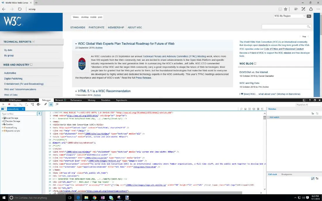
You can see a window that popped up from the bottom with all the HTML code for that site. Other Web browsers might pop this up in a separate window.
You can also get more specific and look at individual HTML elements with the "Inspect element" option. Here is what it looks like in Edge when I inspect a specific title:
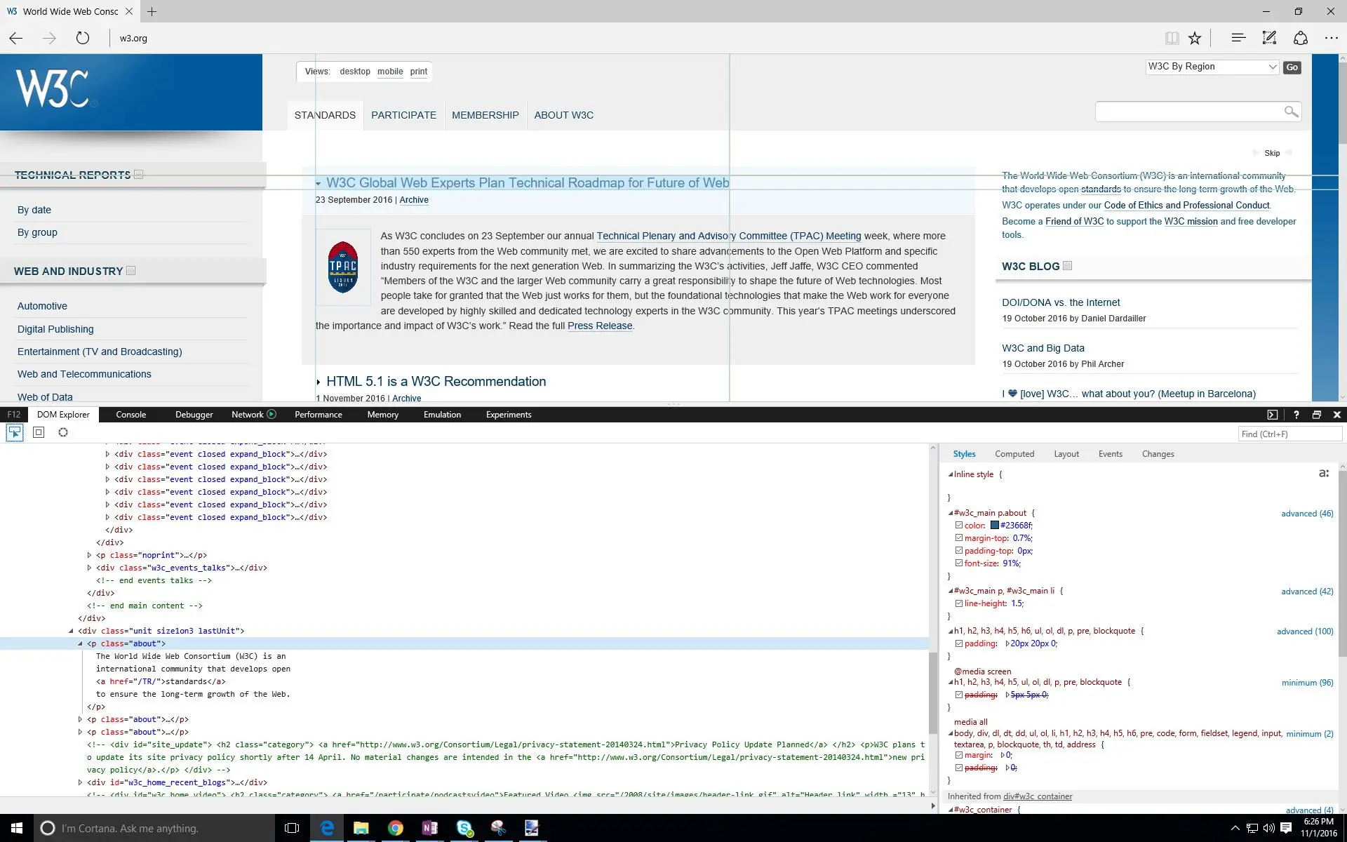
As you can see, not only is the element highlighted on the page, but this also highlights the HTML code and shows you the CSS for that element on the right-hand side. In the video above, you can see me use this view to change the CSS and HTML real-time, which can be a very convenient way to play around with your designs.
As you work in your own sites, you might want to use both of these features of your browser to understand what is happening in your own code, or in Web pages you find on the Web.
Now that you’ve gotten a good idea of what CSS Zen Garden is, take a closer look. Please browse some of the designs, starting from Garments (note that the link to "all designs" is now broken...). Look through the different CSS Zen Garden designs for inspiration. Which is your favorite design? Pick one design and share your critiques with the discussion.
For your chosen design, please answer the following questions:
Now that you have plenty of context, it's time to dive in. We're going to start with a Hello World. The traditional first program you would write when learning a new technology. Since you already have the text from HTML, which would say Hello World, we're going to write Hello Beautiful World and make that text a different color and a different font.
In this demo, I'm going to walk you through how to set up your environment, and writing the HTML and the CSS that goes with it and then seeing it appear in a Web browser. Let's get started.
This is Visual Studio code. This is the program I'm going to use to type out all of my HTML and CSS. When you open the program, it's going to give you a blank file that's untitled and of type ‘plain text’. But as you add things and save them, it can understand a lot of different file formats.
I'm going to start with some HTML… this is really basic HTML, it just put those puts the words ‘Hello World’ on the page. As I added this text you can see that a little white dot showed up to tell me that I have unsaved changes. I'm going to save them!
I have a blank folder here I'm calling Hello World, and this is where I'm going to put all of the things for my single Web site: the CSS, the HTML, any images, etc. You want to make sure that you have one folder for each of your projects.
I'm going to call this HTML page: ‘index’. That's a pretty common title for the main page of your Web site. I'm going to save it, and because I added that ‘.html’ ending, Visual Studio code is smart enough to turn some of the tags blue. It knows these are tags, and this is text.
Now that we've got that, I can open the Explorer and it will show me which files I'm working with. In fact, I can right click on this file and I can copy the path. If I go to my Web browser and I add in the path: that's just the location of the file where this HTML is, on my own personal machine. It's not on the Internet yet.
But if I go to it, my browser is smart enough to look at that HTML page and render it, or display it the same way it what is it was online. There are my words: ‘Hello World’. We have some HTML, but it's not very beautiful. Let's change some things. If I change the HTML and I come back, I can just refresh the page and it will show me my changes. Now that I've got some text, let's actually add some style. I'm going to open a new file that’s going to store my CSS.
For the purposes of this class, I'm going to keep my CSS in a separate file from my HTML, keeps things cleaner. I’m going to write something really basic. I'm going to write a role for the P or paragraph tag. For any rule, I need to set up open and closing curly braces, and then between them, I'm going to add the property. And then the style I have to type what I'm thinking blue… that's a good color ;)
And then, I'm going to save this as a '.css'. You'll often see that style uses a name for the CSS. See, when I hit save, I told Visual Studio code this is a CSS file. It made a lot of assumptions about my code. The P turned yellow to say, ‘hey, I recognize this is attached to HTML’, the property color changed to a different color, it even gives me this cute little color picker so I know exactly which color I'm choosing. Now that I've got this I can come to my HTML refresh and see the text turn blue, right? Ah, nothing happened. That's because my HTML doesn't actually know that my CSS exists yet.
You have to tell the HTML where the CSS file is. So, because I'm a terrible typist, I already have this copied out, I'm going to add the special tag to the header of my HTML. This tells my HTML where to find my CSS. And really, what's important, is you need to make sure that you set the name for the link. And because my CSS is in the same folder as my HTML, I can just give it ‘style.css’ and we'll know where to find it.
Now if I hit save (and make my white dot go away), if I come over here and I refresh, hey magic! Now my text is blue… in fact, now I've added a permanent link between my HTML my CSS. I can start adding more styles. Let's say I want to make the font something sans Serif. If I add in this extra rule, I can hit save, and now when I refresh, I can see the changes.
Here is the CodePen code we wrote in this demo.
<!DOCTYPE html>
<html lang="en">
  <head>
    <meta charset="utf-8">
    <link rel="stylesheet" href="style.css">
  </head>
  <body>
    <p>
     Hello Beautiful World
    </p>
  </body>
</html>
p {
  color: blue;
  font-family:Helvetica;
}
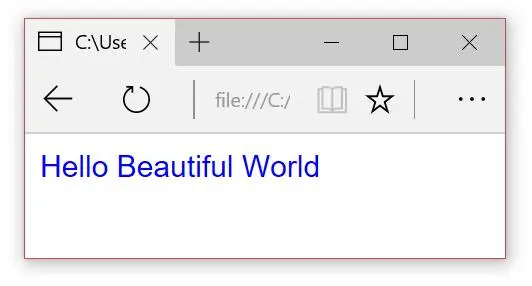
... and here is the "output":
As you write your CSS, you might end up with a pretty large document that can be hard to manage, or you might find yourself working on a team and having to read CSS someone else has written. In these cases, it helps to leave "notes" for the humans that read the file.
There is a way to leave notes that the Web browser will ignore when it is reading your CSS code, they're called "comments". In fact, leaving comments in your code is considered a best practice by developers and is a habit we highly recommend you develop now.
To add comments to your CSS file, you need to surround any text you want the computer to ignore with a set of slashes and asterisks like so:
/* those two symbols start my comment block I can have more comment
text here and the following two symbols end my comment */
As you can see, you can put as much text between the open and close symbols as you need, you can even have multiple lines. If you are working in an editor like Visual Studio code, you will notice that when you turn text into a comment, it turns green to indicate that the computer ignores that code.

Generally, it is a good idea to put a comment at the top of each CSS rule, or at the very least at the top of sets of rules that apply to a single category or section of your Web page.
It's finally time to write your own CSS! Open your code editor of choice and save the following code as a new HTML document.
Remember: to do this, you will need to give it a .html file extension when you are saving it. For example, you could call it index.html
<!DOCTYPE html>
<html lang="en">
  <head>
    <meta charset="utf-8">
  </head>
  <body>
    <p>
      Hello Beautiful World
    </p>
  </body>
</html>
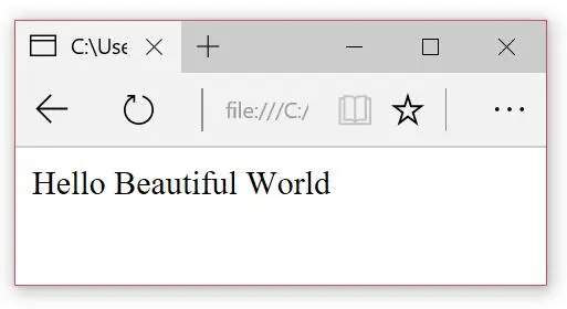
Once you have your HTML document view it in a Web browser. It should look like this:
Now it’s time to add some CSS. Here is the CSS we wrote in the "Hello Beautiful World" demo. Make a new file with this css and save it with a .css file extension. For example, you can call it styles.css
p {
  color: blue;
}
This won’t change the look of your HTML until you link the two files with this HTML tag.
To do this:
<link rel="stylesheet" href="styles.css">
Now change the HTML and CSS files so that it says “Hello <your name>, welcome to my first CSS Web page” in your favorite color! Here’s what mine looks like:
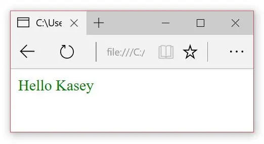
HINT: Is your favorite color not working? Not all color names are recognized by CSS. Sometimes the best way is to use HEX. We'll talk in more detail about colors in the next module, but here is a list of colors you can use: extended color keywords (from W3C's specification) or color keywords (from MDN's documentation).
After this module, you should feel comfortable…
In the next module, you will:
In this module, we're going to focus on building out your CSS toolbox.
First, we'll start with a simple review of HTML. Don't worry! In this course, we're always going to give you the HTML, but we want you to know what's going on.
Then, we're going to meet the CSS rule and break down the pieces so you can start writing around. We'll start with the first part of the CSS rule, the property. The property is the part that helps control the look and feel: the font, the color,… things like that and then we'll meet the selector, the piece that attaches your CSS rule to a specific HTML element.
And then finally, at the end of the module, you get to write your first CSS style specifically for a given HTML Web site.
In this course, we're talking about CSS. But CSS is only one aspect of a Web page. And actually, you can't have CSS unless you have something to attach it to you. In this case, that's HTML. HTML stands for Hyper Text Markup Language, and really the key is that M for markup. What this means is that HTML is a way of tagging your existing content, so that the browser or screen readers or search engines know exactly what that content is. For example, you might want the browser to know, this is a title or this is the button or this is an image, that way it knows how to display it.
But the problem is that HTML does a really bad job with style. That's where CSS comes in. Once you've tagged all of your content as a specific type, you can use CSS to attach to that HTML. In this course, we're always going give you the HTML but let's take a look at some sample code, so you know what it's looks like.Here is just some basic text content. I've got some titles and I've got a couple paragraphs. I want the browser to know: this text is a little more important than the rest of the text, say a title, so that I can display it differently using my CSS.
I'm going to tell the browser this is the title by using something called the tag. It starts with an angle bracket and then it has a name, and then another angle bracket on the other side. And then, I put that in front of the content, and then I also have to add a closing tag at the end of the content. Here, I've used the h1 tag for my title that stands for header 1. It means this is a very important title. I can also use the p, or paragraph tag, to tell the browser: this is a block of body text.
Not only can use HTML to categorize existing text content, but you can use it to insert new elements into your page. Elements like images or videos, buttons, drop-downs, all of that can be inserted with special HTML tags. For example, here's the text so that you can add an image. Now that you've seen what HTML looks like, it will make more sense when we start writing the CSS that corresponds to it. Because the HTML has to come first. In this course, we're just talking about CSS, but if you're not familiar with HTML I really encourage you to look online, and learn a bit more because a well-structured HTML document is going to make your CSS a lot nicer.
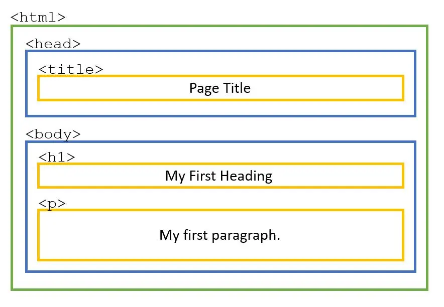
HTML (Hyper Text Markup Language) documents are made up of content and tags. These tags describe the content so that the web browser understands the structure of the page. HTML tags typically come in pairs, an opening tag before and a closing tag after content like so:
<tagname>
  My content
</tagname>
When these three pieces are combined (start tag, content, and end tag), you have what is called an HTML element.
Here is a sample HTML doc:
<!DOCTYPE html> <!-- Doctype declares the document to be
HTML 5 type-->
<html lang="en"> <!-- All your HTML content must be within this
tag -->
  <head> <!-- Anything in the header provides information about the
    document, no content here -->
    <meta charset="utf-8">
    <title>Page Title</title> <!-- This text will show up on the
      tab of the browser for this page -->
  </head> <!-- end for the header section -->
  <body> <!-- start tag for the body section, this is where to put
    all your content to be displayed -->
    <h1>My First Heading</h1> <!-- content in a h1 tag is a
      "heading" of the top level -->
    <p>My first paragraph.</p> <!-- content in a p tag is normal
      or "paragraph" level text -->
  </body>
</html>
*NOTE: In the code above, the text contained within the <!--and --> start and end sequences are comments. Each of them is explaining each tag.
Tags can be nested inside of other tags. This creates a parent/child relationship between HTML elements and forms the overall structure of your HTML document into a tree. This structure has a big effect on your CSS as styles are typically inherited from parent to child. We will take a closer look at style inheritance later in this unit.
There are other types of tags that are called "self-closing", meaning they don't come in an open/close pair. Typically, self-closing tags insert content into your page as opposed to surround content. They look like this:
<img src="images/pic1.png" alt="pic1" />
These types of tags rely on "attributes", these are added modifiers on the tag that have their own values. In the above example, we use the src attribute to set the source for the image.
There are many HTML tags to choose from depending on what elements you want to structure on your page. You can always check what are the current defined HTML tags.
Here is a short list of some of the most common HTML tags, ones you'll see us use throughout this course.
The root element of a document is <html>, and this is the first tag you'll need in your document (after the DOCTYPE, of course!). All your other HTML tags should go inside this one, meaning all HTML documents should start with <html> at the top and end with </html> at the bottom.
You'll notice in the below code that we set the language to English (<html lang="en">) . You can set another language of the text in your page using language attributes (see also this resource).
It is important that you take care to use the lang attribute to indicate the actual language of text in your page because many CSS features will function differently, depending on what language is declared here.
<!DOCTYPE html>
<html lang="en">
  <body>
    <p> Hello World</p>
  </body>
</html>
This is the element that contains all the metadata for your site, such as your link to your CSS, the page's title and links to other files. This should be the first tag in your document, and there should only be one per document.
Note that this is where you will also set the charset to "utf-8" (<meta charset="utf-8">). This shows that you saved the markup using the UTF-8 character encoding, which has many characters outside English, so it should be able to display characters not in the English alphabet.
<!DOCTYPE html>
<html lang="en">
  <head>
    <meta charset="utf-8">
    <title>My First Page</title>
  </head>
  <body>
    <p> Hello World</p>
  </body>
</html>
The section element that contains all the visible content for your site like your text, images, links etc. There should only be one body tag per document and it should come after the head tag.
<!DOCTYPE html>
<html lang="en">
  <head>
    <meta charset="utf-8">
    <title>My First Page</title>
    <link rel="stylesheet" href="styles.css">
  </head>
  <body>
    <p> Hello World</p>
  </body>
</html>
"p" stands for "paragraph" which is a block of text that is physically separated from adjacent blocks through blank lines. This is the most basic way to group text content.
<p>
  This is my introductory paragraph to my Web page! This text will wrap around in a single block
  and then after the paragraph is done there will be a line of white space.
</p>
By surrounding text with an <a> tag you turn it into a hyperlink. You will want to use the "href" attribute to indicate to which target the link should take the user when clicked. The default style of the a tag is to turn the text blue and underlined, and then change the color to purple after you have clicked the link. You can adjust all these styles with CSS.
<a href="https://www.microsoft.com">Microsoft Main Page</a>
This tag will insert an image based on the source you provide via the "src" attribute. If the source is inaccessible, you can also specify "fall back" options via the "alt" attribute. You will always want to specify the "alt" attribute with a short phrase describing the image. This text is what will be read aloud if your user is using a screen reader, or will be displayed if the user's browser will not load images. Note that this is an example of a "self-closing" tag meaning there is no closing tag, you just end the opening tag with a forward slash.
<img src="images/proPic.jpg" alt="a headshot of the instructor" />
The UL tag creates an "unordered list" element, meaning a collection of elements in which the order is meaningless. This is a tag that sets the framework for you to add list elements inside it. You will want to add your elements within the ul tag each surrounded your content with list item or "<li>" tags like in the below example.
<ul>
  <li>This is one element in the list</li>
  <li>One of the elements</li>
  <li>Another element</li>
</ul>
The OL tag works exactly like the UL tag, except that the list element order matters. OL stands for "ordered list" and by default, the list element items are displayed with a number preceding them.
<ol>
  <li>This is the first element</li>
  <li>The second element</li>
  <li>Finally, this is the third element</li>
</ol>
Test Documentation click image:

The br element is a self-closing tag that inserts a line break. This is most evident when placed in a block of text as it essentially represents a carriage return or hitting the "enter" key. Useful for poems.
<p>
  this is my text.
  <br />
  this text will appear on the next line down.
</p>
The header tag is one of the section elements, it's role is to group other HTML elements according to their role on their page. The header element contains all the introductory content on the page typically a title and tagline or navigational elements.
<body>
  <header>
    <h1> Welcome to my page!</h1>
    <h2> My very first web page</h2>
  </header>
</body>
Another sectioning element, the "section" tag is a general-purpose grouping element. It most often should include a header tag at the top. This typically will come after a header tag and before a footer tag.
<body>
  <header>
    <h1> My Page </h1>
  </header>
  <section>
    <h2> My Blog </h2>
  </section>
</body>
Another sectioning element, the "footer" tag is supposed to organize the final content on the page such as the credits or contact info.
<body>
  <header>
    <h1>My Page</h1>
  </header>
  <section>
    <h2>My Blog</h2>
  </section>
  <footer>
    <p>
      copyright 2016
    </p>
  </footer>
</body>
The div element is a generic element to hold content. It is considered a last resort, for when no other element is suitable but is often used to collect together large portions of a site that contain multiple different types of content.
<div>
  <h1> Title for Content </h1>
  <img src="images/contentImage.jpg" />
  <p> This is a paragraph explaining this section of content
    associated with the above image and title</p>
</div>
Note that, as this CSS Introduction course focuses on CSS, we will always provide you with the complete HTML for whatever content you will be asked to style. However, to become proficient in Web development, you are going to need a good handle on HTML. You can start by looking into some of these links:
Or, if you are looking for more in-depth training, we suggest you check out one of these other W3Cx courses to better understand how to structure your pages with HTML and more:
HTML has been available to the public since 1991, but since then a lot has changed. One of the ways to make sure your HTML is well structured and up to date is to use the W3C HTML Validator. As you are developing your pages, it's a good idea to regularly check if your HTML is written according to W3C standards.
You can find the validator here: Validator.
You can pass any URL on the Web into the validator, and it will tell you how the HTML for that page stacks up against Web Standards. If you pass in https://www.w3.org (the W3C's homepage), you see the following:
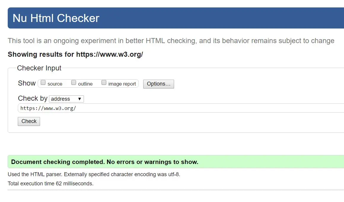
If you start to try out other URLs, you might find this is a very rare result ;)
Try passing in your favorite Web address and see what comes up. For example, If you pass in https://www.microsoft.com/en-us/, you get 567 warnings and errors!
One of the more common errors is using an HTML tag that is considered obsolete. Often the error points you to this wiki page " Use CSS instead".

For this activity, please try out some of your favorite Web addresses in this validator and see what happens. Find a page that has one of these types of errors and answer the following questions in the discussion board:
In this module, we're going to focus on building out your CSS toolbox.
First, we'll start with a simple review of HTML. Don't worry! In this course, we're always going to give you the HTML, but we want you to know what's going on.
Then, we're going to meet the CSS rule and break down the pieces so you can start writing around. We'll start with the first part of the CSS rule, the property. The property is the part that helps control the look and feel: the font, the color,… things like that and then we'll meet the selector, the piece that attaches your CSS rule to a specific HTML element.
And then finally, at the end of the module, you get to write your first CSS style specifically for a given HTML Web site.
Here is an example CSS "rule":
p {
  color: blue;
}
This rule tells the browser to make all text within a paragraph tag blue.
A CSS rule is broken into two parts: the selector and the property

This is the portion of the rule before the first open curly brace ("{" character). This is what tells the browser what HTML tags this rule applies to. Often, you'll just see a selector that matches an HTML tag, like in this instance- our selector is just "p". However, as we get further into this course, you'll find that there are many ways to target specific HTML elements and many different ways to structure selectors so that you are targeting exactly the part of your site you want to style.
This is the portion of the rule between the two curly braces. This is what tells the browser how to style the HTML tag that has been selected. This can be as many lines of code as you choose, each of which has two parts- the property and the value you want that property to be.
For our example, "color" is the property and "blue" is the value, but we could also have had a value of "black" or "#FFFFFF" (which is HEX code for white). Each property line is constructed so:

The style for your page will consist of a list of many CSS rules put together. As we move through this course we will help you build up these rules to style your entire page.
Now that you have a basic understanding of how to put the pieces of a CSS rule together, let's do some practice. Here is some HTML for a page you will style:
<!DOCTYPE html>
<html lang="en">
  <head>
    <meta charset="utf-8">
    <title>My HTML page</title>
    <link rel="stylesheet" href="style.css">
  </head>
  <body>
    <h1>My H1 header</h1>
    <p>This is a block of text to represent a paragraph that you
      will want to style. This might be an explanation of the list
      that follows, it is all contained within a single paragraph
      tag.</p>
    <ul>
      <li>This is list item 1</li>
      <li>Item 2 in the list</li>
      <li>The third item in the list</li>
      <li>Item 4 completes the list</li>
    </ul>
  </body>
</html>
Your goal is to get this HTML to look like the following image in the browser:

To do so, you will need to write 4 CSS Rules. You will need to use the following 4 selectors:
And you will need the following properties:
Now it's up to you to combine these selectors and properties into 4 rules to achieve the final style.
In unit 2.3, we defined a CSS selector as the portion of the CSS rule that tells the browser on which HTML element to apply the defined style.
When your HTML is simple, the selectors can be simple as well. The most basic selectors simply mirror the HTML tag. For example "p" attaches to all <p> tags, "img" will attach to all <img> tags and so on. As you can imagine, there will often be times when you don't want every single HTML element of a particular type to have identical style. In Module 3, we'll discuss a variety of ways to use selectors to attach to specific HTML elements.
In unit 2.2, we briefly mentioned the fact that properties apply to the entire hierarchy of HTML elements to which they are attached. This means that you will have to be very careful which selectors you choose to use in combination with your chosen style. When choosing your selector you might want to keep the following aspects of an HTML element in mind:
It is possible to independently target every HTML element on the page using selectors, but for this module we are going to stick to basics and only use selectors that match the HTML tag name. For example, here are some example selectors we'll use in this module:
a {
/* Style for a tags. */
}
This would affect the style of all link tags on the page.
p {
/* Style for p tags. */
}
This would affect the style of all paragraph tags on the page and the style of elements contained within the paragraph tag.
body {
/* Style for all elements in the body. */
}
This would apply style to the body tag as well as allow the elements inside the body tag to inherit certain styles applied here (check the related CodePen online).

<html lang="en">
  <head>
    <meta charset="utf-8">
    <link rel="stylesheet" href="styles.css">
  </head>
  <body>
    <h1>Title</h1>
    <p>
      In unit 2.3, we defined a CSS selector as the portion of the
      CSS rule that tells the browser on which HTML element to
      apply the defined style.
      <a href="https://www.microsoft.com">Click Here!</a>
    </p>
    <ul>
      <li>When your HTML is simple, the selectors can be simple
        as well</li>
      <li>The most basic selectors simply mirror the HTML tag</li>
      <li>For example "p" attaches to all tags, "img" will attach
        to all tags and so on</li>
      <li>As you can imagine, there will often be times</li>
      <li>when you don't want every single HTML element of a
        particular type to have identical style</li>
    </ul>
    <p>
In Module 3, we’ll discuss a variety of ways to use selectors to attach to specific HTML elements.
In unit 2.2, we briefly mentioned the fact that properties apply to the entire hierarchy of HTML elements to which they are attached. This means that you will have to be very careful which selectors you choose to use in combination with your chosen style.
It is possible to independently target every HTML element on the page using selectors, but for this module we are going to stick to basics and only use selectors that match the HTML tag name. For example, here are some example selectors we’ll use in this module:
</p>
  <ol>
    <li>This would affect the style of all link tags on the
      page</li>
    <li>This would affect the style of all paragraph tags on
      the page</li>
    <li>and the style of elements contained within the paragraph
      tag</li>
    <li>This would apply style to the body tag</li>
    <li>as well as allow the elements inside the body tag to
      inherit certain styles applied here.</li>
  </ol>
</body>
</html>
body {
  color: red; /* Every element inherits this except a tags,
                 which don't inherit by default. */
 }
ul {
  color: blue; /* li elements inherit this color. */
}
p {
  font-style: italic; /* This even the a tags inherit within the
                         paragraphs. */
}
li {
  text-decoration: line-through; /* Applies to all li elements,
                                    in both ul and ol tags. */
}
Part of the reason a well structured HTML document is so important is because HTML elements inherit stylistic properties.
Let's say we have an HTML document (see the corresponding Code Pen):
<!DOCTYPE html>
<html lang="en">
  <head>
    <meta charset="utf-8">
    <title>My HTML page</title>
    <link rel="stylesheet" href="style.css">
  </head>
  <body>
    <header>
      <h1> Title </h1>
      <h2> sub title </h2>
    </header>
    <section>
      <p> This is my paragraph text </p>
      <ul>
         <li> list item 1 </li>
         <li> list item 2 </li>
         <li> list item 3 </li>
      </ul>
    </section>
  </body>
</html>
This is basic structure from the way I have formatted the tags with tabbing, but here is a more visual representation of the hierarchy of tags. Tags that contain other tags are parents, and the tags inside of them are their children in the following tree representation:
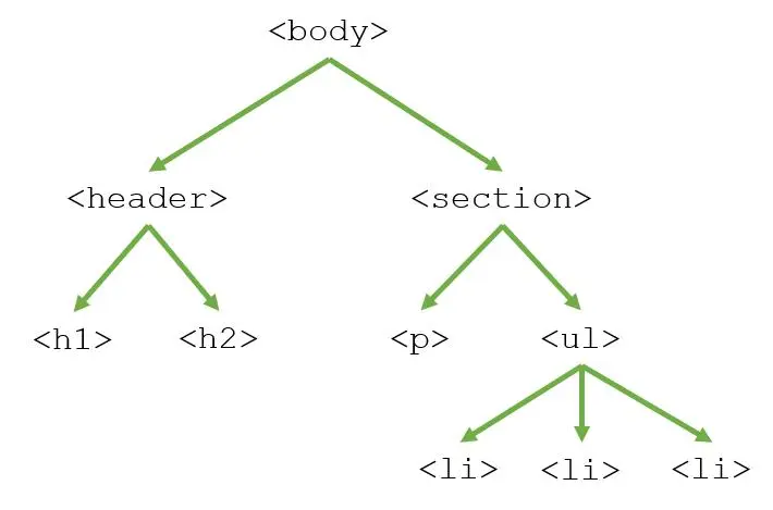
Through inheritance, CSS property values set on one element will be transferred down the tree to that element's children. In this example, every element gets the same font because we applied it to the body tag. Since the body element is a common parent for all visible elements is a convenient selector for when you want to set stylistic rules for the entire document.
Then, we applied different styles at different levels of the tree so that the "li" or list element tag ends up with three different styles (font, underline and green) without us actually applying any style directly to that tag.
body {
  font-family: "Century Gothic", sans-serif;
}
header {
  font-style: italic;
}
section {
  text-decoration: underline;
}
ul {
  color: green;
}
Not every property is inherited, but many are. The CSS specification tell you, for each property, whether it is inheritable. It's a good idea to keep in mind the structure of your HTML document when choosing your selectors so you can use inheritance to your advantage by applying styles to the top most element and save yourself extra CSS code.

<html lang="en">
  <head>
    <meta charset="utf-8">
    <link rel="stylesheet" href="style.css">
  </head>
  <body>
    <header>
      <h1> Title </h1>
      <h2> sub title </h2>
    </header>
    <section>
      <p> This is my paragraph text </p>
      <ul>
        <li> list item 1 </li>
        <li> list item 2 </li>
        <li> list item 3 </li>
      </ul>
    </section>
  </body>
</html>
body {
  font-family: "Century Gothic", sans-serif;
}
header {
  font-style: italic;
}
section {
  text-decoration: underline;
}
ul {
  color: green;
}
You can imagine that multiple HTML elements on your page will have similar style. If you write a separate CSS rule with the same properties for each of these elements, your CSS file can get very large and hard to manage. When designing CSS, the authors wanted to help make it as easy as possible to write and edit style sheets "by hand", so there are a number of features that help keep your styles succinct.
For example, what if you want to change the font that is consistent across many elements? You would have to change it in many places. Instead, you can combine multiple selectors on the same rule like so:
p, ul, ol {
  color: blue;
  background-color: pink;
}
The comma means that each of these elements should have the same, duplicated style. No need to have repeated style! Of course, you could simply apply this style to an element that contains all of these, say the body element, but not all properties are inherited so using the comma is a direct way to apply consistent style across multiple categories of HTML elements.
Here is a CodePen that explores using the comma to combine selectors.

body {
  color: #660099;
}
h1,h2,h3 {
  font-family: Impact, sans-serif;
}
ul,ol {
  font-family: helvetica, sans-serif;
}
h2,ul {
  font-style: italic;
}
h3,ol {
  text-decoration: underline;
}
<html lang="en">
<head>
  <meta charset="utf-8">
  <link rel="stylesheet" href="style.css">
</head>
<body>
  <h1>Title 1</h1>
  <h2>Title 2</h2>
  <ul>
    <li>Part of the reason a well structured HTML document is so
      important</li>
    <li>is because HTML elements inherit stylistic properties</li>
    <li>You can see it's basic structure from the way I have
      formatted the tags with tabbing</li>
  </ul>
  <h3>Title 3</h3>
  <ol>
    <li>but here is a more visual representation of the hierarchy
      of tags</li>
    <li>Tags that contain other tags are parents</li>
    <li>and the tags inside of them are their children in the
      following tree representation</li>
  </ol>
</body>
</html>
Now it's your turn to practice with some selectors of your own.
Let's say you have the following CodePen:
<!DOCTYPE html>
<html lang="en">
<head>
  <meta charset="utf-8">
  <title>My HTML page</title>
  <link rel="stylesheet" href="style.css">
</head>
<body>
  <h1>Main Title</h1>
  <p>
In unit 2.3, we defined a CSS selector as the portion of the CSS rule that tells the browser on which HTML element to apply the defined style.
When your HTML is simple, the selectors can be simple as well. The most basic selectors simply mirror the HTML tag. For example "p" attaches to all <p> tags, "img" will attach to all <img> tags and so on. As you can imagine, there will often be times when you don't want every single HTML element of a particular type to have identical style. In Module 3, we'll discuss a variety of ways to use selectors to attach to specific HTML elements.
In unit 2.2, we briefly mentioned the fact that properties apply to the entire hierarchy of HTML elements to which they are attached. This means that you will have to be very careful which selectors you choose to use in combination with your chosen style. When choosing your selector you might want to keep the following aspects of an HTML element in mind
</p>
  <h2>Sub Title 1</h2>
  <ul>
    <li>How many of these HTML elements are on my page?</li>
    <li>Do I want this style to apply to every one of these
      elements?</li>
    <li>What are this HTML element's children</li>
  </ul>
  <h2>Sub Title 2</h2>
  <ol>
    <li>and do I want this style to apply to them as well?</li>
    <li>Is this element a block element or an inline element</li>
    <li>and does this style make sense in that context?</li>
  </ol>
</body>
</html>
  /* Selector here */  {
  background-color: #ccffcc;
  color: #336600;
}
  /* Selector here */  {
  background-color: #336600;
  color: #ccffcc;
}
  /* Selector here */  {
  border: 3px solid;
}
  /* Selector here */  {
  background-color: #ffff99;
}
  /* Selector here */  {
  text-decoration: underline;
}
Note that there are HTML and some CSS rules, but the rules are missing their selectors. You will need to figure out which selectors belong on top of each of the 5 rules so that your final site looks exactly like this:
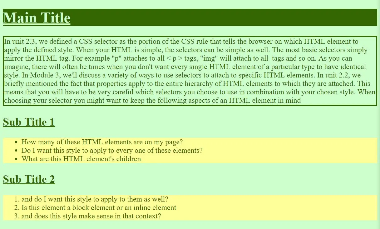
HINT: Some of the rules require multiple comma separated selectors.
In unit 2.5, we briefly introduced you to "properties", the part of the CSS rule that tells the browser how to style specific aspects of the selected HTML element.
There is a huge array of different aspects you can style: color, font, size, spacing and much more! You can find the complete list of CSS properties (from W3C's Web site). Every property has its own collection of possible values. Some require text input, some specific keywords, some numerical input, etc.
Here are some examples of properties that each accept a different style of value:
body {
  background-color: purple; /* Key word */
  color: #FFFFFF; /* HEX code */
  width: 60%; /* Percentage */
  font-size: 20pt; /* Numerical value */
}
The above style is put into action in the following CodePen:

Make sure to look up what the available values are before using a property, because if the browser doesn't understand your value it will typically just skip applying any style. This is where programs like Visual Studio Code come in handy because as you type out the property, the program will automatically suggest possible values.
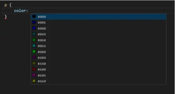
Sometimes the easiest way to learn about different properties is to explore the style on one of your favorite Web sites. You can use your browser tool to inspect an HTML element. Here is an example of inspecting a title:
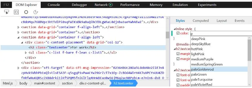
If you are not sure how to do this, please refer to the demo in unit 1.3 to see this in action while inspecting CSS Zen Garden designs.
As you can see, the browser tools display the value of the properties, and if you click into that space it will even give you some of the different value options and you can even change them and watch the Web site update dynamically.
Color is one of the first things you'll want to explore when designing your Web site. Thankfully, CSS provides a wide array of tools for you to control the color of different HTML elements. There are basic color properties:
This property sets the foreground color of an element's text content. By default, all text content will be set to black. If you set the color on one HTML element it will be inherited by all HTML elements within that. For example, if you set the color property on the body tag to blue, all text on your web page will be changed to blue, unless that text has a more specific color property that will override it.
This property sets the background color of an element. This color then represents the exact space the element takes up, which is always a rectangular area. The default value is 'transparent' which means whatever is behind the element will shine through.
Note that background-color is one example of a property that is not inherited, so you will have to directly set the background-color on each element. To set the overall color of your page, apply a background color to the body tag, and since all other element's background colors will be transparent by default, it will appear as if everything has that same background color.
These color properties take in a color as their value, and there are three different ways you can define that color: keyword, a HEX code or an rgb value.
Probably the simplest and least flexible way to set colors is using a keyword. A keyword is one of the predefined colors like "blue" or "green".
body {
   background-color: teal;
}
The list of color keywords is: aqua, black, blue, fuchsia, gray, green, lime, maroon, navy, olive, orange, purple, red, silver, teal, white, and yellow. You can read more about these keyword colors here.
A HEX code is a 6 character code to represent the color, giving you a lot more options. The 6 characters of the code are broken into 3 sets of 2, where each set of 2 represents the amount of either red, green or blue that makes up the color. These sets are hexadecimal numbers, which means that each ranges between 00 to FF where 00 means no color and FF means all of that color. Thus #000000 represents pure black and #FFFFFF represents pure white.
When using a hex code in CSS you must put a hash character in front of the 6 characters like so:
body {
   background-color: #00CC00; /* Green */
}
You can also specify colors using rgb in decimal form like so:
body {
   background-color: rgb(0,204,0); /* Same green as above. */
}
This will give you the same range as HEX values. This method is a less common, but it's up to you which method of specifying colors you prefer.
Here are some of the colors you can use, and the three different ways you can set their value in the color or color-background property:
maroon #800000 red #ff0000 orange #ffa500 yellow #ffff00 olive #808000
purple #800080 fuchsia #ff00ff white #ffffff lime #00ff00 green #008000
navy #000080 blue #0000ff aqua #00ffffteal #008080
black #000000 silver #c0c0c0 gray #808080
You can see these color properties in action using all three approaches to setting the value in this CodePen.
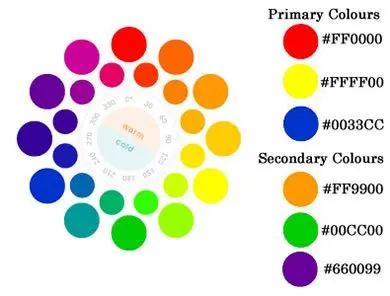
Font is an extremely important part of how you communicate content to your user.
Since not all fonts are available on all computers (there are thousands of fonts, and most are not free), CSS provides a system of fallbacks. You list the font that you want first, then any fonts that might fill in for the first if it is unavailable, and you should end the list with a generic font, of which are: serif, sans-serif, monospace, cursive and fantasy.
p {
  font-family: Helvetica, Verdana, sans-serif;
}
This property sets the font face. There is a collection of Web safe fonts that generally each browser has agreed to support, but there are an unlimited number of different fonts. The problem is they might not all look the way you want them to on different browsers.
That is why this property "font-family" allows a list of fonts in the order of your preference. This comma-separated list orders your font preference from left to right. In our above example, our first choice is Helvetica, if the browser doesn't support that it will move to the next on the list, Verdana, and if it still doesn't support that it will just pick any sans-serif font it does support. You should always end your font family with fonts that are likely to be supported by the browser, this way you are guaranteed to have control over the font-family.
See this quick reference listing what the fonts look like with different properties.
Something to keep in mind: some fonts have names with multiple words like "Times New Roman" or "Century Gothic". When using these fonts you'll need to surround the entire name with quotes so the browser understands that is a single font name like so:
p {
  font-family: "Times New Roman", "New Century Schoolbook", serif;
}
h1 {
  font-size: 2.5em;
}
CSS offers a number of different units for expressing length. Font-size sets the overall scale of your text. You can use a lot of different units to set the font size. Some of these units you are probably familiar with if you have used text editors before such as pt size or you can use px size. However, these methods are not advised because they are static and will not adapt based on screen size. It's better to use relative units, such as em, instead.
Use ems to make scalable style sheets! This is especially important for users who have special font preferences due to accessibility requirements. To use em, do not set font-size on the body tag, but instead set the size for each element in relation to the user's default. For example, 1em is the default, 2em is twice as big, 0.5em is half as big etc.
For curious people (i.e. non mandatory material), here is an excerpt from "The amazing em unit and other best practices" (Chapter 3 of the book "Cascading Style Sheet - designing for the Web" 3rd edition, by Håkon Wium Lie & Bert Bos):
Named after the letter "M", the em unit has a long-standing tradition in typography where it has been used to measure horizontal widths. For example, the long dash (—) often found in American texts is known as an "em dash" because historically, it has had the same width as the letter "M". Its narrower cousin (–), often found in European texts, is similarly referred to as "en dash".
The meaning of em has changed over the years. Not all fonts have the letter "M" in them (for example, Chinese), but all fonts have a height. The term has therefore come to mean the height of the font – not the width of the letter "M".
In CSS, the em unit is a general unit for measuring lengths (for example, page margins and padding around elements). You can use it both horizontally and vertically, and this shocks traditional typographers who have always used the em exclusively for horizontal measurements. By extending the em unit to also work vertically, it has become a very powerful unit – so powerful that you seldom have to use other units of length.
Another great resource is this article on font sizing tips and tricks.
p {
   font-weight: bold;
}
The weight of a font is the thickness of the letters. You can set this property using keywords with which you might be familiar: bold, normal or lighter. You can also set this property more specifically using numerical values 100, 200, 300, 400, 500, 600, 700, 800 or 900. Normal is represented as 400, whereas bold is 700.
Note that few fonts have settings for all values. If the value is not available, the browser will use the nearest available one. For example, if 800 is not available but 700 is, then the browser will display 700. Please try different fonts in this Codepen to see how they look at each weight setting.
p {
  font-style: italic;
}
The font style property adjusts the angle of the letters in relation to the horizontal plane. Italic forms are generally cursive in nature while oblique faces are typically sloped versions of the regular face.
p {
  text-decoration: underline;
}
Text-decoration adds a line across your text. You can set this line to be underneath your text, underline, through your text, line-through, or on top, overline.
Here is a CodePen exploring each of these styles.

<!DOCTYPE html>
<html lang="en">
  <head>
    <meta charset="utf-8">
    <title>My HTML page</title>
    <link rel="stylesheet" href="style.css">
  </head>
  <body>
    <h1>Main title</h1>
    <h2>Sub title</h2>
    <p>
      Lorem ipsum dolor sit amet, consectetur adipiscing elit. Duis
      lacinia consequat nibh, non commodo neque maximus semper.
      Vivamus non ultricies massa, vel convallis nunc. Aenean
      tempus risus at orci faucibus, eget hendrerit elit sodales.
      Quisque imperdiet diam nibh, ut semper enim dapibus et.
      Interdum et malesuada fames ac ante ipsum primis in
      faucibus. Aenean in feugiat neque. Nunc eget libero
      mauris. Maecenas condimentum luctus nulla. Nulla a
      sem orci. Cras eget neque viverra, condimentum nulla
      et, tincidunt libero. In sit amet quam purus. Aliquam
      erat volutpat. Sed hendrerit urna quis sapien mattis
      dictum. Etiam vehicula tortor eu libero finibus
      dapibus. Mauris nunc neque, sodales nec est sed,
      gravida convallis sem. Nam vulputate sed est sed
      eleifend. Quisque sodales elit at ornare vulputate.
    </p>
  </body>
</html>
body {
  font-family: Helvetica, Verdana, sans-serif;
  font-size: 12pt;
}
h1 {
  font-size: 3em;
  font-style: italic;
}
h2 {
  font-size: 2em;
  text-decoration: underline;
}
p {
  font-weight: bold;
}
There are even more ways to adjust text appearance and you can read more about them here:
CSS provides a great set of tools to help you position the HTML elements on your page, and we will cover that in depth in Module 4. For now we will talk about how to apply white space around individual HTML elements.
There are two different ways you can define white space:
For now, we'll use pixels because that is easier to learn. However, ultimately you will want to use percentages and ems so your content adapts to different screens. We will discuss how to use percentages in Module 4.
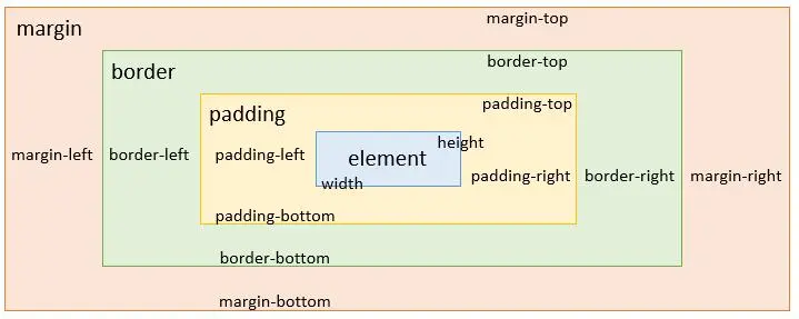
When you view an element in your browser tools you can see the white space around it represented like so:
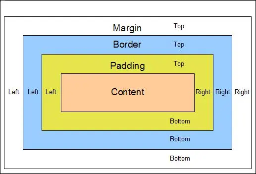
The above image is called the "box model", which we will get into more detail about in Module 4. For now, you can see that the space around the content is broken into three distinct regions.
p {
  padding: 20px;
}
"Padding" is the white space that sits closest to an HTML element. Many elements already have a default padding defined. For example, ul elements by default are indented to the left a bit because they have a left padding.
You can set the padding on an element's four sides independently using padding-top, padding- right, padding-bottom and padding-left. Or, you can use the more compact padding: 10px 15px 20px 25px. In this case, the order of the numbers sets the top, right, bottom and left paddings. In the example below, I collapsed all of these and just set the padding on all four sides to be 20px. Here is a CodePen that demonstrates all these different ways to set padding.
p {
  border: 1px black solid;
}
The "border" is the area outside the padding of an HTML element. By default, borders are set to be empty, but you can set their width, color, pattern, even an image! Like padding, you can even adjust the four sides of a border independent of one another using border-top, border-right, order-bottom or border-left. You can also adjust the different aspects of a border with border-width, border-color, and border-style. In the above example, I collapsed all of these properties into a single simple property and value set.
p {
  margin-bottom: 50px;
}
An HTML element's "margin" is the white space that sits outside the border. Margins of HTML elements interact with one another on the page to determine how they are arranged on the page. A lot of elements have default margins applied.
For example, the body tag typically has a margin that causes any content to not extend all the way to the extreme edge of the page. Be careful, margins can be tricky. When two margins touch they "collapse" such that the space between the elements is equivalent to the larger of the two margins. Like the above properties, you can also set the margins on each side independently using margin-top, margin-left, margin-bottom and margin-right.
Here is a CodePen exploring padding, border and margin.

body {
  background-color: #99ffff;
  margin-top: 20px;
  margin-left: 70px;
}
h1 {
  background-color: #ff6699;
  border-bottom: 20px #ff0066 solid;
  margin-bottom: 10px;
  padding: 5px;
}
ul {
  background-color: #ff9933;
  border-left: 5px black dashed;
  margin: 50px;
}
li {
  background-color: #ffcc66;
  margin: 10px;
  padding: 10px;
}
p {
  background-color: #ccff99;
  border: 10px white double;
  padding: 0px;
  margin: 0px;
}
Now that you have a few properties in your CSS toolbox, let's practice using them.
Here is some HTML and CSS, but as you can see the CSS rules have selectors but no properties. Check also the corresponding Codepen:

<!DOCTYPE html>
<html lang="en">
<head>
  <meta charset="utf-8">
  <title>My HTML page</title>
  <link rel="stylesheet" href="style.css">
</head>
<body>
  <h1>Adding Properties</h1>
  <h2>Using Colors, Fonts and Spacing</h2>
  <p>
    There is a huge array of different aspects you can style:
    color, font, size, spacing and much more! For a complete
    list of official CSS properties, please check:
    https://www.w3.org/Style/CSS/all-properties#list
    or https://meiert.com/en/indices/css-properties/
  </p>
  <ol>
    <li>Make sure to look up what the available values are
      before using a property</li>
    <li>because if the browser doesn't understand your value
      it will typically just skip applying any style</li>
    <li>This is where programs like Visual Studio Code come in
      handy</li>
    <li>because as you type out the property the program will
      automatically suggest possible values for you </li>
    <li>Sometimes the easiest way to learn about different
      properties is to explore the style on one of your favorite
      websites</li>
  </ol>
  <p>
    If you aren't sure how to do this refer to the demo in unit
    1.3 to see this in action while inspecting CSS Zen Garden designs.
    As you can see, the browser tools display the value of the
    properties, and if you click into that space it will even give
    you some of the different value options and you can even change
    them and watch the Web site update dynamically.
  </p>
</body>
</html>
body {
}
h1 {
}
h2 {
}
ol {
}
li {
}
p {
}
These CSS rules have selectors, but no properties. For this activity, it is up to you to add the correct properties and set their values appropriately to achieve this final style:
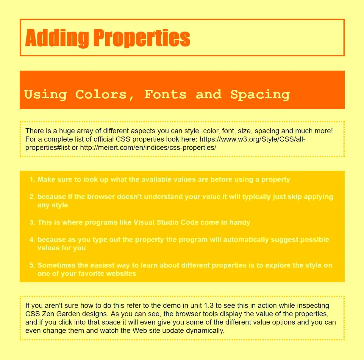
Here are the color HEX code used above:
Here are the fonts used above:
Note: This exercise uses three common fonts, Helvetica, Impact and Courier New. If you are on Windows or MacOS, you almost certainly have all three of them. But Linux, Android and others usually do not offer Impact and Courier New. Microsoft made free versions available and on most Linux distributions there is an easy way to install them: look in your package manager for a package called ttf-mscorefonts-installer (or similar). If you don't want to install fonts and you are on Linux, you can try Courier instead of Courier New. Availability of other fonts differs a lot. Maybe you can look in the system settings to see if there is an interesting font available to use instead of Impact.
But this points to a fundamental limitation of font-family in CSS: you cannot be sure that somebody who views your pages has all the fonts that you chose. The solution is to embed the fonts in the style sheet (a technique known as Web Fonts). But that is beyond the scope of this course.
In each unit, we will have a section like this one where we profile specific aspects of Web sites and the various ways you can use CSS to style them. This is intended to give you practical examples of how to apply the CSS you are developing along the way.
Each style study will discuss the different concerns of styling a given element and three sample styles.
There are a couple different categories of text on a Web page: titles, body text, links, captions, etc. You'll want to style each of these differently to help your user understand the proper context for your text. One of the most important categories of text to stand out are your titles.
However, you should only alter a few of these following aspects at a time to prevent your titles from being too distracting. The below is an example of using too many different aspects of font for emphasis:

#busyTitle h1{
  font-size: 2em;
  font-family: Impact;
  color: yellow;
  background-color: gray;
  font-style: italic;
  font-variant: small-caps;
  font-weight: bold;
  text-decoration: underline;
}
This title uses soft clean colors based on print media, so we chose a serif font. We also increased the size and color to help the title appear more prominent than the body text.

#design1 {
  background-color: #F4F4F4;
  font-family: "Lucida Sans Unicode", sans-serif;
}

#design1 h1 {
  color: #C0B283;
  font-size: 4em;
  font-weight: 700;
  font-family: Garamond;
  width: 300px;
}

#design1 p {
  color: #373737;
  font-size: 1.2em;
}
This design is intended to look futuristic, so it only uses sans-serif, thin font with high contrast colors.

#design2 {
  font-family: Century Gothic, sans-serif;
  background-color: #0E0B16;
}

#design2 h1 {
  font-weight: 400;
  font-size: 2.3em;
  color: #A239CA;
  font-style: italic;
}

#design2 p {
  color: #E7DFDD;
}
This design is based on pastel primary colors and uses color as a highlight against the default white background. We have achieved the separation between title and body text by setting its background color separately and giving it a bottom border.

#design3 {
  color: #DF744A;
  font-family: Arial, sans-serif;
}
#design3 h1 {
  background-color: #BFD8D2;
  text-align: center;
  font-size: 4em;
  font-weight: 100;
  padding: 30px;
  border-bottom: 5px #DCB239 solid;
  font-family: Helvetica, sans-serif;
}
#design3 p {
  background-color: #FEDCD2;
  padding: 50px;
}
Here is a CodePen of all the above examples of different title designs for you to play around with.
Buttons are a key way that your users will interact with your page. Often buttons are a call to action for your user- so you will want them to stand out!
When styling a button you aren't just styling the text, but also the area around it, including the border. By giving them a distinct background color or border you make it clear that this whole area is "clickable". Typically your user will expect your button to be wider than it is tall, to accomplish this you'll want to set the left and right padding to be greater than the top and bottom paddings.
Here is an example (to come) of a button where it's not immediately clear that it is actually a button ("click here").

More examples of buttons are described below.
This design is a pretty traditional button where it has a distinct background-color and border- color to help it stand out from both the background and the body text.

#design1 {
  background-color: #94618E;
  color: #F8EEE7;
  font-family: Corbel;
}
#design1 button {
  background-color: #F4DECB;
  padding: 10px 25px;
  border: 5px solid #F8EEE7;
  color: #49274A;
  font-weight: bold;
  font-size: 1.2em;
}
This is a more modern button design where there is no distinct border, but just a flat color background. You'll note the poor accessibility of the text and button (for example, no sufficient contrast between foreground and background - find out more in these tips for designing).

#design2 {
  background-color: #D9D9D9;
  color: white;
  font-family: "Century Gothic", sans-serif;
}
#design2 button {
  background-color: #4484CE;
  border: 0px;
  color: white;
  padding: 10px 50px;
  font-family: Impact, sans-serif;
  font-size: 1.3em;
}
This is a big graphic button that uses border-radius to give the button rounded corners.

#design3 {
  font-family: Impact, sans-serif;
  font-size: 2em;
}

#design3 button {
  font-family: Impact, sans-serif;
  font-weight: 100;
  background-color: white;
  border: 7px #EC576B solid;
  border-radius: 20px;
  font-size: 0.8em;
}
In summary, here are three different ways to style buttons you can play around with.
Now that you know a bit more about how CSS is written, you will start to understand and notice more of the design elements as you navigate around the Web.
In this module's style studies section, you learned some effective ways to style titles and buttons. You also learned about some design choices that make your titles and buttons not as effective...
For this activity, please find a Web page that has either titles or buttons and discuss how effectively they are styled. In the discussion below, answer the following questions:
Now that you have played around with applying selectors and properties, you have the tools to make a much more sophisticated Web page than "Hello Your World".
For your module project, you are going to create a page describing yourself using your favorite colors. Your Web page must have the following content:
And in addition, you must employ the following styles:
For example, here is what my page looks like:
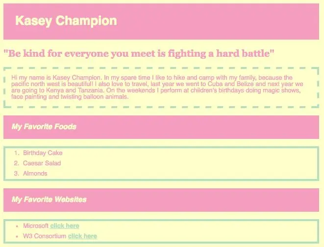
Note that you are welcome to look up other styles and apply them however you like as long as you at least have the above requirements met. We've set up a discussion forum below, in case you want to share your work!
Remember that if you want to post an assignment without personal information of yours in, feel free to change the content of the assignment to anything you like, so long as you incorporate the required code features. For example, you could instead create a profile page for an imagined character, or a brief biography of someone you admire.
In this module, we're going to be talking about selectors.
At this point, we've seen basic selectors, but we're starting to have a slightly more complex HTML document. We're going to need a lot more tools than just the HTML tag name.
In this module, we're going to talk about classes and IDs, pseudo-classes, contextual selectors, and then how you combine all these selectors together and understand the Cascading part of Cascading style sheets.
In this module, we'll learn:
In our last module (2), we learned about something called Selectors. This entire module is all about exactly that: Selectors. Because so far, we've actually seen pretty simple ones. They probably look something like this, and as you can see, this portion before the open curly brace, that's what we call Selector. And so far, we've only used ones that match the name of the HTML tag, which is totally fine. If you want every single paragraph to look exactly the same, or say you only have one header on your page.
As our Web pages get a lot more complicated, we have a lot more of the same HTML element and chances are we're going to want them to look different from one another. Thankfully, there's a whole list of different types of Selectors that we can use to specifically target each one of these HTML elements.
In this module, we're going to talk about things like classes, IDs, contextual selectors, pseudo- classes. All those things are going to help us really narrow our CSS. For example, we've probably written some CSS like this for this HTML page.
But, as you can see, every single one of the paragraphs ends up looking exactly the same. Because as long as I use the selector P for paragraph, it applies to every paragraph. Here is a preview of some of the things we're going to learn in this module.
Now, I have three different rules, for each of my three paragraphs. And they all look completely different which makes my Web site a lot more dynamic. Learning to properly select your HTML elements through CSS is crucially important to making sure that you get the most out of CSS.
The CSS code mentioned in above lesson:
p {
  color: white;
  background-color: midnightblue;
  font-size: large;
}
.middle {
  color: darkviolet;
  background-color: lightgray;
  padding-left: 120px;
  padding-right: 120px;
  font-size: large;
}
#bottom {
  background-color: transparent;
  color: black;
  font-family: 'Franklin Gothic Medium';
}
Often, a single page will have a whole bunch of the same html tag, but that doesn't necessarily mean you want each tag of that type to look exactly the same. Say, for example, you have lots of different links on your page. Things that take you to different pages, things that take you back, and things that navigate you around the site. You might want to make the ones that take you back to your home page a little more noticeable. But how do you do that?
They're all link tags. The answer? Classes and IDs! Classes and IDs are special names that you create and you assign to specific HTML tags. Once you've got these names attached, you can use those as selectors for your CSS rules. Assign an element ID when you're only going to assign it to a single thing.
Say for example, you have lots of buttons on your page but you want to make the one that charges the user's credit card extra noticeable. You can use that by giving it an id of say "pay button", and then you can make sure you user knows exactly what that button is going to do when they click it. Assign a class when you want a whole group of elements to all look the same.
Say for example, you want your navigation bar to be filled with links that all look very similar. If you assign a class, that then say puts them all in the same place and gives them the same font, your user will know which links are actually navigating them around the site, and which ones are going to take them away from your site to a different one. Now, let’s take a look at a whole bunch of different examples of how you can use classes and ids to target exactly what you want.
Classes and IDs are "attribute selectors". This means that you can attach style to HTML elements based on that element's attributes. This empowers you to apply different style to items of the same HTML type.
[Definition and documentation]
A class is an HTML attribute that specifies a name for a group of elements on the page. You can apply the class name to as many elements as you like, even if they are of different HTML tag types. You can use the class name as the selector, like so:
<p class="className">The intro paragraph</p>
Class names must be single words, but you can include digits and dashes as long as the name begins with a letter. Note that names are case sensitive. To apply a CSS rule to a class, you must precede its name by a period ("."), like in the code below:
.className {
  color: blue;
}
[Definition and documentation]
An ID is an HTML attribute that specifies a name or unique identifier for a particular HTML element. They are like classes with a very important distinction: the value of the ID attribute must be unique throughout the document. This lets you target a single HTML element for styling. You set the id of an HTML element like so:
<p id="MyFirstId"> This is an extra special paragraph </p>
ID names have the same rules as class names: start with a letter, can include numbers and dashes, no spaces. The way to create a selector for an ID is also similar to how you create a selector for a class, except you replace the period with a hash symbol ("#") like in the code below:
#MyFirstId {
  color: blue;
}
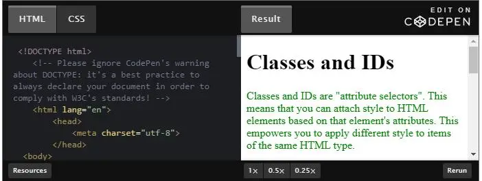
<!DOCTYPE html>
<html lang="en">
<head>
  <meta charset="utf-8">
  <title>Classes and IDs</title>
  <link rel="stylesheet" href="style.css">
</head>
<body>
  <h1>Classes and IDs</h1>
  <p id="intro">
    Classes and IDs are "attribute selectors". This means that
    you can attach style to HTML elements based on that element's
    attributes. This empowers you to apply different style to
    items of the same HTML type.
  </p>
  <p class="odd">
    Classes are an HTML attribute that specifies a name for a group
    of elements on the page. You can apply the class name to as
    many elements as you like, even if they are of different HTML
    tag types. You can use the class name with a period in front
    as the selector.
  </p>
  <p class="even">
    Class names must be single words, but you can include digits
    and dashes as long as the name begins with a letter. Note
    that names are case sensitive.
  </p>
  <p class="odd">
    An ID is an HTML attribute that specifies a name or unique
    identifier for a particular HTML element. They are like
    classes with a very important distinction: the value of
    the ID attribute must be unique throughout the document.
    This lets you target a single HTML element for styling.
  </p>
  <p class="even">
    ID names have the same rules as class names: start with a
    letter, can include numbers and dashes, no spaces. The way
    to create a selector for an ID is also similar to how you
    create a selector for a class, except you replace the
    period with a hash symbol ("#").
  </p>
</body>
</html>
#intro {
  color: green;
}
.odd {
  color: blue;
}
.even {
  color: red;
}
body {
  background-color: #00ccff;
  color: white;
  font-family: Helvetica, sans-serif;
  margin: 35px 25px 0px 25px;
}
p,h2 {
  padding: 10px;
}
.topSection{
  background-color: #3300cc;
  color: #cccccc;
}
.bottomSection {
  background-color: #cccccc;
  color: #3300cc;
}
#importantItem {
  text-decoration: underline;
  color: #99ff99;
}
#unimportantItem {
  color: gray;
}
As you can note, it's not too interesting because not all of the styles are applied to the HTML as shown in the pen below:
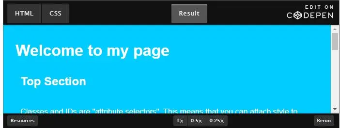
In this activity, your job is to add the HTML id and class attributes to the correct elements so that you get a final result that looks like this:
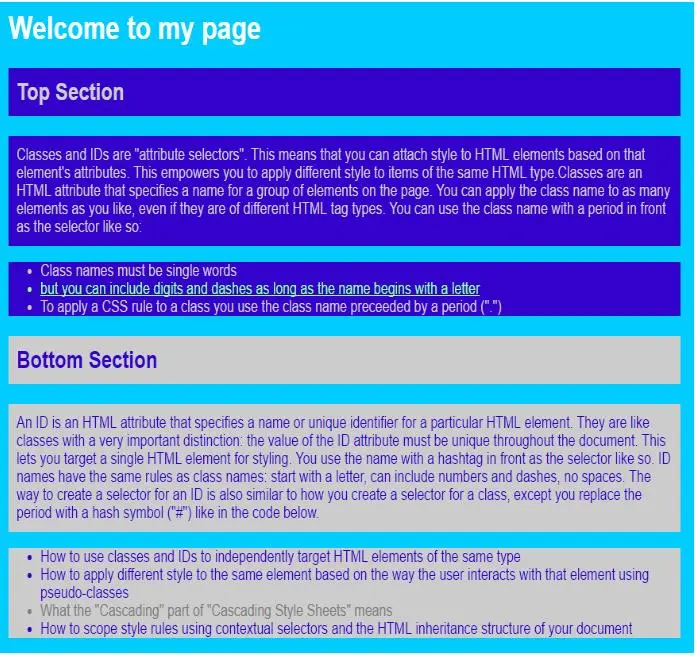
Sometimes, you'll want to adjust the style of an element, based on how the user has interacted with it. The best example of this is links. Often times, you'll notice a link is blue, and then after you click on it it turns purple.
This is the default style for the pseudo class visited. There's also a bunch of other pseudo-classes that let you manipulate whether the user is hovering over it with their cursor, or they're focusing on it and other such activity.
Let’s take a look at the different pseudo-classes and how you can design a really interactive Web site. Pseudo-classes are a way to select HTML elements based on their state as opposed to their HTML structure. Pseudo-classes must always be applied to an existing selector. Their "flag character" is the colon (":").
Here are some of the most popular pseudo-classes:
a:visited {
  color: gray;
  font-style: italic;
}
These pseudo classes are the ones you are probably most familiar with. Even on this page you've probably noticed that links have different style than paragraph text. The <a> tag by default sets the text color to blue with an underline, but have you ever seen a purple link? This is the "visited" pseudo-class that applies a different style to links that the user has already clicked. The opposite of visited is "link" which is a link a user has not yet clicked. These two states are mutually exclusive, meaning a link cannot be both at the same time.
The hover pseudo-class is applied when the user points at an object but doesn't activate it, most commonly when they let their mouse cursor lay on top of an element without clicking. Some form factors don't support this, such as touch devices or pen surfaces. This is a really good way to encourage a user to click a link and you will often see it used in navigation bars.
li:hover {
  background-color: yellow;
}
The focus pseudo class applies when a user has chosen to begin interacting with an element, such as when they click into a form input field so that the input field is then ready to accept keyboard input.
input:focus {
  background-color: blue;
}
The active pseudo-class applies when an element is activated. This happens in the time between when the user clicks their mouse and they release it.
p:active {
  color: red;
}
You can read more about pseudo-classes in this MDN "Pseudo-classes" document.
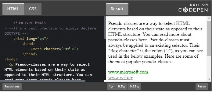
Now it's your turn to try out some pseudo classes. Here is a Web page (see the CodePen Practice with Pseudoclasses) and the CSS code:
body {
  background-color: #006666;
  color: white;
}
h1 {
  text-decoration: underline;
}
input {
  border: 3px white solid;
}
input {
  border: 3px yellow solid;
}
input {
  background-color: yellow;
  border: 3px yellow solid;
}
button {
  background-color: white;
  color: #006666;
  border: 3px white solid;
}
button {
  background-color: #006666;
  color: white;
}
button {
  background-color: #33cc99;
}
li {
  background-color: white;
  color: #006666;
}
li {
  background-color: #33cc99;
  color: white;
}
a {
  color: white;
}
a {
  color: #33cc99;
}
If you look at the CSS for this page you'll notice there are multiple CSS rules with the same selectors. That is because some of these rules need to have pseudo classes applied.
Please add pseudo-classes to the existing rules so that:
The resulting output should look like this when the user has not interacted with the page in any way:
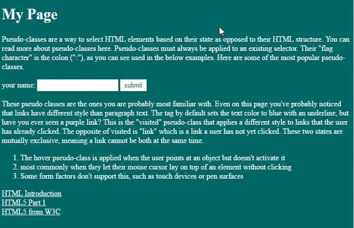
In the last section, we actually combined two selectors into one rule. By adding a pseudo-class onto an existing selector, we are further targeting a specific HTML element. There's actually lots of situations in which you want to combine multiple selectors. You can actually use all of the selectors, we've seen so far into a single rule. You do this by putting them in a specific order separated by spaces. You would call this approach contextual selection, because each selector is referencing the hierarchy it's been placed in.
Now, let's take a look at how you can order all the selectors you have in your toolbox to really target that specific HTML element. When you use two selectors separated by a space on a rule, you scope the rule to the elements that correspond to the selector on the right that are INSIDE the elements that correspond to the selector on the left. Let's say we have the following HTML:
<!DOCTYPE html>
<html lang="en">
  <head>
    <meta charset="utf-8">
  </head>
  <body>
    <img src="images/pic1.jpg" alt="pic 1" />
    <p>
      This is my paragraph full of useful information
      <img src="images/pic2.jpg" alt="pic 2" />
      Since there is text around these images, they should be
      styled a little differently.
      <img src="images/pic3.jpg" alt="pic 3" />
    </p>
    <img src="images/pic4.jpg" alt="pic 4" />
  </body>
</html>
If we applied the following CSS rule then the images INSIDE the paragraph would be set to a width of 100px, but that rule would not apply to the images outside the paragraph.
p img {
  width: 100px;
}
Below is a diagram of the given HTML with the two images that will be styled by the above rule are indicated by the red arrows.
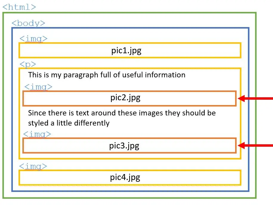
As your web pages get more complex, contextual selectors become more important, because it becomes increasingly unmanageable and inefficient to apply classes and IDs to each individual item, as a page scales up. Contextual selection becomes especially useful when you structure your HTML with section tags like header, section, article and footer. Pay attention to the styles of the paragraphs and lists in the following example:
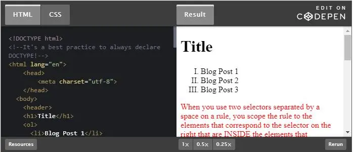
For practice, we are going to learn how to better scope CSS without the crutch of classes and IDs.
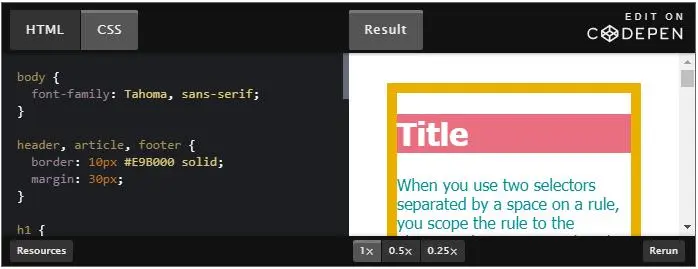
body {
  font-family: Tahoma, sans-serif;
}
header, article, footer {
  border: 10px #E9B000 solid;  /* pure (or mostly pure) yellow */
  margin: 30px;
}
h1 {
  color: #E86E80;  /* soft red */
}
h1 {
  background-color: #E86E80;  /* soft red */
  color: #FFFFFF;
}
p {
  background-color: #008F95;  /* dark cyan */
  color: #FFFFFF;  /* white */
}
p {
  background-color: #FFFFFF;  /* white */
  color: #008F95;  /* dark cyan */
}

ol {
  background-color: #E24E43;  /* bright red */
  color: #FFFFFF;  /* white */
}
ol {
  background-color: #FFFFFF;  /* white */
  color: #E24E43;  /* bright red */
}
ol {
  border: 5px solid #E24E43;  /* bright red */
}
So, there are CSS rules with duplicate selectors. You'll need to add some extra selectors to the existing CSS rules so that instead of duplicate rules, you have rules that address different instances of the HTML elements based on the structure of the HTML.

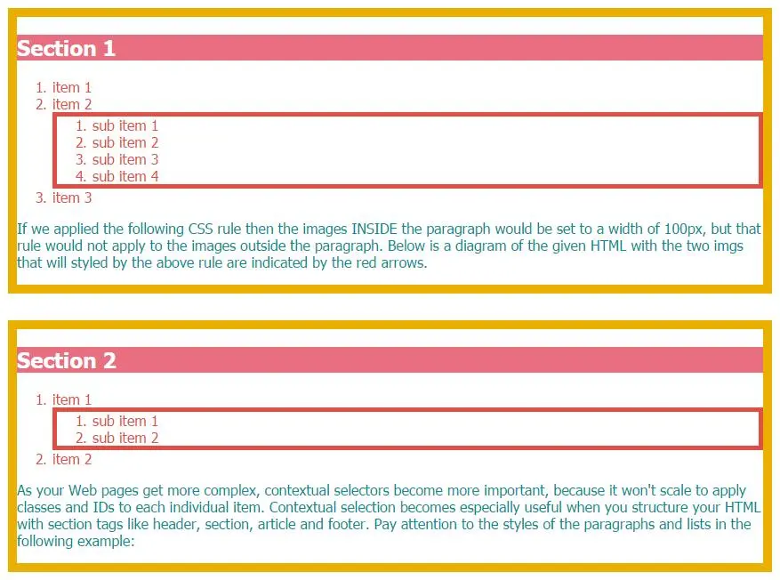

Hopefully, at this point, it's become very clear why what we're working on is called a style sheet. But where is the cascading part coming? CSS has a very specific hierarchy of style. So that you can write multiple rules that apply to the same HTML tag but the browser will still know how to make it look.
But how does the browser decide when there's multiple rules? The answer: the most specific rule wins. But then, why would you want to have multiple rules for the same tag?
A lot of times, you're going to have multiple style sheets. Imagine you have one parent style sheet that applies to your whole Web site, but then you have individual smaller style sheets that apply to the different pieces of it, like say, your blog or your gallery.
Imagine, you want to highlight a specific piece of text. You could either write individual rules for each piece of text in your whole Web site —most of which will be very similar and then one would be different— or, you can write one style apply it to the body tag, so that every single piece of text is affected and then use an ID to target the exceptions.
Because the ID tag is so much more specific than the body that rule wins. As you can imagine this is going to save you a lot of time and a lot of typing. And I'm sure you know computer scientists are all about efficiency.
Now let's take a closer look at how you can use the cascading nature of CSS to optimize your style. Now that you've learned all these different selectors, you've probably noticed that there is nothing preventing one from creating rules that overlap, meaning creating rules that apply style to the same HTML elements. In fact, it's very common for HTML elements on a page to have multiple CSS rules competing for importance.
Thanks to the "cascading" part of "Cascading Style Sheets", this isn't a problem. That is because CSS has a way to figure out which rule "wins" when styles are conflicting. CSS actually computes a "weight" for each style rule and the one with the greatest weight wins. If you want all the specifics on how this weight is computed you can read more here. For simplicity's sake, the most specific rule wins!
Look at the corresponding HTML and CSS, where code showing how Cascading order applies with many overlapping rules:
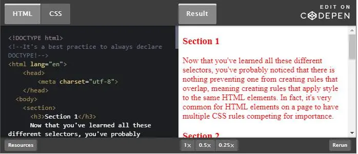
section {
  color: red;
}
section section {
  color: orange;
}
section section section {
  color: green;
}
#section {
  color: blue;
}
section:hover {
  color: purple;
}
section:hover section:hover {
  color: pink;
}
section:hover section:hover section:hover {
  color: yellow;
}
Cascading order can be difficult to manage. Consider the following pen:
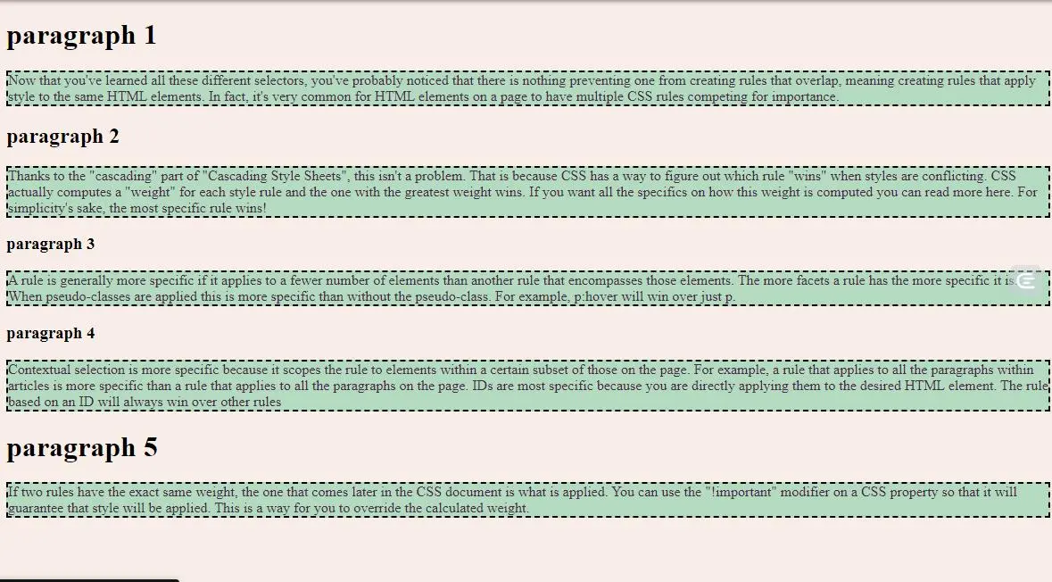
body {
  background-color: #F8EEE7;
}
p {
  background-color: #F4DECB;
}
p {
  background-color: #94618E;
  color: #F8EEE7;
}
p {
  background-color: #49274A;
}
p {
  background-color: #FFFFFF;
  color: #49274A;
}
p {
  background-color: #B4DBC0 !important;
  border: 2px dashed black;
}
Note that there are a lot of repeat CSS rules. For this activity, you cannot change any of the HTML (meaning you cannot add any IDs), but you'll need to change the CSS to make some of the rules more specific so that you achieve this final result:
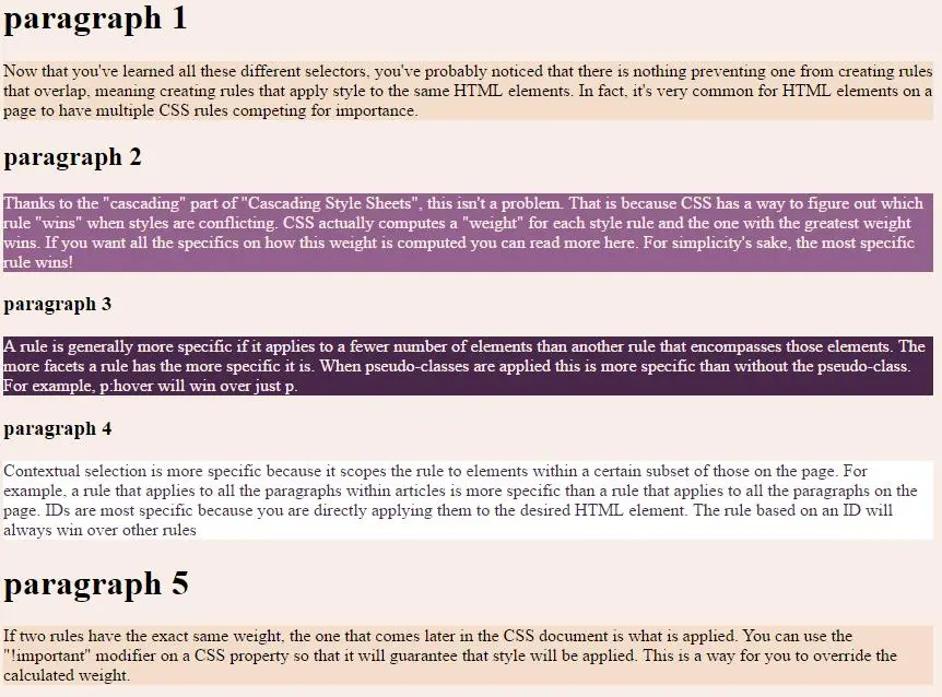
The image below shows when you hover "paragraph 4". The same hover should apply to ALL p tags.
body {
  background-color: #f8eee7;
}
p {
  background-color: #f4decb;
}
section p {
  background-color: #94618e;
  color: #F8EEE7;
}
article p {
  background-color: #49274a;
}
#specific {
  background-color: #ffffff;
  color: #49274A;
}
p:hover {
  background-color: #b4dbc0 !important;
  border: 2px dashed black;
}
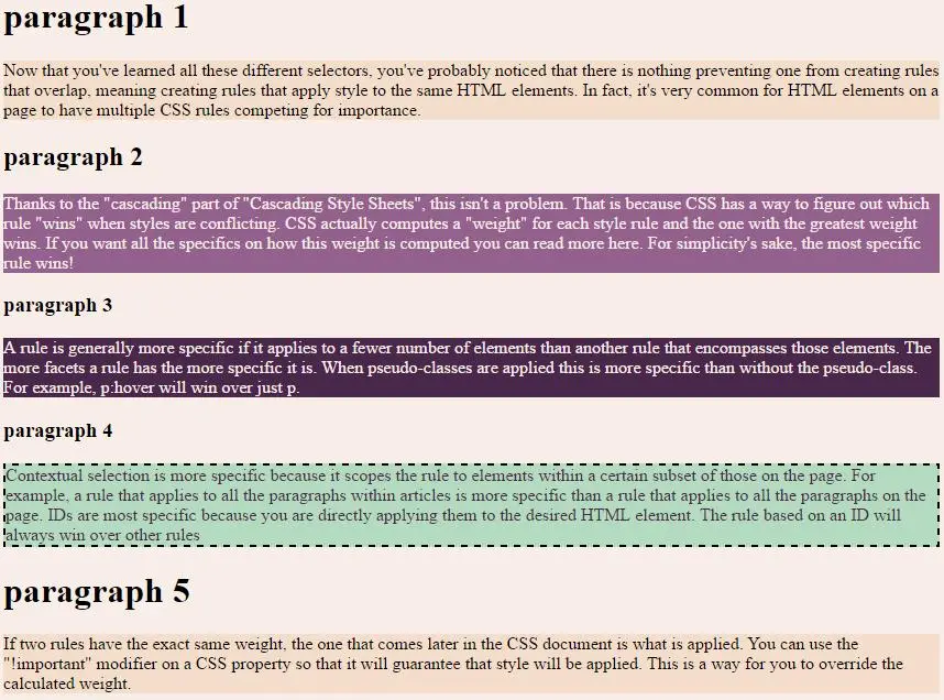
Images are an extremely important part of your page, not only as part of your content but as a key way to help style your page. Before you even get to styling them you need to put considerable thought into what type of images to include in your page. One of the easiest ways to slow down your site's performance is to include lots of large, high-quality images. There are two general things to consider when picking your images: what format and how large are they?
It's important to format and size your image before uploading it to your site, because while you can use CSS to resize it, the browser will download the full image even if you've chosen to display it smaller than it is. You can resize images using the width or height properties of CSS like so:
img {
  width: 100px;
  height: 100px;
}
In Module 4, we will discuss width and height in detail, but for the purpose of images, know that if you only set one of these two properties the image will scale according to its original dimensions. If you set both width and height, CSS will stretch your image to fit whatever you specify.
Rarely does it look nice when your content images touch your text content. You'll often want to give your images a good amount of white space surrounding them, and you can do this with padding and/or margin. In the examples below, you can see how you can even use padding and margin to achieve some interesting stylistic effects with your images.
In Module 2, we saw how you can use the "border-radius" property to make a button with rounded corners. You can do the same to images. You might even notice that it has become popular to turn square images into perfect circles, especially for icons or profile photos.
When you see complicated styles as part of a Web page's design, chances are there are images as a foundational element. For example, you will often see images set as backgrounds or as a link. Remember that you can put an <img> tag within an anchor tag to turn it into a link. You can also use the background-image CSS property to set an image as a background instead of just using a solid color. You can read more about background images here.
It is best to overlay real text rather than use pixelated text. This makes it possible to search, copy and style the text, as well as making translation much easier. It also has accessibility benefits and makes translation much easier.
As you can see, there are a lot of things to consider, and if you do not plan your images carefully, they can end up looking very disruptive, like this "Bad Image" example:

<!DOCTYPE html>
<!--It's a best practice to always declare DOCTYPE!-->
<html lang="en">
  <head>
    <meta charset="utf-8">
  </head>
  <body>
    <div id="badImg">
      <p>
        Here is an image that is unformatted, so the surrounding
        text directly touches it.
      </p>
      <p>
        <img src="https://www.w3c.fr/wp-content/uploads/
        2016/12/26420235490_7ae150d467_b.jpg"
        width="300" alt="rows of people sitting in a theatre and
        wearing virtual reality devices." ></p>
        <p>It also doesn't integrate well with the text content,
        so it does not flow with your other content.</p>
      </p>
    </div>
  </body>
</html>
div {
  margin-bottom: 50px;
}
#badImg {
  background-color: gray;
  padding: 10px;
  color: white;
}
This design shows some of the basics in properly incorporating images. It uses the colors from the image in the design of the overall page to help the image look as if it belongs. It also uses padding to give the image a "polaroid-style" border.
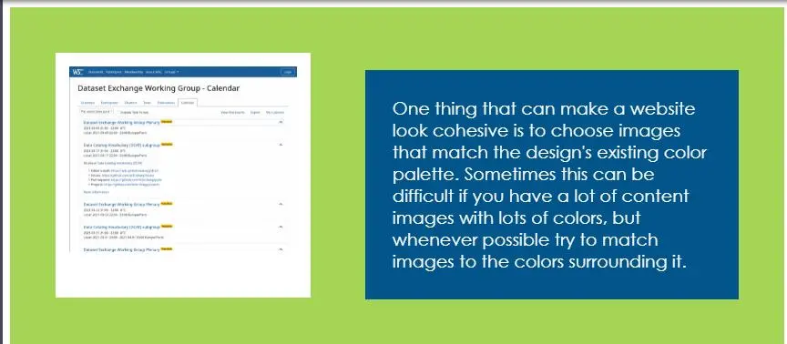
div {
  margin-bottom: 50px;
}
#images1 {
  background-color: #A4D555;
  padding: 50px;
  width: 750px;
}
#images1 p {
  background-color: #02558B;
  font-family: "Century Gothic";
  font-size: 1.2em;
  color: white;
  width: 350px;
  padding: 30px;
  float: right;
}
#images1 img {
  width: 250px;
  padding: 15px 15px 50px 15px;
  background-color: white;
}
<!DOCTYPE html>
<!-- It's a best practice to always declare DOCTYPE! -->
<html lang="en">
  <head>
    <meta charset="utf-8">
  </head>
  <body>
    <div id="images1">
      <p>
        One thing that can make a website look cohesive is to choose
        images that match the design's existing color palette.
        Sometimes this can be difficult if you have a lot of content
        images with lots of colors, but whenever possible try to
        match images to the colors surrounding it.
      </p>
      <img src="https://www.w3.org/blog/wp-content/uploads/
        2021/03/group_calendar-768x627.png"
        alt="snapshot of the Dataset Exchange Working Group
        Calendar" />
    </div>
  </body>
</html>
This design is an example of an image gallery design. This gives all the images the same size and alignment while including plenty of white space to help the page not look too overwhelming despite having multiple photos.
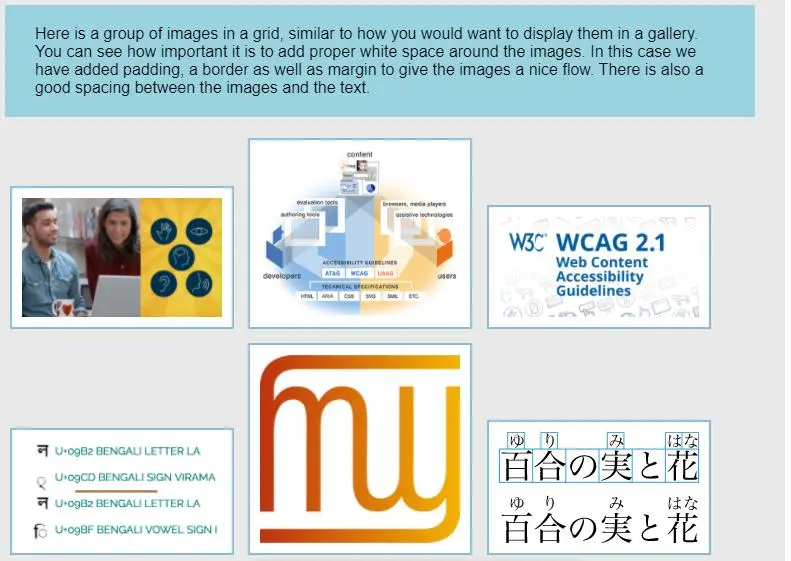
<!DOCTYPE html>
<!--It's a best practice to always declare DOCTYPE!-->
<html lang="en">
  <head>
    <meta charset="utf-8">
  </head>
  <body>
    <div id="images2">
      <p>
        Here is a group of images in a grid, similar to how you
        would want to display them in a gallery. You can see how
        important it is to add proper white space around the
        images.
        In this case we have added padding, a border as well as
        margin to give the images a nice flow. There is also a
        good spacing between the images and the text.
      </p>
      <img src="https://www.w3.org/comm/assets/graphics/
        w3cx-accessibility-intro.jpg"
        alt="man and woman looking at a computer screen" />
      <img src="https://www.w3.org/WAI/content-images/
        wai-std-gl-overview/specs.png"
        alt="illustration showing the WAI guidelines for the
        different components, detailed description at
        https://www.w3.org/WAI/intro/components-desc.html#guide" />
      <img src="https://www.w3.org/WAI/images/WCAG21/
        [email protected]"
        alt="WCAG 2.1" />
      <img src="https://www.w3.org/International/questions/
        qa-indic-graphemes-data/jhilli_codepoints.png"
        alt="Code points that make up the Bengali word 'jhilli'." />
      <img src="https://www.w3.org/International/
        logos/mlw-notext-500-white.png"
        alt="logo of the W3C Internationalization Activity" />
      <img src="https://www.w3.org/TR/2020/WD-simple-ruby-20200609/
        img/fig06.svg"
        alt="Example of horizontal ruby" />
    </div>
  </body>
</html>
div {
  margin-bottom: 50px;
}
#images2 {
  width: 750px;
  background-color: #E9E9E9;
  padding: 30px;
  font-family: Arial;
}
#images2 p {
  background-color: #99D3DF;
  padding: 20px 30px;
}
#images2 img {
  width: 200px;
  padding: 10px;
  border: 2px #88BBD6 solid;
  margin: 5px;
  background-color: white;
}
This design demonstrates the use of an image both as a background and as a link. When using images as design elements, it is best to use simple images to let your content still be easily consumable.
<!DOCTYPE html>
<!--It's a best practice to always declare DOCTYPE!-->
<html lang="en">
  <head>
    <meta charset="utf-8">
  </head>
  <body>
    <div id="images3">
      <p> Here is some body text that is now on top of an image
        because it is set as the background. When using an image as a
        background try to pick an image that is not overly busy, this
        can make your text or other images difficult to read when
        placed on top of.
      </p>
    <div id="navBox">
      <div id="clickHere"> <a href="https://www.w3.org">Click
        The Image</a> </div>
      <a href="www.w3.org">
      <img src="https://upload.wikimedia.org/wikipedia/
        commons/thumb/c/ce/Font_Awesome_
      5_solid_arrow-circle-right.svg/512px-Font_Awesome_5
        _solid_arrow-circle-right.svg.png"
      width="80" alt="A solid-weight icon from Font Awesome, a
        free web icon font" /></a>
      </div>
    </div>
  </body>
</html>
div {
  margin-bottom: 50px;
}
#images3 {
  background-image: url('https://upload.wikimedia.org/wikipedia/
    commons/4/45/Big_Cumulonimbus.JPG');
  background-repeat: no-repeat;
  height: 500px;
  width: 500px;
}
#images3 p, #clickHere {
  color: white;
  font-family: Tahoma;
  padding: 40px;
}
#navBox {
  width: 220px;
  margin-left: 30px;
}
#clickHere {
  float: right;
  padding: 30px 0px;
}
#clickHere a {
  color: white;
}
Forms can be a surprisingly tricky element to style because you are asking for a lot of interaction from your user, and the burden is on you as the designer to make it clear what exactly you are asking them to do. However, with a few simple design changes you can make it much easier for your user to navigate your form. Here are some key design elements to keep in mind when designing forms:
<!DOCTYPE html>
<!--It's a best practice to always declare DOCTYPE!-->
<html lang="en">
<head>
  <meta charset="utf-8">
</head>
<body>
  <div id="uglyForm">
    <form>
      <h1>Sign Up</h1>
      <input type="text" value="Given name" />
      <input type="text" value="Family name" />
      <input type="text" value="Email" />
      <button>Submit</button>
    </form>
  </div>
</body>
</html>
div {
  margin-bottom: 50px;
  height: 400px;
}
form {
  padding: 30px;
  width: 500px;
}
/* Bad Design */
#uglyForm input {
  border: 0px;
}
#uglyForm button {
  background-color: white;
  border: 0px;
}
You might never know it, but each of the 4 elements below the title are intended for the user to interact with. By stripping them of their styles you can see how important it is to add visual cues for your user.
The first form design uses basic layout to give each input element a clear label, space and area for input followed by a clear submit button. This design also used pseudo classes to engage the user, which you can see in action in the Code Pen below:
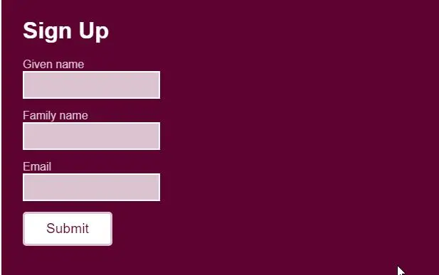
<!DOCTYPE html>
<!--It's a best practice to always declare DOCTYPE!-->
<html lang="en">
<head>
  <meta charset="utf-8">
</head>
<body>
  <div id="form1">
    <form>
      <h1>Sign Up</h1>
      Given name
      <br />
      <input type="text" />
      <br />
      Family name
      <br />
      <input type="text" />
      <br />
      Email
      <br />
      <input type="text" />
      <br />
      <button>Submit</button>
    </form>
  </div>
</body>
</html>
div {
  margin-bottom: 50px;
  height: 400px;
}
form {
  padding: 30px;
  width: 500px;
}
/* DESIGN 1 */
#form1 {
  background-color: #5E0231;
  font-family: Arial;
  color: #DBC3D0;
}
#form1 h1 {
  color: white;
  margin: 0px 0px 20px 0px;
}
#form1 input {
  background-color: #DBC3D0;
  border: 2px white solid;
  padding: 10px;
  margin-bottom: 15px;
}
#form1 input:hover, #form1 input:focus {
  border: 2px #DBC3D0 solid;
  background-color: white;
}
#form1 button {
  background-color: white;
  border: 3px #DBC3D0 solid;
  border-radius: 5px;
  color: #5E0231;
  padding: 10px 30px;
  font-size: 1.2em;
}
#form1 button:hover {
  background-color: #DBC3D0;
  color: white;
}
This form design is more minimalist, using the clear and consistent design and layout to help the user feel like the form is extra short.
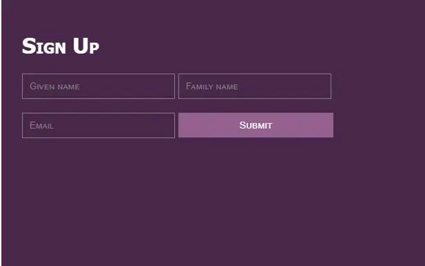
<!DOCTYPE html>
<!--It's a best practice to always declare DOCTYPE!-->
<html lang="en">
  <head>
    <meta charset="utf-8">
  </head>
  <body>
    <div id="form2">
      <form>
        <h1>Sign Up</h1>
        <input type="text" value="Given name" />
        <input type="text" value="Family name" />
        <br />
        <input type="text" value="Email" id="form2email" />
        <button>Submit</button>
      </form>
    </div>
  </body>
</html>
div {
  margin-bottom: 50px;
  height: 400px;
}
form {
  padding: 30px;
  width: 500px;
}
/* DESIGN 2 */
#form2 {
  background-color: #49274A;
  font-family: Tahoma;
  font-variant: small-caps;
}
#form2 h1 {
  color: white;
}
#form2 input {
  background-color: #49274A;
  border: 1px #828081 solid;
  padding: 10px;
  color: #828081;
  font-variant: small-caps;
  margin-bottom: 20px;
  width: 200px;
}
#form2 input:hover, #form1 input:focus {
  border: 1px #94618E solid;
  color: #94618E;
}
#form2 button {
  background-color: #94618E;
  border: 0px;
  color: white;
  font-size: 0.9em;
  padding: 10px 20px;
  font-variant: small-caps;
  width: 225px;
}
This form design leaves lots of white space to help it feel clean and simple.
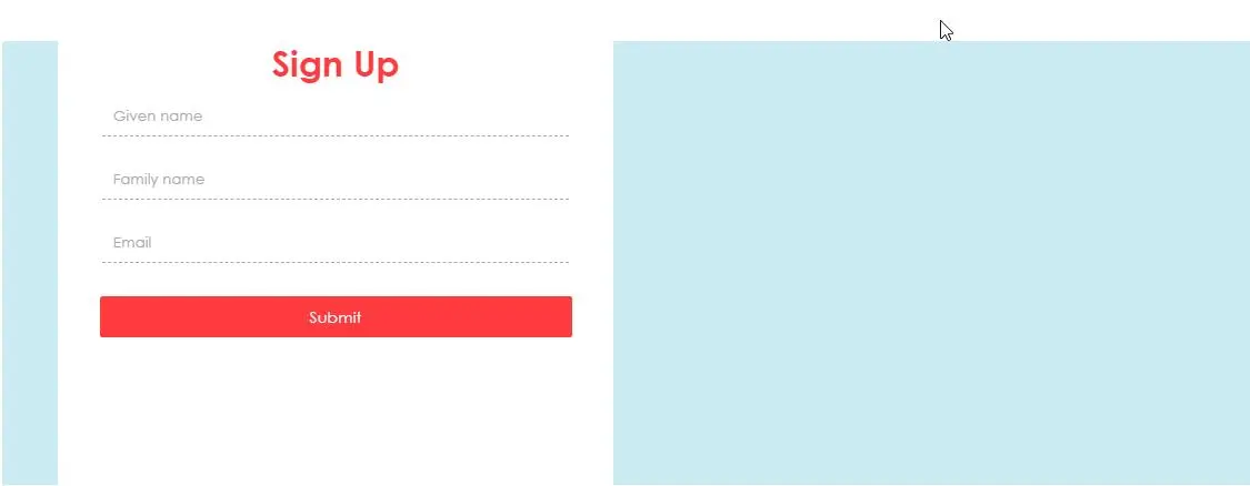
<!DOCTYPE html>
<!--It's a best practice to always declare DOCTYPE!-->
<html lang="en">
  <head>
    <meta charset="utf-8">
  </head>
  <body>
    <div id="form3">
      <div id="box">
        <h1>Sign Up</h1>
        <input type="text" value="Given name" />
        <input type="text" value="Family name" />
        <input type="text" value="Email" />
        <button>Submit</button>
      </div>
    </div>
  </body>
</html>
div {
  margin-bottom: 50px;
  height: 400px;
}
form {
  padding: 30px;
  width: 500px;
}
/* DESIGN 3 */
#form3 {
  background-color: #CAEBF2;
  font-family: 'Century Gothic';
}
#box{
  background-color: white;
  border-radius: 2px;
  margin: 50px;
  text-align: center;
  width: 500px;
}
#form3 h1 {
  color: #FF3B3F;
  text-align: center;
  margin: 0px;
}
#form3 input {
  border: 0px;
  border-bottom: 1px #A9A9A9 dashed;
  padding: 10px;
  color: #A9A9A9;
  width: 80%;
  margin: 10px;
  font-family: 'Century Gothic';
}
#form3 input:focus, #form3 input:hover {
  border: 1px #FF3B3F solid;
}
#form3 button {
  background-color: #FF3B3F;
  border: 0px;
  border-radius: 2px;
  color: white;
  font-size: 0.9em;
  padding: 10px 20px;
  margin: 20px;
  width: 85%;
font-family: 'Century Gothic';
}
The pen below is a recap of all forms presented in this page:
<!DOCTYPE html>
<!--It's a best practice to always declare DOCTYPE!-->
<html lang="en">
<head>
  <meta charset="utf-8">
</head>
<body>
  <div id="uglyForm">
    <form>
      <h1>Sign Up</h1>
      <input type="text" value="Given name" />
      <input type="text" value="Family name" />
      <input type="text" value="Email" />
      <button>Submit</button>
    </form>
  </div>
  <div id="form1">
    <form>
      <h1>Sign Up</h1>
        Given name
      <br />
      <input type="text" />
      <br />
        Family name
      <br />
      <input type="text" />
      <br />
        Email
      <br />
      <input type="text" />
      <br />
      <button>Submit</button>
    </form>
  </div>
  <div id="form2">
    <form>
      <h1>Sign Up</h1>
      <input type="text" value="Given name" />
      <input type="text" value="Family name" />
      <br />
      <input type="text" value="Email" id="form2email" />
      <button>Submit</button>
    </form>
  </div>
  <div id="form3">
    <div id="box">
      <h1>Sign Up</h1>
      <input type="text" value="Given name" />
      <input type="text" value="Family name" />
      <input type="text" value="Email" />
      <button>Submit</button>
    </div>
  </div>
</body>
</html>
div {
  margin-bottom: 50px;
  height: 400px;
}
form {
  padding: 30px;
  width: 500px;
}
/* Bad Design */
#uglyForm input {
  border: 0px;
}
#uglyForm button {
  background-color: white;
  border: 0px;
}
/* DESIGN 1 */
#form1 {
  background-color: #5E0231;
  font-family: Arial;
  color: #DBC3D0;
}
#form1 h1 {
  color: white;
  margin: 0px 0px 20px 0px;
}
#form1 input {
  background-color: #DBC3D0;
  border: 2px white solid;
  padding: 10px;
  margin-bottom: 15px;
}
#form1 input:hover, #form1 input:focus {
  border: 2px #DBC3D0 solid;
  background-color: white;
}
#form1 button {
  background-color: white;
  border: 3px #DBC3D0 solid;
  border-radius: 5px;
  color: #5E0231;
  padding: 10px 30px;
  font-size: 1.2em;
}
#form1 button:hover {
  background-color: #DBC3D0;
  color: white;
}
/* DESIGN 2 */
#form2 {
  background-color: #49274A;
  font-family: Tahoma;
  font-variant: small-caps;
}
#form2 h1 {
  color: white;
}
#form2 input {
  background-color: #49274A;
  border: 1px #828081 solid;
  padding: 10px;
  color: #828081;
  font-variant: small-caps;
  margin-bottom: 20px;
  width: 200px;
}
#form2 input:hover, #form1 input:focus {
  border: 1px #94618E solid;
  color: #94618E;
}
#form2 button {
  background-color: #94618E;
  border: 0px;
  color: white;
  font-size: 0.9em;
  padding: 10px 20px;
  font-variant: small-caps;
width: 225px;
}
/* DESIGN 3 */
#form3 {
  background-color: #CAEBF2;
  font-family: 'Century Gothic';
}
#box{
  ackground-color: white;
  border-radius: 2px;
  margin: 50px;
  text-align: center;
  width: 500px;
}
#form3 h1 {
  color: #FF3B3F;
  text-align: center;
  margin: 0px;
}
#form3 input {
  border: 0px;
  border-bottom: 1px #A9A9A9 dashed;
  padding: 10px;
  color: #A9A9A9;
  width: 80%;
  margin: 10px;
  font-family: 'Century Gothic';
}
#form3 input:focus, #form3 input:hover {
  border: 1px #FF3B3F solid;
}
#form3 button {
  background-color: #FF3B3F;
  border: 0px;
  border-radius: 2px;
  color: white;
  font-size: 0.9em;
  padding: 10px 20px;
  margin: 20px;
  width: 85%;
  font-family: 'Century Gothic';
}
Now that you have a host of new selectors available, you can style much more complicated HTML. Take your "about me page" from Module 2, and add to it so that it becomes more of a "profile". Your page must have the following elements:
Once you have all these elements, style them to look nice, but you must have each of the following:
For reference here is what my solution looks like:
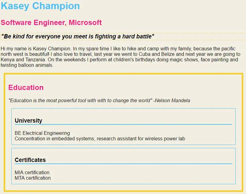
The Box Model is a way for us to distinguish the areas surrounding an HTML element and directly control each of their white space and HTML element is to be considered, to be contained within a box with four sides.
The areas around this box are separated into three types:
The Padding sits between the HTML element and the Border.
The Border sits between the Padding and Margin. You can control The Borders color weight and style.
The Margin sits between The Border and the rest of the page. But be careful when two Margins meet the bigger one wins.
The Box Model is how Web browsers see individual HTML elements. When laying out a document, the browser's rendering engine represents each element as a rectangular box according to the standard CSS basic box model. CSS determines the size, position, and properties (color, background, border size, etc.) of these boxes.
We discussed how to adjust the white space of these areas in Module 2.5, but in this module we will be discussing these areas as a method to position elements on a page.
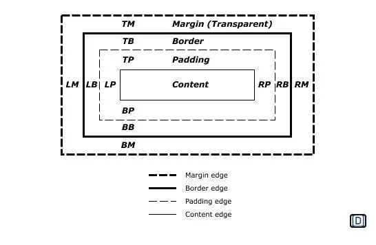
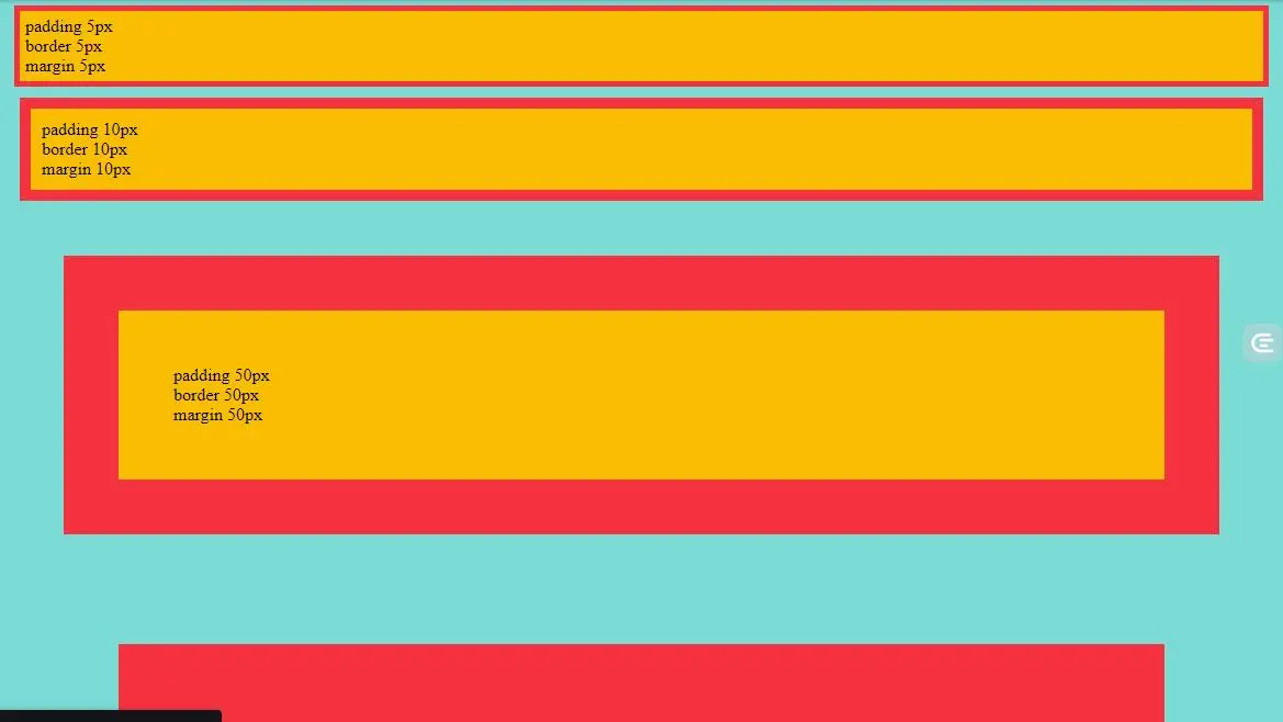
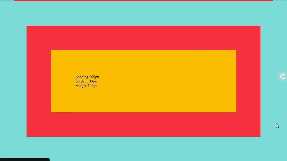
<!DOCTYPE html>
<!--It's a best practice to always declare DOCTYPE!-->
<html lang="en">
<head>
  <meta charset="utf-8">
</head>
<body>
  <p id="five">
    padding 5px <br />
    border 5px <br />
    margin 5px <br />
  </p>
  <p id="ten">
    padding 10px <br />
    border 10px <br />
    margin 10px <br />
  </p>
  <p id="fifty">
    padding 50px <br />
    border 50px <br />
    margin 50px <br />
  </p>
  <p id="oneHundred">
    padding 100px <br />
    border 100px <br />
    margin 100px <br />
  </p>
</body>
</html>
body {
  background-color: #7CDBD5;
}
p {
  background-color: #F9BE02;
}
#five {
  padding: 5px;
  border: 5px #F53240 solid;
  margin: 5px;
}
#ten {
  padding: 10px;
  border: 10px #F53240 solid;
margin: 10px;
}
#fifty {
  padding: 50px;
  border: 50px #F53240 solid;
  margin: 50px;
}
#oneHundred {
  padding: 100px;
  border: 100px #F53240 solid;
  margin: 100px;
}
One of the simplest ways to align content is to use the direct text-align property. This can help you set the alignment of text or inline content within the context of their containing HTML element.
h1 {
  text-align: center;
}
If you have used a text editor before, like Microsoft Word, you've probably used the different text-align properties: left (default for English), right, center and justify. Text-align in CSS works the same way. Left, center and right specify how the lines of text within the text block are arranged. Justify sets the left and right edges of the text flush with the container's edges, which stretches the white space between words so that the overall block fits in a perfect rectangle.
See below for examples of what each of these values will do to your text:
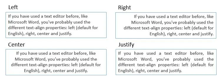
Note that this property can only apply to block elements like paragraphs, divs and headers.
h1 {
  line-height: 1.2;
}
You may have noticed that the text-align property sets the content's alignment horizontally, but it leaves its vertical alignment unchanged. Text lives within a specified vertical space, in which the text is drawn by default in the middle of that vertical space.
If you change the height of the containing HTML block, the text will remain at the top of the block. However, if you instead use the "line-height" property, then the block will grow and the text will vertically center within it.
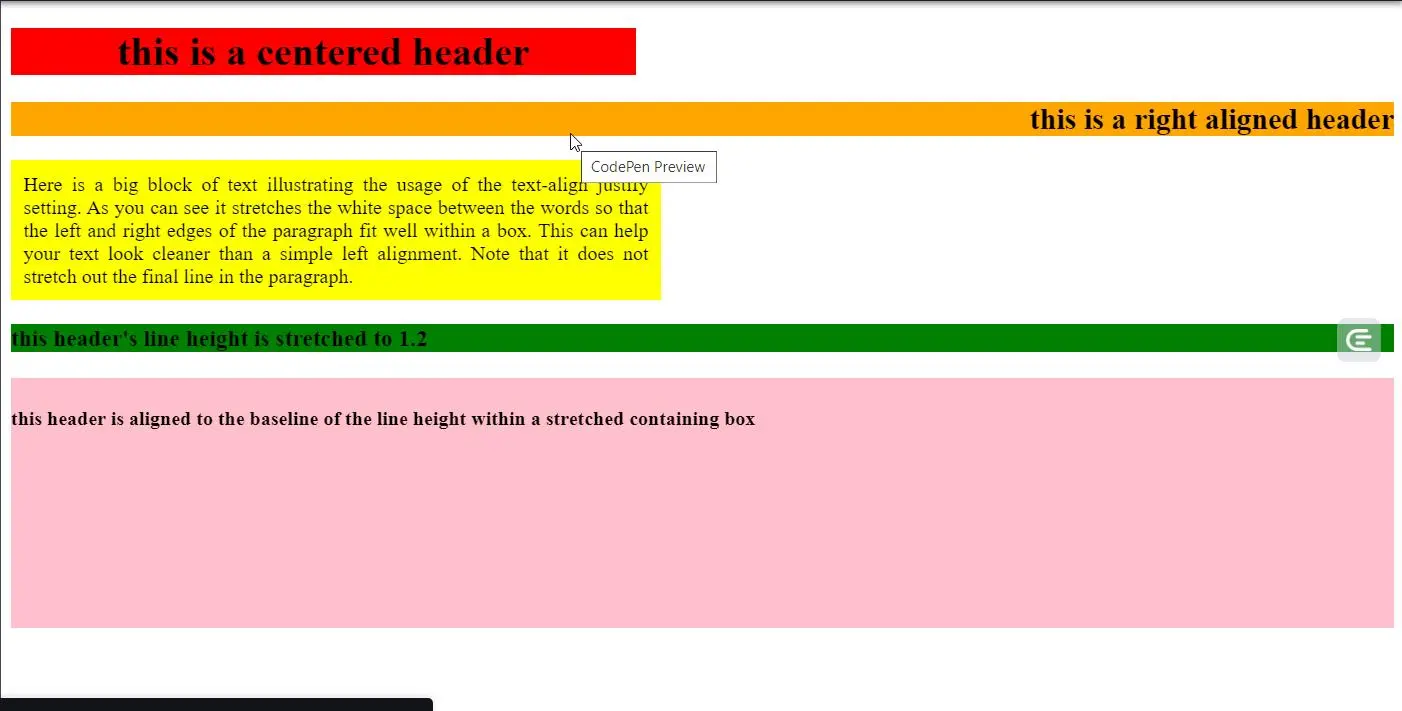
<!DOCTYPE html>
<!--It's a best practice to always declare DOCTYPE!-->
<html lang="en">
  <head>
    <title>Aligning text </title>
    <meta charset="utf-8">
  </head>
  <body>
    <h1>this is a centered header</h1>
    <h2>this is a right aligned header</h2>
    <p>
      Here is a big block of text illustrating the usage of the
      text-align justify setting. As you can see it stretches
      the white space between the words so that the left and
      right edges of the paragraph fit well within a box.
      This can help your text look cleaner than a simple left
      alignment. Note that it does not stretch out the final
      line in the paragraph.
    </p>
    <h3>this header's line height is stretched to 1.2</h3>
    <h4>this header is aligned to the baseline of the line
    height within a stretched containing box</h4>
  </body>
</html>
h1 {
  background-color: red;
  width: 500px;
  text-align: center;
}
h2 {
  background-color: orange;
  text-align: right;
}
p {
  background-color: yellow;
  width: 500px;
  padding: 10px;
  text-align: justify;
}
h3 {
  background-color: green;
  line-height: 1.2;
}
h4 {
  background-color: pink;
  height: 200px;
  line-height:4;
}
Please do not use text-align indiscriminately. If there's a possibility that your site will need to be translated into a language that uses the Arabic, Hebrew, or Thaana scripts (which read from right to left), it creates difficulties to have to change all the right values to left and vice versa.
Most, but not yet all, major browsers support the values start and end. The start value aligns text with the side of the line where you start reading, whether that's on the left for English or the right for Urdu. They also make more sense for use with vertical text, such as for Japanese and Mongolian. Once these values are widely supported by browsers, they will often be a better choice than right and left, since there's no need to change the values for pages as the language changes.
Also, note that CSS will in the future provide better support for justification in languages where words are not separated by spaces, such as Chinese and Thai, or languages where words are separated by special marks, such as in Amharic. Check more information about different approaches to justification.
Once you finish this course, look out for these and other international features of CSS as you explore its features further.
Until now we've let the browser decide how big the element is, but you can actually adjust its width and height manually.
[Documentation: the width property and the height property]
p {
  width: 30%;
}
You can use pixel values for both width and height, but you'll most often want to use percentages to set these so that your elements grow and shrink as appropriate based on the screen size.
For example, if we set the width of a paragraph to 30% as you resize the browser window, you'll see how that element dynamically resizes. That's because when you use percentages, the size is computed based on the element's "containing block", or the element that contains the one you're styling. If your element is just within the body tag, the width is computed based on the relationship with the screen width.
Things are a bit more complicated with using a percentage to set an element's height. This is because typically the body's height is not specified, so if you use a percentage the size won't adjust.
min-width, max-width, min-height, max-height
[Documentation: max and min width and max and min height]
Setting width and height with percentages will save you work because your design will automatically optimize for the user's screen size. However, some elements can't grow and shrink as dynamically as text can.
For example, images will get "pixelated" if you let them grow too large, and they can look really distorted. Thankfully, you can set max and min width and heights. This way, you can set a range for your image to grow and shrink where you know it will still look good.
img {
  width: 100%;
  max-width: 1024px;
}
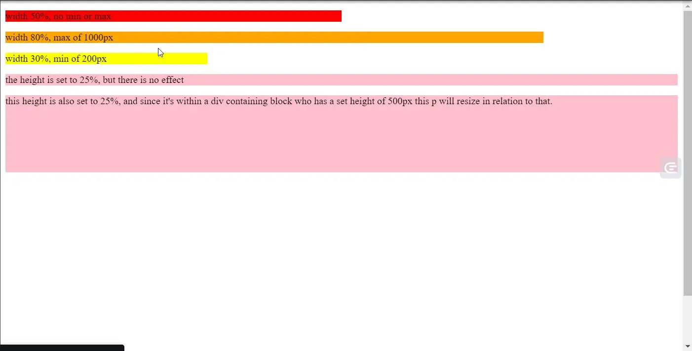
<!DOCTYPE html>
<!--It's a best practice to always declare DOCTYPE!-->
<html lang="en">
  <head>
    <title>Dynamic width and height</title>
    <meta charset="utf-8">
  </head>
  <body>
    <p id="width50"
      >width 50%, no min or max
    </p>
    <p id="width80max"
      >width 80%, max of 1000px
    </p>
    <p id="width30min"
        >width 30%, min of 200px
    </p>
    <p class="heightSet">
      the height is set to 25%, but there is no effect
    </p>
    <div id="containingBlock">
      <p class="heightSet">
        this height is also set to 25%, and since it's within a
    div containing block who has a set height of 500px this p will
    resize in relation to that.
      </p>
    </div>
  </body>
</html>
#width50 {
  background-color:red;
  width: 50%;
}
#width80max {
  background-color: orange;
  width: 80%;
  max-width: 1000px;
}
#width30min {
  background-color: yellow;
  width: 30%;
  min-width: 200px;
}
.heightSet {
  background-color: pink;
  height: 25%;
}
#containingBlock {
  height: 500px;
}
When you view the above example, the paragraphs will dynamically resize based on the size of your window. Please view the code first in a wide window, and then in a much narrower window.
You will note that the elements have resized accordingly, but have hit the limits of their min and max constraints. This is why using percentages for width and height are so important, it helps you write code that works for all screen sizes.
Whenever possible, it is ideal to position your elements by adjusting their padding and margins. Sometimes this isn't enough to get the element exactly where you'd like it to be, so to achieve this we'll learn more tools later in this module. Regardless, you'll almost always want some padding and margin around your element so it's best to adjust these before progressing onto more complicated positioning methods.
Once you have set the width for your element, you can then set margins as a way to position your element relative to others. One of the most commonly used margin settings is "auto". That is because if you set an element's left and right margin to auto it will be dynamically centered within its containing block.
div {
  width: 50%;
  margin-left: auto;
  margin-right: auto;
}
Note however, that this only works for block HTML elements like paragraphs, divs and headers. If you want to use this to position an inline element, such as img or a, you will need to tell CSS to treat them as block elements by setting display: block;
img {
  display: block;
  width: 200px;
  margin-left: auto;
  margin-right: auto;
}
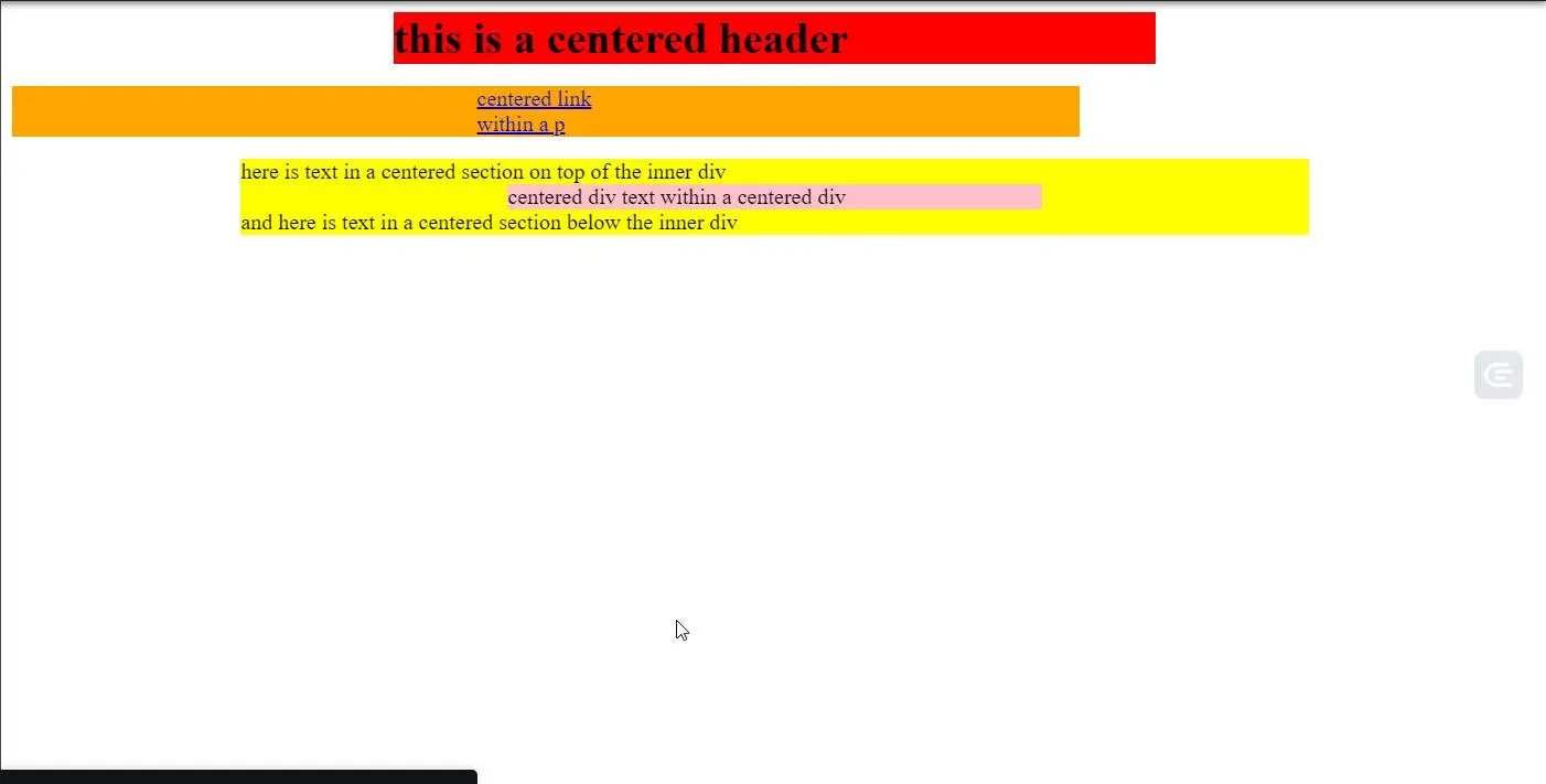
<!DOCTYPE html>
<!--It's a best practice to always declare DOCTYPE!-->
<html lang="en">
   <head>
      <meta charset="utf-8">
   </head>
   <body>
      <h1>this is a centered header</h1>
      <p>
         <a href="www.microsoft.com">centered link within a p</a>
      </p>
      <section>
         here is text in a centered section on top of the inner div
      <div>
         centered div text within a centered div
      </div>
         and here is text in a centered section below the inner div
      </section>
   </body>
</html>
h1 {
  background-color: red;
  width: 50%;
  margin: 0 auto;
}
p {
  background-color: orange;
  width: 70%;
}
a {
  display: block;
  width: 100px;
  margin: 0 auto;
}
section {
  background-color: yellow;
  width: 70%;
  margin: 0 auto;
}
div {
  background-color: pink;
  width: 50%;
  margin: 0 auto;
}
Here is what the above code looks like in a wide window:

Now, if you resize the window, the elements remain centered no matter what. Here is the above code in a narrow window:
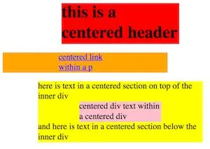
For this activity, you are going to practice some of the basic alignment properties you've learned in this unit.
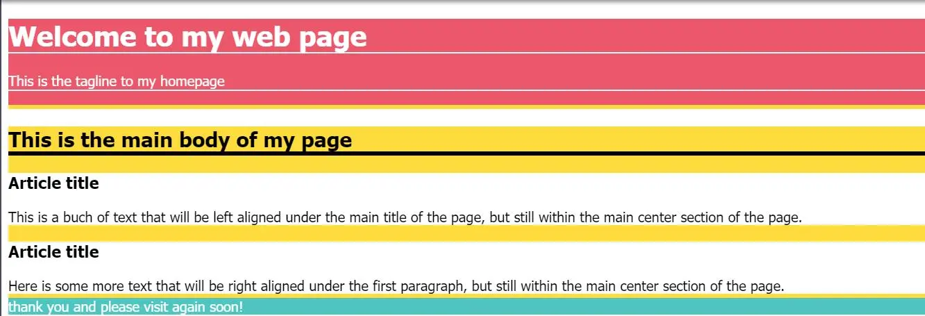
<!DOCTYPE html>
<!--It's a best practice to always declare DOCTYPE!-->
<html lang="en">
   <head>
      <title>Practice with Alignment</title>
      <meta charset="utf-8">
   </head>
   <body>
      <header>
         <h1>Welcome to my web page</h1>
         <p>
            This is the tagline to my homepage
         </p>
      </header>
      <section>
         <h2>This is the main body of my page</h2>
         <article id="leftP">
            <h3>Article title</h3>
            This is a bunch of text that will be left aligned under
            the main title of the page, but still within the main
            center section of the page.
         </article>
         <article id="rightP">
            <h3>Article title</h3>
               Here is some more text that will be right aligned
               under the first paragraph, but still within the
               main center section of the page.
         </article>
      </section>
      <footer>
         thank you and please visit again soon!
      </footer>
   </body>
</html>
body {
  font-family: Tahoma;
}
header {
  background-color: #EC576B;
  color: white;
  border-bottom: 5px #FEDC3D solid;
}
header h1 {
  border-bottom: 2px #FFFFFF solid;
}
header p {
  border-bottom: 2px #FFFFFF solid;
}
section {
  background-color: #FEDC3D;
}
h2 {
  border-bottom: 5px #000000 solid;
}
article {
  background-color: #FFFFFF;
}
#leftP {
}
#rightP {
}
h3 {
}
footer {
  background-color: #4EC5C1;
  border-top: 5px #FEDC3D solid;
  color: white;
}
The resulted HTML and CSS codes produce a Web page where elements are not very well aligned. Your goal is to add properties to the existing CSS rules so that the final page looks like this:
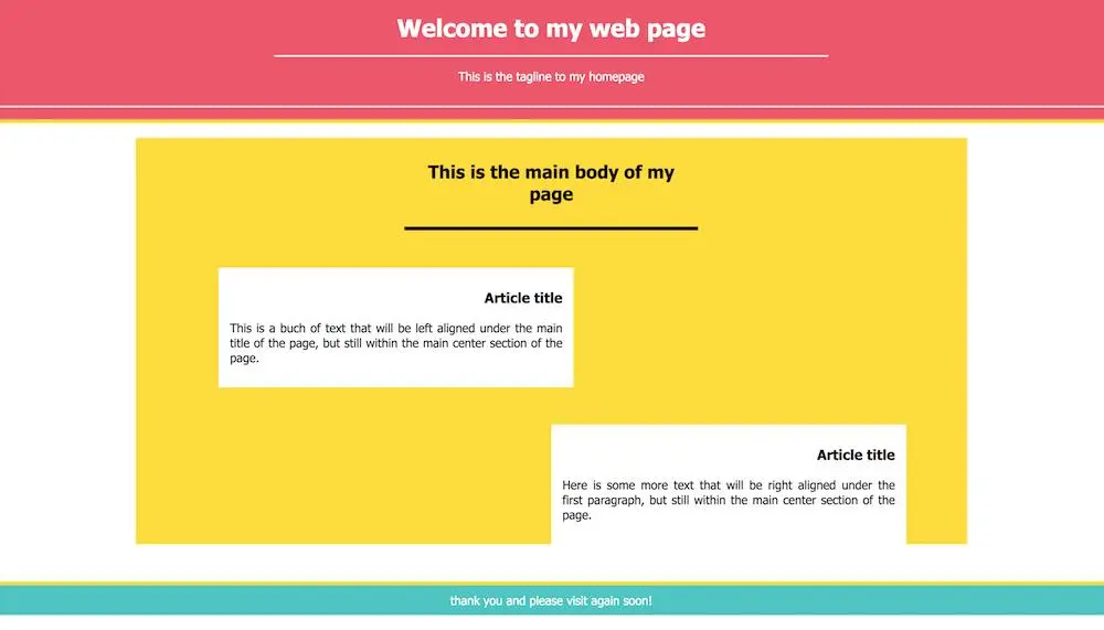
After when you look at other Web pages, you'll see multiple HTML elements sitting side-by-side. When you look at our Web pages, there's only one element per horizontal space. That's because by default, CSS will place your HTML elements one after another on a vertical line.
But how do you save all your space and prevent your user from scrolling endlessly? The ‘Float property’. The float property liberates your elements so they can share horizontal space and you can make the best use of the whole width of your window. Now you too can condense your content and save your user from endless scrolling.
If your elements are still not exactly where you want them to be after adjusting the padding, margins and alignment, then you can try out the float property. The "float" property is one of the most powerful tools you can master when learning CSS.
h1 {
  width: 20em;
  float: right;
}
Up until now, we haven't moved elements very far from wherever the web browser automatically places them, but as you've probably noticed this has left our page very left side heavy. This is because, by default, elements are stacked one on top of the other, and they don't share horizontal space. With the float property, we can change this.
The float property liberates an element from its automatic position and lifts it up to "float" on top of other elements in the direction you specify. You can specify float either right, left or the default of none.
Elements underneath a floating object will automatically wrap themselves around the content. For example, if you float an image, the text underneath will wrap around it so that none of it is actually obscured underneath the image, but now both text and an image can share horizontal space.
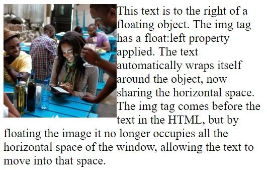
You'll often want to set the width of a floating object so that you have tighter control over the space that object occupies. Remember that, by default, block HTML elements occupy the entire width of the page, even if there isn't actual content that extends that far. In this case, you'll want to set the width so that your element's size more accurately represents its content and you don't have unnecessary white space.
Once you have some elements floating things can get a little messy. Its easy for floating objects to overlap, and to prevent this you can use the "clear" property.
p {
  clear: both;
}
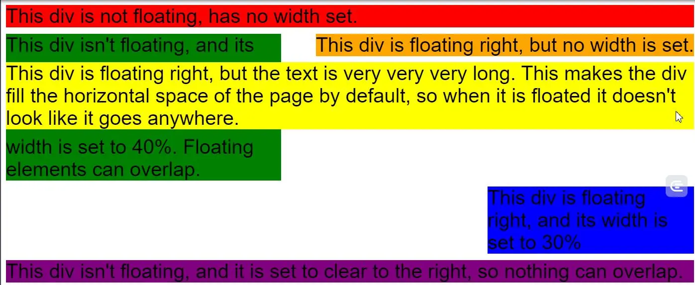
<!DOCTYPE html>
<!--It's a best practice to always declare DOCTYPE!-->
<html lang="en">
  <head>
    <title>Floating elements</title>
    <meta charset="utf-8">
  </head>
  <body>
    <div id="default">
      This div is not floating, has no width set.
    </div>
    <div id="floatRightNoWidth">
      This div is floating right, but no width is set.
    </div>
    <div id="floatRightTooWide">
      This div is floating right, but the text is very very
      very long.
      This makes the div fill the horizontal space of the page
      by default,
      so when it is floated it doesn't look like it goes anywhere.
    </div>
    <div id="noFloatWidthSet">
      This div isn't floating, and its width is set to 40%.
      Floating elements can overlap.
    </div>
    <div id="floatRightWidthSet">
      This div is floating right, and its width is set to 30%
    </div>
    <div id="noFloatClearRight">
      This div isn't floating, and it is set to clear to the right,
      so nothing can overlap.
    </div>
  </body>
</html>
body {
  font-size: 24pt;
  font-family: helvetica, sans-serif;
}
div {
  margin-bottom: 10px;
}
#default {
  background-color: red;
}
#floatRightNoWidth {
  background-color: orange;
  float: right;
}
#floatRightTooWide {
  background-color: yellow;
  float: right;
}
#noFloatWidthSet {
  background-color: green;
  width: 40%;
}
#noFloatClearRight {
  background-color: purple;
  clear: right;
}
#floatRightWidthSet {
  background-color: blue;
  width: 30%;
  float: right;
}
One of the toughest parts of layouts with CSS is figuring out which elements to apply a float property to.
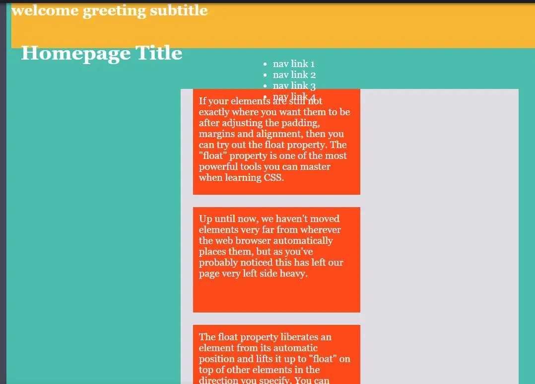
<!DOCTYPE html>
<!--It's a best practice to always declare DOCTYPE!-->
<html lang="en">
  <head>
    <title>Practice with Float</title>
    <meta charset="utf-8">
  </head>
  <body>
    <header>
      <h2>welcome greeting subtitle</h2>
      <h1>Homepage Title</h1>
    </header>
    <section id="navigation">
      <ul>
         <li>nav link 1</li>
         <li>nav link 2</li>
         <li>nav link 3</li>
         <li>nav link 4</li>
      </ul>
    </section>
    <section id="content">
      <div id="topRight">
        If your elements are still not exactly where you want them
        to be after adjusting the padding, margins and alignment,
        then you can try out the float property. The "float"
        property is one of the most powerful tools you can master
        when learning CSS.
      </div>
      <div id="topLeft">
        Up until now, we haven't moved elements very far from
        wherever the web browser automatically places them,
        but as you've probably noticed this has left our page
        very left side heavy.
      </div>
      <div id="bottomRight">
        The float property liberates an element from its automatic
        position and lifts it up to "float" on top of
        other elements in the direction you specify. You can
        specify float either right, left or the default of none.
      </div>
      <div id="bottomLeft">
        Elements underneath a floating object will automatically
        wrap themselves around the content. For example, if you
        float an image, the text underneath will wrap around it
        so that none of it is actually obscured underneath the
        image.
      </div>
    </section>
  </body>
</html>
body {
  background-color: #4ABDAC;
  color: #FFFFFF;
  font-family: Georgia, serif;
}
header {
  background-color: #F7B733;
  height: 75px;
}
h1 {
  padding: 15px;
}
#navigation {
  height: 30px;
  width: 30%;
  margin-left: auto;
  margin-right: auto;
}
#navigation li:hover {
  border-bottom: 1px #FC4A1A solid;
}
#content {
  background-color: #DFDCE3;
  width: 50%;
  margin: 0 auto;
}
div {
  background-color: #FC4A1A;
  width: 250px;
  height: 150px;
  padding: 10px;
  margin: 20px;
}
As you can see the layout is pretty messy. Your job in this activity is to decide which elements deserve a float property (such as the navigation!). The main focus of the task is about understanding floats, but as before, try to ensure your page also works well when the window is resized.
You might also need to adjust some widths, margins and paddings to get everything looking like the final image below:
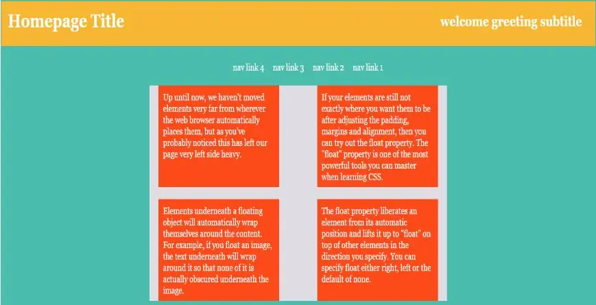
HINT: Pay close attention to the IDs applied to the HTML elements
<!DOCTYPE html>
<!--It's a best practice to always declare DOCTYPE!-->
<html lang="en">
  <head>
    <title>Practice with Float</title>
    <meta charset="utf-8">
  </head>
  <body>
    <header>
      <h2>welcome greeting subtitle</h2>
      <h1>Homepage Title</h1>
    </header>
    <section id="navigation">
      <ul>
        <li>nav link 1</li>
        <li>nav link 2</li>
        <li>nav link 3</li>
        <li>nav link 4</li>
      </ul>
    </section>
    <section id="content">
      <div id="topRight">
        If your elements are still not exactly where you want them
        to be after adjusting the padding, margins and alignment,
        then you can try out the float property. The "float"
        property is one of the most powerful tools you can master
        when learning CSS.
      </div>
      <div id="topLeft">
        Up until now, we haven't moved elements very far from
        wherever the web browser automatically places them, but as
        you've probably noticed this has left our page very
        left side heavy.
      </div>
      <div id="bottomRight">
        The float property liberates an element from its automatic
        position and lifts it up to "float" on top of
        other elements in the direction you specify. You can
        pecify float either right, left or the default of none.
      </div>
      <div id="bottomLeft">
        Elements underneath a floating object will automatically
        wrap themselves around the content. For example, if you
        float an image, the text underneath will wrap around it
        so that none of it is actually obscured underneath the
        image.
      </div>
    </section>
  </body>
</html>
body {
  background-color: #4ABDAC;
  color: #FFFFFF;
  font-family: Georgia, serif;
  margin: 0px;
  padding-bottom: 0px;
}
header {
  background-color: #F7B733;
  height: 75px;
  margin-top: 0px
}
h2 {
  float: right;
  padding-right: 20px;
}
h1 {
  padding: 20px;
  margin-top: 0px;
}
#navigation {
  height: 50px;
  width: 92%;
}
#navigation li:hover {
  border-bottom: 1px #FC4A1A solid;
}
ul {
  width: 400px;
  margin-left: auto;
  margin-right: auto;
  list-style: none;
}
li {
float: right;
  margin-top: 10px;
  margin-left: 20px;
}
content {
  background-color: #DFDCE3;
  width: 20%;
  margin: 0 auto;
  min-width: 700px;
}
div {
  background-color: #FC4A1A;
  width: 250px;
  height: 150px;
  padding: 10px;
  margin: 20px;
}
#topRight {
  float: right;
  margin-top: 0px;
}
#bottomRight {
  float: right;
  margin-top: 0px;
  margin-bottom: 0px;
}
#topLeft {
  margin-top: 0px;
}
#bottomLeft {
  margin-bottom: 0px;
}
Up and till now, you've probably noticed that all the Web sites you've been making: a lot of content on the left and a lot of white space on the right. This is because we've allowed all of your HTML elements to stay in their default positions.
However, when you look at Web sites out in the world, a lot of them are much better balanced. This is because those designers are controlling the relationship of the elements to each other and to the browser window. You too can place your elements using only six properties: top, right, bottom, left, width and height.
By designing the positioning of your Web site through the relationship of HTML elements to each other and to the browser window, as the browser window shrinks and grows, your layout maintains its shape. The "position" property sets the algorithm for how the Web browser will compute the way the HTML elements are placed on the page.
There are four different value options for the position property:
div {
  position: relative;
}
[ Documentation for the box offsets: 'top', 'right', 'bottom', 'left']
Once you've set the position to "relative" that frees you up to set the top, right, bottom and left properties-otherwise known as the "box offsets". These properties specify the distance between this object and its normal static position and the corner of the box that we are specifying.
For example, if we set the "left" to be "30px", it will move the element 30px to the right away from the left of where it was placed by default.
p {
  position: relative;
  left: 10px;
}
Note that position is not an inherited property so you will have to apply it individually to each element. Because of this it is best to use this approach to designing your layout sparingly and should only be used after you cannot achieve your desired layout with alignment or floating.
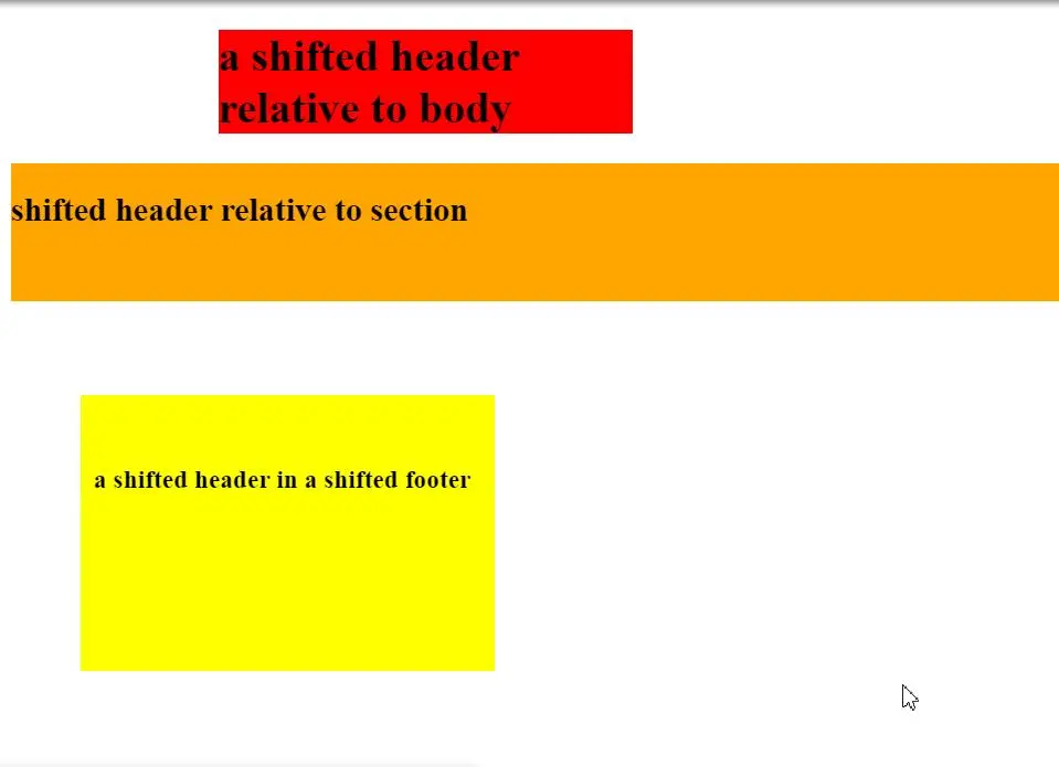
<!DOCTYPE html>
<!--It's a best practice to always declare DOCTYPE!-->
<html lang="en">
  <head>
    <title>Relative Positioning</title>
    <meta charset="utf-8">
  </head>
  <body>
    <h1>a shifted header relative to body</h1>
    <section>
      <h2>shifted header relative to section</h2>
    </section>
    <footer>
      <h3>a shifted header in a shifted footer</h3>
    </footer>
  </body>
</html>
h1 {
  background-color: red;
  width: 300px;
  position: relative;
  left: 150px;
}
section {
  background-color: orange;
  height: 100px;
}
h2 {
  position: relative;
  top: 20px;
}
footer {
  background-color: yellow;
  height: 200px;
  width: 300px;
  position: relative;
  left: 50px;
  top: 50px;
}
h3 {
  position: relative;
  top: 50px;
  left: 10px;
}
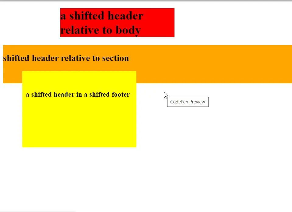
Note that relative positioning can make elements overlap - check the following CSS code as a second example:
h1 {
  background-color: red;
  width: 300px;
  position: relative;
  left: 150px;
}
section {
  background-color: orange;
  height: 100px;
}
h2 {
  position: relative;
  top: 20px;
}
footer {
  background-color: yellow;
  height: 200px;
  width: 300px;
  position: relative;
  left: 50px;
  top: -50px;
}
h3 {
  position: relative;
  top: 50px;
  left: 10px;
}
For this activity, we are going to focus on using relative positioning to adjust how items sit on the page.
Here is CodePen with some HTML and CSS:
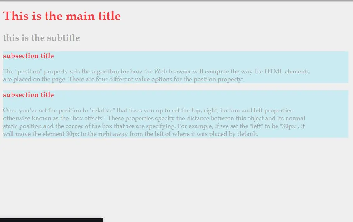
body {
  background-color: #EFEFEF;
  color: #A9A9A9;
  font-family: "Book Antiqua", serif;
}
h1 {
  color: #FF3B3F;
}
h2 {
}
div {
  background-color: #CAEBF2;
  width: 80%;
}
h3 {
  color: #FF3B3F;
}
p {
  width: 90%;
}
Your task is to add CSS so that you achieve this final layout:

You can do this with padding and margins, but limit yourself to only add position, top and left properties. Try resizing your browser window, and if you've implemented everything correctly all the elements will stay in the same position relative to one another.
body {
  background-color: #EFEFEF;
  color: #A9A9A9;
  font-family: "Book Antiqua", serif;
  width: 950px
}
h1 {
  color: #FF3B3F;
  height: 25px
}
h2 {
  postiion: relative;
  margin-left: 45px;
  height: 25px
}
div {
  background-color: #CAEBF2;
  width: 80%;
  position: relative;
  left: 80px
}
h3 {
  color: #FF3B3F;
  padding-left: 10px;
}
p {
  width: 90%;
  padding-left: 25px;
}
One of the most important aspects of any Web site is the navigation menu. Over time, top level navigation has become fairly standardized so your user will be looking for some key elements that help them find their way around your site:
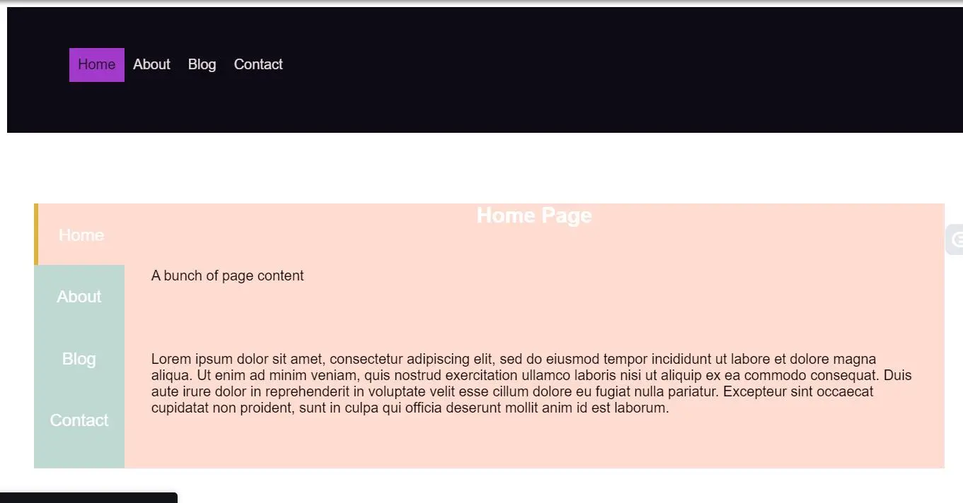

This is a very basic menu design. It floats the list elements to the left and gives them each a simple hover property (underline) and a new background color for the link representing the page you are currently viewing.
div {
  clear: both;
  margin-bottom: 50px;
  padding: 30px;
  font-family: Arial;
}
ul {
  list-style: none;
  height: 50px;
}
a {
  text-decoration: none;
}
#menu1 {
  background-color: #0E0B16;
}
#menu1 a {
  color: #E7DFDD;
}
#menu1 li {
  padding: 10px;
  float: left;
}
#menu1 a:hover {
  border-bottom: 2px #A239CA solid;
}
#menu1 .currentPage {
  background-color: #A239CA;
}
#menu1 .currentPage a {
  color: #0E0B16;
}
This menu design uses a vertical arrangement but still floats the overall menu object so it can sit level with your content. You can also see a tabbed format here where the page you are currently viewing directly connects to the menu item representing it.
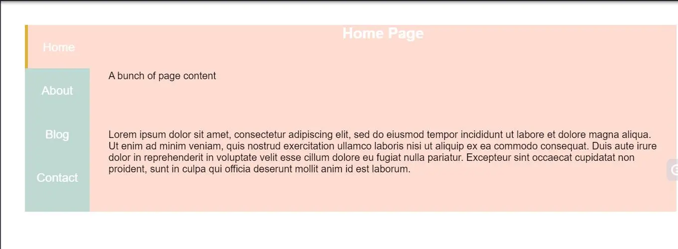
div {
  clear: both;
  margin-bottom: 50px;
  padding: 30px;
  font-family: Arial;
}
ul {
  list-style: none;
  height: 50px;
}
a {
  text-decoration: none;
}
#menu2 ul {
  width: 10%;
  height: 300px;
  background-color: #BFD8D2;
  margin: 0px;
  text-align: center;
  padding: 0px;
  float: left;
}
#menu2 a {
  color: #FFFFFF;
}
#menu2 li {
  height: 15%;
  padding-top: 25px;
}
#menu2 li:hover {
  background-color: #FEDCD2;
  border-left: 5px #DCB239 solid;
}
#menu2 li a {
  font-size: 1.2em;
}
#menu2 .currentPage {
  background-color: #FEDCD2;
  border-left: 5px #DCB239 solid;
}
#menu2 section {
  background-color: #FEDCD2;
  margin-left: 10%;
  height: 300px;
}
#menu2 h1 {
  margin: 0px;
  color: #FFFFFF;
  text-align: center;
}
#menu2 p {
  padding: 30px;
}
<!DOCTYPE html>
<!--It's a best practice to always declare DOCTYPE!-->
<html lang="en">
  <head>
    <title>Style studies: menu 2</title>
    <meta charset="utf-8">
  </head>
  <body>
    <div id="menu2">
      <ul>
        <li class="currentPage"><a href="">Home</a></li>
        <li><a href="">About</a></li>
        <li><a href="">Blog</a></li>
        <li><a href="">Contact</a></li>
      </ul>
      <section>
        <h1>Home Page</h1>
        <p>A bunch of page content </p>
        <p>Thi is a page of information within a section.
        Was in latin.  I don't know latin so I'm winging it with
        this bullshit. I had a similar issue with my 2011 Ford
        Fusion. With help from forums all over, the issue was
        narrowed down to 1. Blend Door Actuator 2. EVAP Temp
        Sensor 3. HVAC Control Module. Since the blend door
        was the easiest to get to, I replaced it first but it
        did not resolve the issue. I was able to get OHP Ford
        ELMconfig USB device from Amazon for about $30 and
        using Forscan software on a laptop I was able to rule
        out the evap sensor. I did not want to spend over $200
        for a HVAC control module and was able to buy used on
        ebay for $30. Replaced it last night and my a/c
        has worked perfect since. Hope this helps.
        </p>
      </section>
    </div>
  </body>
</html>
This third design employs hover as a way to expose secondary links. This lets you leave the top level clean and simple but gives the user the power of more specific options when they interact with your header.
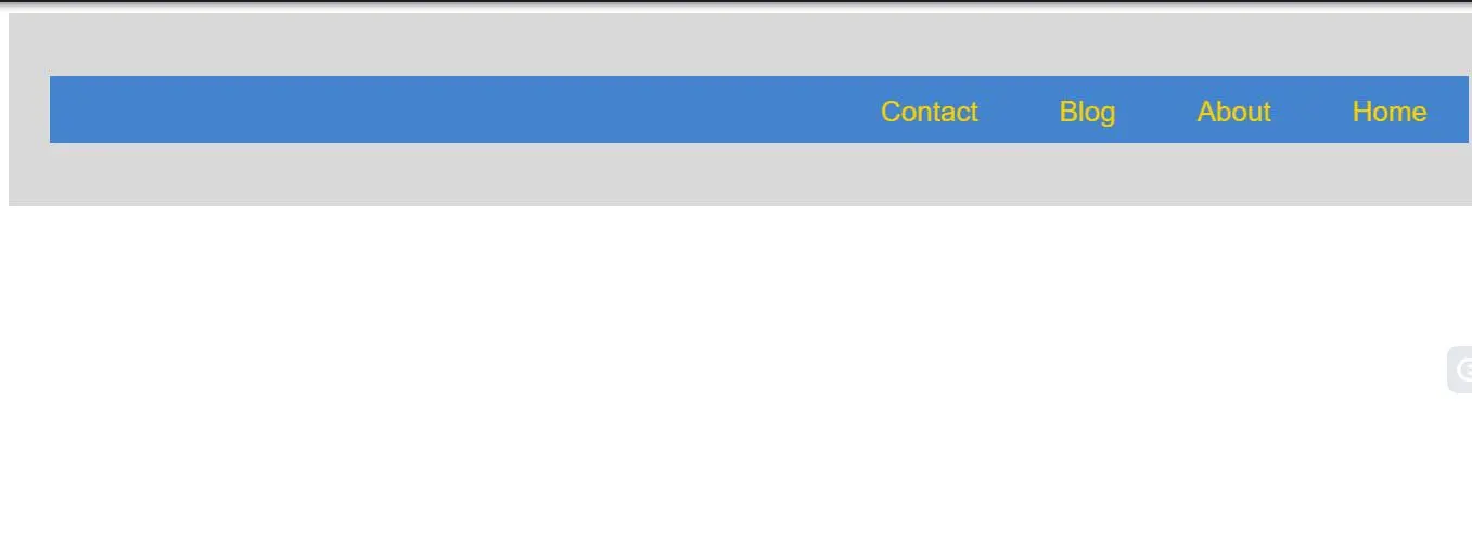
div {
  clear: both;
  margin-bottom: 50px;
  padding: 30px;
  font-family: Arial;
}
ul {
  list-style: none;
  height: 50px;
}
a {
  text-decoration: none;
}
#menu3 {
  background-color: #D9D9D9;
}
#menu3 ul {
  background-color: #4484CE;
}
#menu3 li {
  float: right;
  padding: 15px 30px;
}
#menu3 li:hover {
  background-color: #F9CF00;
}
#menu3 li:hover a {
  color: #4484CE;
}
#menu3 a {
  color: #F9CF00;
  font-size: 1.3em;
}
#menu3 .subitems {
  background-color: #F9CF00;
  width: 100%;
  padding: 0px;
  display: none;
}
#menu3 .subitems li {
  width: 100%;
  margin: 0px;
  padding: 0px;
  float: none;
  color: #4484CE;
}
#menu3 #about:hover .subitems {
  display: block;
}
<!DOCTYPE html>
<!--It's a best practice to always declare DOCTYPE!-->
<html lang="en">
  <head>
    <title>Style studies: menu 3</title>
    <meta charset="utf-8">
  </head>
  <body>
    <div id="menu3">
      <ul>
        <li class="currentPage"><a href="">Home</a></li>
        <li id="about">
          <a href="">About</a>
          <ul class="subitems">
            <li>subitem 1</li>
            <li>subitem 2</li>
          </ul>
        </li>
        <li><a href="">Blog</a></li>
        <li><a href="">Contact</a></li>
      </ul>
    </div>
  </body>
</html>
The footer of your page is typically the last thing your user will see, so it's important that you provide them any essential information. Typically, you will see footers that just contain contact info, but often they can also include navigation links, search bars or other calls to action.
You will want your footer to flow with your overall page design, but to be distinct from your content.
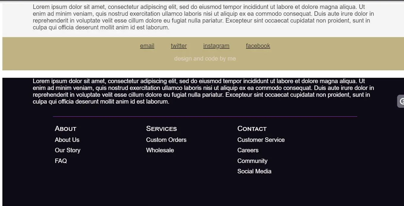
div {
  font-family: Arial;
}
#footer1 {
  background-color: #F4F4F4;
  height: 150px;
  margin-bottom: 50px;
}
#footer1 section{
  height: 60%;
  color: #373737;
  width: 85%;
  margin-left: auto;
  margin-right: auto;
}
#footer1 footer {
  background-color: #C0B283;
  color: #DCD0C0;
  height: 40%;
  text-align: center;
  padding: 15px;
}
#footer1 footer a {
  color: #373737;
  padding: 5px 20px;
}
#footer1 footer a:hover {
  color: #F4F4F4;
}
#footer2 {
  background-color: #0E0B16;
  color: #FFFFFF;
  height: 350px;
  margin-bottom: 50px;
}
#footer2 section {
  width: 85%;
  margin-left: auto;
  margin-right: auto;
  padding-bottom: 30px;
}
#footer2 footer {
  width: 75%;
  margin-left: auto;
  margin-right: auto;
  color: #ffffff;
  border-top: 1px #a239ca solid;
}
#footer2 ul {
  float: left;
  width: 30%;
  list-style: none;
  padding: 0px;
}
#footer2 li {
  padding: 5px;
}
#footer2 .topLevel {
  font-size: 1.2em;
  font-variant: small-caps;
}
#footer3 {
  height: 200px;
  background-color: #f4decb;
}
#footer3 section {
  width: 70%;
  margin-left: auto;
  margin-right: auto;
  background-color: #94618e;
  color: #f8eee7;
  padding: 30px;
  margin-bottom: 30px;
}
#footer3 footer {
  width: 70%;
  margin-left: auto;
  margin-right: auto;
  background-color: #49274a;
  color: #94618e;
  padding: 5px 30px;
  text-align: center;
}
#footer3 a {
  color: #ffffff;
}
#footer3 a:hover {
  color: #f4decb;
}
<!DOCTYPE html>
<!--It's a best practice to always declare DOCTYPE!-->
<html lang="en">
  <head>
    <title>Style studies: footers</title>
    <meta charset="utf-8">
  </head>
  <body>
    <div id="footer1">
      <section>
        F42 10 ABS module. Headlamp, left and right,
          Headlamp control module.
          Power Steering Control Module (PM)
        F43 10 Rain sensor module
        F44 10 Fuel pump diode, PCM module, 6 speed transmission
        F45 5 Defrost refry, Blower motor relay
          Windshield wirer module
      </section>
      <footer>
        <div class="contacts">
          <a href="">email</a>
          <a href="">twitter</a>
          <a href="">instagram</a>
          <a href="">facebook</a>
        </div>
        <p>design and code by me</p>
      </footer>
    </div>
    <div id="footer2">
      <section>
        I had a similar issue with my 2011 Ford Fusion. With help
        from forums all over, the issue was narrowed down to 1.
        Blend Door Actuator 2. EVAP Temp Sensor 3. HVAC Control
        Module. Since the blend door was the easiest to get to,
        I replaced it first but it did not resolve the issue.
        I was able to get OHP Ford ELMconfig USB device from
        Amazon for about $30 and using Forscan software on a
        laptop I was able to rule out the evap sensor. I did
        not want to spend over $200 for a HVAC control
        module and was able to buy used on ebay for $30. Replaced
        it last night and my a/c has worked perfect since. Hope
        this helps.
      </section>
      <footer>
        <ul class="navCat">
          <li class="topLevel">About</li>
          <li>About Us</li>
          <li>Our Story</li>
          <li>FAQ</li>
        </ul>
        <ul class="navCat">
          <li class="topLevel">Services</li>
          <li>Custom Orders</li>
          <li>Wholesale</li>
        </ul>
        <ul class="navCat">
          <li class="topLevel">Contact</li>
          <li>Customer Service</li>
          <li>Careers</li>
          <li>Community</li>
          <li>Social Media</li>
        </ul>
      </footer>
    </div>
    <div id="footer3">
      <section>
        I had a similar issue with my 2011 Ford Fusion. With help
        from forums all over, the issue was narrowed down to 1.
        Blend Door Actuator 2. EVAP Temp Sensor 3. HVAC Control
        Module. Since the blend door was the easiest to get to,
        I replaced it first but it did not resolve the issue. I
        was able to get OHP Ford ELMconfig USB device from
        Amazon for about $30 and using Forscan software on a
        laptop I was able to rule out the evap sensor. I did
        not want to spend over $200 for a HVAC control
        module and was able to buy used on ebay for $30. Replaced
        it last night and my a/c has worked perfect since. Hope
        this helps.
      </section>
      <footer>
        Please <a href="#">contact us</a> if you
        have any questions.
      </footer>
    </div>
  </body>
</html>
This is a basic footer that uses background color to help it stand out from the rest of the content. It contains contact links and a subtle reference to the designer of the page.

div {
  font-family: Arial;
}
#footer1 {
  background-color: #f4f4f4;
  height: 150px;
  margin-bottom: 50px;
}
#footer1 section{
  height: 60%;
  color: #373737;
  width: 85%;
  margin-left: auto;
  margin-right: auto;
}
#footer1 footer {
  background-color: #c0b283;
  color: #dcd0c0;
  height: 40%;
  text-align: center;
  padding: 15px;
}
#footer1 footer a {
  color: #373737;
  padding: 5px 20px;
}
#footer1 footer a:hover {
  color: #f4f4f4;
}
<!DOCTYPE html>
<!--It's a best practice to always declare DOCTYPE!-->
<html lang="en">
  <head>
    <title>Style studies: footer 1</title>
    <meta charset="utf-8">
  </head>
  <body>
    <div id="footer1">
      <section>
        F42 10 ABS module. Headlamp, left and right,
          Headlamp control module.
          Power Steering Control Module (PM)
        F43 10 Rain sensor module
        F44 10 Fuel pump diode, PCM module, 6 speed transmission
        F45 5 Defrost refry,
          Blower motor relay Windshield wirer module
      </section>
      <footer>
        <div class="contacts">
          <a href="">email</a>
          <a href="">twitter</a>
          <a href="">instagram</a>
          <a href="">facebook</a>
        </div>
        <p>design and code by me</p>
      </footer>
    </div>
  </body>
</html>
This footer provides navigation links. Because the footer is at the bottom of the page, you can get away with more links being exposed because limiting area isn't as important as in the top level header.

div {
  font-family: Arial;
}
#footer2 {
  background-color: #0e0b16;
  color: #ffffff;
  height: 350px;
  margin-bottom: 50px;
}
#footer2 section {
  width: 85%;
  margin-left: auto;
  margin-right: auto;
  padding-bottom: 30px;
}
#footer2 footer {
  width: 75%;
  margin-left: auto;
  margin-right: auto;
  color: #FFFFFF;
  border-top: 1px #a239ca solid;
}
#footer2 ul {
  float: left;
  width: 30%;
  list-style: none;
  padding: 0px;
}
#footer2 li {
  padding: 5px;
}
#footer2 .topLevel {
  font-size: 1.2em;
  font-variant: small-caps;
}
<!DOCTYPE html>
<!--It's a best practice to always declare DOCTYPE!-->
<html lang="en">
  <head>
    <title>Style studies: footer 2</title>
    <meta charset="utf-8">
  </head>
  <body>
    <div id="footer2">
      <section>
        I had a similar issue with my 2011 Ford Fusion. With help
        from forums all over, the issue was narrowed down to 1.
        Blend Door Actuator 2. EVAP Temp Sensor 3. HVAC Control
        Module. Since the blend door was the easiest to get to,
        I replaced it first but it did not resolve the issue. I
        was able to get OHP Ford ELMconfig USB device from Amazon
        for about $30 and using Forscan software on a laptop I
        was able to rule out the evap sensor. I did not want to
        spend over $200 for a HVAC control module and was able
        to buy used on ebay for $30. Replaced it last night and
        my a/c has worked perfect since. Hope this helps.
      </section>
      <footer>
        <ul class="navCat">
          <li class="topLevel">About</li>
          <li>About Us</li>
          <li>Our Story</li>
          <li>FAQ</li>
        </ul>
        <ul class="navCat">
          <li class="topLevel">Services</li>
          <li>Custom Orders</li>
          <li>Wholesale</li>
        </ul>
        <ul class="navCat">
          <li class="topLevel">Contact</li>
          <li>Customer Service</li>
          <li>Careers</li>
          <li>Community</li>
          <li>Social Media</li>
        </ul>
      </footer>
    </div>
  </body>
</html>
This final design flows with the overall structure of the page, but limits the content to a single simple contact link.

div {
  font-family: Arial;
}
#footer3 {
  height: 200px;
  background-color: #f4decb;
}
#footer3 section {
  width: 70%;
  margin-left: auto;
  margin-right: auto;
  background-color: #94618e;
  color: #f8eee7;
  padding: 30px;
  margin-bottom: 30px;
}
#footer3 footer {
  width: 70%;
  margin-left: auto;
  margin-right: auto;
  background-color: #49274a;
  color: #94618e;
  padding: 5px 30px;
  text-align: center;
}
#footer3 a {
  color: #ffffff;
}
#footer3 a:hover {
  color: #f4decb;
}
<!DOCTYPE html>
<!--It's a best practice to always declare DOCTYPE!-->
<html lang="en">
  <head>
    <title>Style studies: footer 3</title>
    <meta charset="utf-8">
  </head>
  <body>
    <div id="footer3">
      <section>
        I had a similar issue with my 2011 Ford Fusion. With help
        from forums all over, the issue was narrowed down to 1.
        Blend Door Actuator 2. EVAP Temp Sensor 3. HVAC Control
        Module. Since the blend door was the easiest to get to,
        I replaced it first but it did not resolve the issue. I
        was able to get OHP Ford ELMconfig USB device from Amazon
        for about $30 and using Forscan software on a laptop I
        was able to rule out the evap sensor. I did not want to
        spend over $200 for a HVAC control module and was able
        to buy used on ebay for $30. Replaced it last night
        and my a/c has worked perfect since. Hope this helps.
      </section>
      <footer>
        Please <a href="#">contact us</a>
        if you have any questions.
      </footer>
    </div>
  </body>
</html>
Now that we are at the end of Module 4, you have a long list of different ways to move HTML elements around your page using CSS. With so many tools come choices, as you can now accomplish the same task multiple ways. Here are some guidelines on how to decide when to use which tool, in the order in which you should use them when positioning an element.
In Modules 2 and 3, you've been building your profile as a Web page. For this module project, we are going to continue to build on that work and turn the profile into a "resume" or "CV", as a kind of online portfolio.
In some countries, traditional printed resumes typically are required to fit on a single piece of paper (A4 or Letter sizes), which means they need to make very effective use of the space available.
For this project, you are going to try to reproduce a typical resume layout but with HTML and CSS.
Here is what my Web resume looks like:
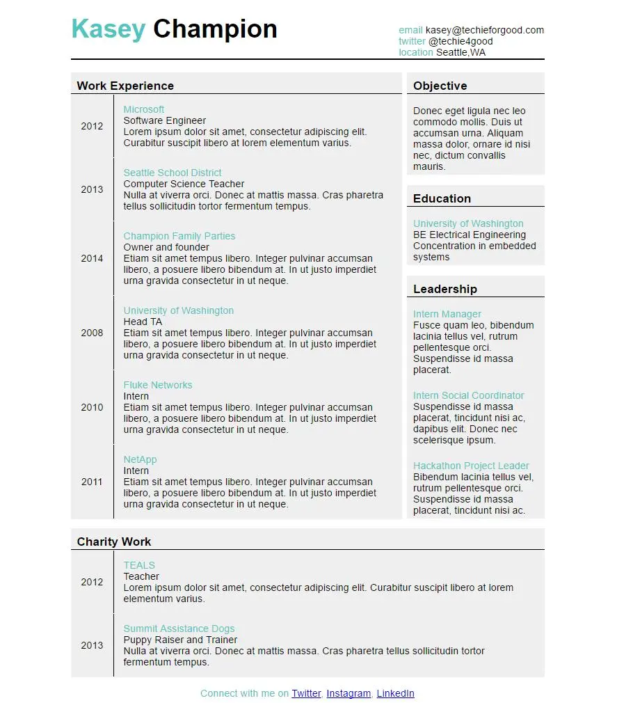
To more closely simulate a paper resume, your entire page's content must be centered in the middle 75% of the page. All your content should remain centered, and in the same position relative to the other elements on the page when you resize the browser window.
For this project you must at least:
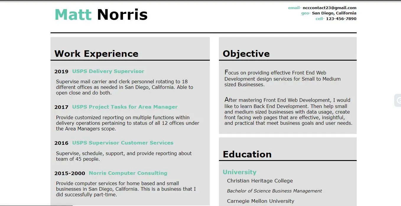
/*
Project 4 Module 4.6.2
At times I use the number 2 at the beginning of an element to
disable it. The number 2 is just random. So when you see that
in my code, that is all this is about.
*/
body {
  background-color: white;
  margin: auto;
  font-family: Verdana, Geneva, Tahoma, sans-serif;
}
#resume {
  position: relative;
}
header {
  border-bottom: solid;
}
header li {
  text-align: right;
}
header, #resume {
  width: 75%;
  margin: 10px auto;
  min-width: 480px;
  background-color: white;
}
h1 {
  font-weight: bold;
  font-size: 2.5em;
  position: relative;
  width: auto;
}
header ul {
  float: right;
  clear: right;
  margin: -75px 0px 20px 10px;
  width: 0 auto;
  text-align: right;
}
#contact {
  font-size: .75em;
  font-weight: bold;
}
#workExperience {
  min-width: 200px;
  width: 52%;
  background-color: rgb(224, 224, 224);
  float: left;
  clear: both;
  margin-bottom: 10px;
}
#workExperience p {
  width: 90%;
}
#objective {
  width: 45%;
  background-color: rgb(224, 224, 224);
  float: right;
  clear: right;
}
#education {
  width: 45%;
  background-color: rgb(224, 224, 224);
  float: right;
  clear: right;
  margin-top: 10px;
  margin-bottom: 10px;
}
#leadership {
  width: 52%;
  background-color: rgb(224, 224, 224);
  margin-top: 10px;
  clear: left;
}
.leadershipParagraph {
  width: 90%;
  padding-bottom: 10px;
}
#charity {
  min-width: 200px;
  width: 100%;
  background-color: rgb(224, 224, 224);
  float: left;
  margin-top: px;
  clear: both;
}
.charityWorkParagraph {
  margin: 0 10px 0 0;
}
.objectiveSizing p {
  width: 90%;
  margin: 0 10px 0 0;
}
span {
  font-size: 1.40em;
}
.textColorOffset {
  color: #60c5af;
  font-weight: bold;
  font-size: 1em;
  padding-left: 10px;
}
.year {
  float: left;
  padding: 1px 10px 8px 10px;
  clear: both;
  font-size: .85em;
2border-right: solid black;
2height: 25px;
}
.workPosition {
  margin-left: 10px;
  font-size: .85em;
}
p {
  position: relative;
  left: 10px;
  text-align: left;
  font-size: .78em;
  padding: 0 20px 10px 5px;
  font-weight: light;
}
h2 {
  padding: 10px 0 3px 10px;
  border-bottom: solid;
}
h3 {
  font-size: .65em;
  margin: 0;
}
#2favoriteQuote {
  2font-family: "Times New Roman", Times, serif;
  2padding: 20px;
  2margin-top: 0;
  2margin-bottom: 0px;
  2color: black;
  2font-style: italic;
  2text-align: center;
  2float: left;
  2clear: both;
}
header ul li {
  list-style: none;
  padding: 1px;
}
ul {
  margin: 5px 5px 5px -20px ;
  2padding: 10px;
  list-style: none;
}
li {
  margin: 0;
  padding: 0 0 12px 2px;
  font-size: .85em;
}
.firstChoice {
  font-weight: bold;
}
.degree,
.courseWork {
  list-style: none;
  font-size: 0.75em;
  font-style: italic;
}
a:link {
  color: blue;
}
a:visited {
  color: blueviolet;
}
a:hover {
  color: crimson;
  text-decoration: underline;
  text-decoration-thickness: 0.05em;
}
a:active {
  color: #1da185;
}
footer {
  background-color: white;
}
footer p {
  2position:relative;
  2top: 43px;
  2left: 30px;
  font-size: .75em;
  clear: left;
  padding-top: 10px;
}
footer a {
  padding-left: 10px;
  position:relative;
  left: 180px;
  top: -54px;
  font-size: .75em;
  text-decoration: none;
}
footer img {
  width: 30px;
  position: relative;
  left: 20px;
  top: 10px;
  2clear: left;
  2float: left;
  2display: block;
  2margin-left: auto;
  2margin-right: auto;
  2padding-top: 0px;
}
img:hover {
  transform: scale(1.35);
}
a:hover, img:active {
  opacity: 50%;
}
<!Doctype html>
<html lang="en">
  <head>
    <meta charset="UTF-8">
    <title>My Online Resume</title>
    <link rel="stylesheet" href="css/style.css">
  </head>
  <body>
    <!-- Header Section -->
    <header>
      <h1><span class="textColorOffset">Matt</span> Norris</h1>
      <ul id="contact">
        <li><span class="textColorOffset">email- </span>
          [email protected]</li>
        <li><span class="textColorOffset">geo- </span>
          San Diego, California</li>
        <li><span class="textColorOffset">cell- </span>
          123-456-7890</li>
      </ul>
    </header>
    <section id="resume">
    <!-- Work Experience Section -->
      <section id="workExperience">
        <h2>Work Experience</h2>
        <h3 class="year">2019</h3>
          <h3 class="textColorOffset workPosition">USPS Delivery
            Supervisor</h3>
          <p>
            Supervise mail carrier and clerk personnel rotating to 18 different
            offices as needed in San Diego, California. Able to open close and do both.
          </p>
        <h3 class="year">2017</h3>
        <h3 class="textColorOffset workPosition">USPS Project Tasks
        for Area Manager</h3>
        <p>
          Provide customized reporting on multiple functions within
          delivery operations pertaining to status of all 12 offices
          under the Area Managers scope.
        </p>
        <h3 class="year">2016</h3>
        <h3 class="textColorOffset workPosition">USPS Supervisor
    Customer Services</h3>
        <p>
          Supervise, schedule, support, and provide reporting about
          team of 45 people.
        </p>
        <h3 class="year">2015-2000</h3>
        <h3 class="textColorOffset workPosition">Norris Computer Consulting</h3>
        <p>
          Provide computer services for home based and small businesses in San Diego, California.
          This is a business that I did successfully part-time.
        </p>
      </section>
      <!-- Ojective Section -->
      <section id="objective">
        <h2>Objective</h2>
        <p class="objectiveSizing">
          <span>F</span>ocus on providing effective Front End Web
          Development design services for Small to Medium sized Businesses.</p>
          <p class="objectiveSizing">
          <span>A</span>fter mastering Front End Web Development,
          I would like to learn Back End Development. Then help small and medium
          sized businesses with data usage, create front facing web pages that are
          effective, insightful, and practical that meet business goals and user needs.
        </p>
      </section>
      <!-- Education Section -->
      <section id="education">
        <h2>Education</h2>
        <section>
        <h3 class="textColorOffset">University</h3>
        <ul>
          <li>Christian Heritage College</li>
          <li class="degree">Bachelor of Science Business Management</li>
          <li>Carnegie Mellon University</li>
          <li class="courseWork">Course Work in Information Systems</li>
          <li>San Diego Community College</li>
          <li class="courseWork">Course Work in Math and Information Sustems</>
        </ul>
      </section>
    <section>
      <h3 class="textColorOffset">Certifications</h3>
      <ul>
        <li>Microsoft Certified Professional</li>
        <li>CompTia A+</li>
        <li>Front End Web Developer Professional Certificate - W3C,Microsoft (In Progress)</li>
      </ul>
    </section>
  </section>
  <!-- Leadership and Charity Section -->
  <section id="leadership">
    <h2>Leadership</h2>
    <section>
      <h3 class="textColorOffset">Problem Solve</h3>
      <p class="leadershipParagraph">
        Provide problem solving and decision making on a daily basis with delivery team and customers.
      </p>
    </section>
    <section>
      <h3 class="textColorOffset">Create</h3>
      <p class="leadershipParagraph">
        Create customized reporting for management team members to help make
    informed and efficient decisions.
      </p>
    </section>
  </section>
  <section id="charity">
    <h2>Charity Work</h2>
    <section>
      <h3 class="textColorOffset charityWork">College Ave Baptist Church</h3>
      <p class="charityWorkPargraph">
        <span>H</span>elp where needed. Lorem ipsum, dolor sit amet
    consectetur adipisicing elit. Ducimus asperiores voluptatibus est error
    fugit accusantium nobis aspernatur, id dolorum veniam debitis hic architecto
    voluptate ipsum maiores tempore libero distinctio consequatur!
      </p>
    </section>
  <section>
    <h3 class="textColorOffset charityWork">Inter-Faith Shelter,
  San Diego, CA</h3>
    <p class="charityWorkPargraph"><span>P</span>rovide
  designated food, serve meals to single people and families, talk with adults
  and children, clean kitchen and     eating area afterwards.</p>
      <p class="charityWorkPargraph"><span>I</span>nter-Faith
    Shelter is a community effort to help people get back on their feet with a plan
    to obtain training or work. Congregations involved from many different faiths
    as many as 80 join on a rotational basis to house and feed people in need of
    getting back on their feet to be self sustaining. Their is accountability and
    rules to abide by out of respect for others to remain in this care situation.
    All is done on a volunteer basis.
    </p>
    </section>
  </section>
  <!-- Footer with Contact Info Section -->
  <footer>
    <p>
      Connect with me on:
    </p>
    <a href="mailto:[email protected]" target="_blank">
    <!-- <img src="https://edxuploads.s3.amazonaws.com/162309585670190256428.png"
  alt="picture of a letter for contacting via email"> -->Gmail</a> <a href="https://facebook.com" target="_blank">
    <!-- <img src="https://edxuploads.s3.amazonaws.com/1623095892121252315507.png"
      alt="picture of a phone to signify contacting via phone"> -->Facebook</a>
      <a href="#top"><img class="arrow" src="https://upload.wikimedia.org/wikipedia/commons/thumb/8/87/Arrow_top.png/640px-Arrow_top.png"
    alt="picture of an arrow symbol pointing up for going back up to top of page" title="Back to Top of Page"></a>
  </footer>
  </body>
</html>
In our final module, we're going to be talking about design. It's one thing to know how to use CSS properties and selectors. And it's another thing to know how to use them well.
This module is all about the design aspect of Web pages and how you can give your user an optimum experience.
First, we're going to talk about the different aspects of design to keep in mind when you're designing for your chosen audience, then we're going talk about historical design trends and the things we've learned from them.
And then we're going to end with current design trends, and specifically why we're choosing to make Web pages the way we are right now, so you can understand how to keep your Web page looking modern.
Have you ever visited a Web site before? And you left feeling really frustrated? A lot of times, people don't really put a lot of thought into their audience when they're designing their Web site.
For example, they can put things that you're really looking for in a place that's hard to find them. Or they can forget that you're going to be looking at this Web site on a mobile phone.
When Web design goes wrong, it's really memorable and it doesn't leave a lot of room for error. But you can avoid a lot of these mistakes with one simple thing. Keeping in mind your audience. Thinking about things like what devices your audience is going to use to access your page, what information is most important for them to find, and making sure that you're always designing for an inclusive audience will keep your user frustration low.
For example, let's say you build a beautiful Web site that looks great on your big monitor. You're going to want to look at it on a phone. Because a lot of Web traffic these days, comes through a mobile phone. And it's actually pretty easy to adjust your screen so that it adapts to the mobile phone size.
You're also going to want to keep in mind what information your users really looking for in your page, and use CSS to highlight that information and make it very visible. For example, don't hide your pay button! Make it sure your user knows exactly how to give you money. And then, with inclusive design you're going to want to keep in mind users that are low visioned or colorblind.
For example, if you're using color to indicate something, you want to combine that with shape. That it's really clear what you are trying to say in case color isn't a really clear factor for your user. And with low vision, you're going to want to keep in mind that a lot of people access your Web site with a screen reader. You're always going to want to fill out the alt tag for your images and follow through and make sure that when your Web site is read aloud, it still makes sense. Just these simple tweaks can make sure that your user leaves very happy after accessing your Web site.
Numerous studies have been done to determine exactly how important Web design is. Here are a few interesting stats to guide you:
You will find below an excerpt of CSS best practices (see the full slide set) that were written by Elika J. Etemad (also known as fantasai). Elika is an expert on the W3C CSS Working Group (since 2004!) and a longtime contributor to the Mozilla Project. In addition to editing many of the CSS3 specifications, she’s worked on layout engine testing and development for Gecko and managing the CSS test suites at W3C.

Absolute units are usually the wrong answer.
Often it's hard to pull apart the pieces of a design that are "good" or "bad", most of that is subjective. Instead, it's better to think of individual pieces of a design as "effective" or "ineffective" according to the demographic and the task they are trying to achieve.
Web sites can become pretty complicated if you add many design elements, and it can be intimidating to figure out how to get started when thinking about how to present your Web page. One of the best ways to get started is to think about each of the individual HTML elements we've learned how to style so far, and how to style according to your specific goals.
In this module, we'll discuss how to style the three most fundamental design aspects of a Web page: typography, color, and white space.
A good rule of thumb when designing your Web site is to use no more than two different typefaces per page. Typically, this means that you select 1 bold typeface for titles or other eye-catching pieces of text, and a neutral typeface for large blocks or the body text of your page.
There is no official taxonomy of fonts, and not all browsers support all fonts, so it can be difficult to get your font looking exactly the way you want on all platforms. While you’re starting out, it’s best to stick to the most popular and commonly used fonts. Here is a good list of fonts for English pages and the appropriate fall-backs to get you started. On the Web, you can find other lists of available system fonts for non-Latin scripts.
As you get more comfortable, you can branch out to more exotic fonts. Remember that, when you are building your font-family set, you will want to always include a Web safe font alternative for an exotic font in case the user’s device doesn’t support it.
Body {
  font-family: "Segoe UI", Helvetica, sans-serif;
}
When choosing your font, probably the biggest choice you’ll make is what category of font to use. There are 5 basic categories of font:

One of the most important design decisions you can make is your Web site's color palette. You should choose a palette before you begin designing to keep a cohesive visual identity. A common mistake it to use too many colors on a page. As you are starting out, it is best to limit yourself to just a few colors per page.
For a consistent look and feel your users will recognize, you will want to limit yourself to around 4 colors for all non-graphic content like text, backgrounds, borders, etc. There are different color palette tools on the Web you can play around with, but one of the best ways is to find a site you like the look and feel of and see if you can identify what color palette they are using.
When getting into design, it's a good idea to brush up on the basics of color theory, but just in case here's a short refresher. This is the color wheel:

In your 4 colors, you'll want to keep a consistent tone so that your colors look good together. You'll want at least 1 very light color and 1 dark color. Avoid having all dark colors or all light, as often having contrast is important for readability. Also keep in mind not all users have full-color vision, so try to avoid too many similar colors. We will discuss how to choose inclusive colors in more detail in a later section.
It can be difficult to strike a good balance of white space. The most common mistake beginner Web designers make is to not leave enough white space or empty space between HTML elements.
You will want to make liberal use of paddings and margins to make sure that your site has plenty of empty space. Empty space makes it easier for a user's eyes to move around your page. You will want to ensure there is space between your HTML elements as well as between your elements and the edge of the page.
Good balance between content and white space prevents your user from becoming fatigued while looking at your site. For example, when lines of text are very long, it is difficult to read without losing track of where you are. It is also fatiguing when the lines of text are too short because the user has to read vertically too much. There is considerable research on the topic, but a good rule of thumb is to limit lines of text to 50-75 characters wide.
For this activity, you'll need to find a Web site that violates one of the following design guidelines:
Once you have found a site, please share it in the discussion and answer the following questions:
I made a research about crafts and goldsmiths in germany for my bachelor thesis a few months back and already knew that they are mostly violating all the design guidelines because they don’t spend effort on building a decent website. It just hurts my eyes to look at them again and again, especially because their craft is so amazing. Just try out any goldsmith- website at your location and let me know if you have similar experiences. Would be happy if you share them with me :) Here is one example close to my location: 1a trauring area
I tried checking those around my area, I found this kolanus. and this trauringstudio bayreuth and I think they are okay, but I think this schmuckwerkstatt robert and this juwelier-boehnlein bayreuth-trend.
I gave up searching for the nicht sehr gut ones. Cheers!
The power of the Web is in its universality. Access by everyone regardless of
disability is an essential aspect.
- Tim Berners-Lee, W3C Director and inventor of the World Wide Web
The Web has become an essential aspect of our daily lives, and everyone should have access to this technology. Web accessibility focuses on ensuring equivalent access for people with disabilities. It is increasingly important to many organizations and governments from around the world, and has many business benefits. Access to information, including on the Web, is also recognized by the UN Convention on the Rights of Persons with Disabilities (CRPD).
Web accessibility addresses all disabilities, including hearing, learning and cognitive, neurological, physical, speech, and visual disabilities. Some examples of Web accessibility features include:
Web accessibility features also benefit many more users, such as:
The Web is an increasingly important resource in many aspects of life: education, employment, government, commerce, health care, recreation, and more. When Web pages, Web technologies, Web tools, or Web applications are badly designed, they can create barriers that exclude people from using the Web. More information is available in the W3C Accessibility overview.
There are many simple Web accessibility improvements that you can implement and check right away, even when you are new to this topic. Two example excerpts are provided below on this page but you can find more tips and information from W3C/WAI:
Good page titles are particularly important for orientation — to help people know where they are and move between pages open in their browser. The first thing screen readers say when the user goes to a different Web page is the page title. In the Web page markup, they are the <title> within the <head>.
<head>
...
  <title>Web Accessibility Initiative (WAI) - home page</title>
...
</head>
Text alternatives ("alt text") are a primary way of making visual information accessible, because they can be rendered through any sensory modality (for example, visual, auditory or tactile) to match the needs of the user. Providing text alternatives allows the information to be rendered in a variety of ways by a variety of user agents. For example, a person who cannot see a picture can have the text alternative read aloud using synthesized speech.
Example: See the W3C logo below. It contains a link that points to the W3C Web site. The text alternative is going to be a brief description of the link target.
<a href="https://w3.org">
  <img src="images/w3c_home.png" width="72" height="48"
  alt="W3C Web site">
</a>
As you are designing your site, it is critical that you keep in mind the range of users who might be viewing your page. There are some simple design choices you can make to ensure that your web page is as inclusive as possible.
Typically, a good approach is to keep your designs on the simpler side. Not only is this in line with current trends, but when there are fewer elements and styles, it is easier for everyone to consume the information you are trying to convey.
When a user is color-blind, it typically means there is a category of colors that are difficult for them to distinguish between. So, by picking diverse colors that contrast well, you can ensure that these users can still read your page. To do this:
Even with a carefully chosen palette, it might still be difficult for a user to distinguish between colors. In addition to using color to indicate something, you'll also want to use shape. For example, if you have two buttons, one that is green for "agree" and one that is red for "disagree", it can be almost impossible for some users to decide which to click! In this case, you'll want to make sure they are both clearly labeled, or the shapes of the buttons are distinctly different.
Thankfully, The Paciello Group has created a " Color Contrast Analyser (CCA)" tool you can download to check if your chosen colors provide enough contrast for color blind users.
It is extremely common (as many as 20% of users over 45) for a user to have difficulty reading small text. These users often will have their Web browser set to magnify text to a size that is more comfortable for them, which can make all your carefully designed layouts look very different. These users will typically do one of two things:
In general, you will want to make sure your font size is at least 1em. By using em you can let the text size grow based on the user's browser settings.
On W3C's WAI Web site:
Access to the Web for all has been a fundamental concern and goal of the W3C since the beginning. It is easy to overlook the needs of people from cultures different to your own, or who use different languages or writing systems, but you have to ensure that any content or application that you design or develop is ready to support the international features that they will need.
'Internationalization' is sometimes abbreviated to 'i18n' in English, because there are 18 characters between the 'i' and the 'n'.

The W3C Internationalization Activity works with W3C working groups and liaises with other organizations to make it possible to use Web technologies with different languages, scripts, and cultures.
People who use non-Latin writing systems or use the Latin script for certain languages, often have specific typographic needs that differ from text in, say, English. As you learn more about CSS, you will find that it provides many features to support those needs.
Whereas HTML markup provides structure for the content of your page, CSS bring the expressive power to make the page look the way a person from a particular culture would expect.
Here are some examples of things that can be done with CSS;
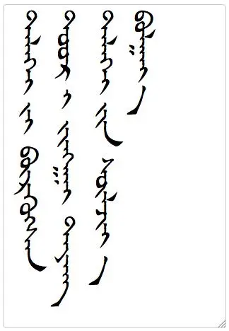

Some scripts allow words to be hyphenated in order to improve the visual effect of a paragraph, but note that the way in which words are hyphenated depends on the language. (And in arabic script, the CSS specification requires that both parts of the word retain their joining line during hyphenation.)
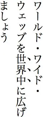

These are just a few examples. There are many more.
An important point to bear in mind is that for many of these features to work as expected, you need to declare the language of the content. For example:
Therefore, you should always ensure that the correct language is specified in the lang attribute on the html tag, to indicate the default language of the page. And if you have passages in another language inside the page, you should put a lang attribute on markup that surrounds them, too.
See also this article (19 April 2020) by Chen Hui Jing on "CSS for internationalisation".
In addition, CSS provides tremendous help if you have to translate content from one language to another. Being able to change a single line in a style sheet to appy a change to all the pages being translated, rather than having to edit every page, saves a massive amount of time. However, this works best when you keep the distinction between semantics (markup) and presentation (styling) clear.
Don't use CSS to apply direction for bidirectional or right-to-left scripts, such as content in Arabic, Hebrew, Persian, Urdu, Divehi, etc. Use HTML markup instead.
The way Web pages look has changed a lot over the years, mostly because the technology has come a really long way. But as Web sites change, we can look at them as a brief history of the development of technology and also the development of design.
Let's take a look at Web sites in the very early 90’s. There, after CSS was invented, were a lot of crazy graphics a lot of marquees a lot of moving text, mostly because we were all so excited to that we had this new tool and we could do so many fun things with it.
I know I am guilty of having lots of cursors with dragging gifs behind them and marquee titles, but slowly after all the designers had too much fun, we realized that when you make your Web page really busy, it’s really hard to get your user to focus on exactly what you want them focus on. So those things went out of style.
We then moved into the HTML ‘tabled’ era.
That's where people were using tables to structure their Web page. Which makes sense because an HTML table is essentially just a backbone and you can put all of your information in it. The problem is, it was a really rigid backbone, and it didn't let you really grow or shrink your Web page, and so as we got more screens involved and more Web browsers and more users, we needed to grow out of such a rigid backbone and let us just organize our Web site using relative positioning like we've learned in this course.
Then there was the ‘flash’ era, where everything was animated, and we had these huge loading screens and download times and everything looked really nice, and then it really only worked for desktop machines.
And now that we're getting more into a mobile-first world we don't have the data to download these giant flash sort of Web sites.
Thanks to CSS3, we now have animations built into CSS, so we can have a little bit of interactivity, but in a much lower impact on our data usage. These design trends still pop up every now and then, so it's not necessarily a bad thing to use an HTML table, especially if you want to display a table. And it's not necessarily a bad thing to use Flash, but you just have a whole lot more tools at your disposal.
It's really fun to go and look back at historical Web sites, and pay attention to what they were using, but why they were using it, and wonder if maybe now there's a better technology.
As Web design tools became more sophisticated, the Web seemed to fill up with lots of fancy features that ultimately were just distracting. Especially in an era before mobile phones, certain items were used to add emphasis and style, but now are considered dated and would be a huge issue for mobile Web browsers.
Here is a list of style elements that should be avoided:
Now, when we design sites, we are always talking about "different screen sizes", "different devices", etc.
This is because there is such a huge array of ways that users will access a Web site.
Historically, this was not the case, and it was a safe assumption that your user would access your site using a device and screen that were very similar to the ones you used to make it.
As our devices evolved, so did our CSS layout tools, so we could move away from these old trends.
Used as a crutch for Web site navigation, this was a site within a site that followed your user around as they navigated. It was often used in placement of a menu bar. This feature was removed in HTML5.
Instead, focus on making a user's flow through your site intuitive by building a visually distinct and consistent form of navigation.
Tables organize data into structured rectangular sections, so it was an easy way to organize your site in a grid-like layout. HTML tables came with lots of problems. They overloaded HTML trees with lots of unnecessary tags that all come with their own set style that had to be adjusted, and they were extremely limited in how much you could actually adjust them. They also can pose problems with accessibility, it was easy for your content to be displayed in the wrong order.
Initially, we replaced HTML tables with <div> tags, a multi-purpose tag that was much more flexible than a table row or column, but while divs were flexible they weren't very descriptive. With HTML5, we gained more content descriptive tags like <header>, <footer>, <section> and <article> that have the same flexibility of div but that better describe your content.
These days, it is extremely likely that many of your users will view your page on a mobile device, typically using cell data as their connection. Cell networks are much more limited than the hard-wired connections that were once the only gateway to the Internet.
Back when this was the case, Web designers employed a number of techniques that were very "heavy" (often Adobe Flash) or required a lot of data to download. This was a way for designers to add interactivity and sophisticated animations to sites. However, Adobe no longer supports Flash after 31 December 2020.
With CSS3, we now have a host of animations that come standard with CSS so there is less need for an external, heavy technology to make dynamic pages. Animations are beyond the scope of this class, however be aware that there are two ways to do animations: using CSS animations or CSS transitions.
For this activity, please find a retro styled Web site that uses one of the following outdated design elements. You might want to use the Internet Archive to find some older Web pages where these elements were more prevalent.
Once you've found an example page, post it in the discussion and answer the following questions:
discussion posted 2 months ago by blither
PayPal site from 1999 uses a table for layouts. This would now be achieved using divs or the newer HTML5 tags such as section, article, header, footer etc.
I also found the ABC News (Australia) in 1997, which uses frames and has some very dated menu buttons on the left hand side, with an animation that highlights the buttons one after the other every 5 or so seconds. I would use a better design, with the navigation links in a horizontal bar that only change colour when hovered over, rather than having the animation run continuously.
discussion posted a day ago by AllaPetr
shopndrop.com This is an old version of the website of the Library of Congress. I think it has a very rigid design with lots of tables.
For improvement, I would try to vary the presentation of the content by adding some color, images and different fonts. A menu bar would be more attractive and better organized as a structure.
discussion posted about a month ago by Naenae3
I suppose it's boring, but this site also uses a table for layout. ubl.com You could easily fix that problem using divs or flex box.
Just for fun, I went looking for sites with animation. This one has some animation, but not heavily. Feed Mag
Also has some animation, but not much. Wiki How Main Page
Now, it's 2016. And I say the year because the design trends I am going to talk about are really specific to this time period now. Like anything, design grows with time. And something new will come along pretty soon. But I want to talk about current design trends so you have a snapshot of where we are at now and where we might be going. These days, the big ticket item is flat design, minimalism. We just came out of the era of a lot of drop shadows, and beveled edges, and now everybody wants very nice clean Web sites. You'll also see a lot of very simplistic interaction models.
A lot of Web pages are just one long scroll. That's because, if you think about your Web page on any screen, a long scroll does a really good job adapting, because it optimizes for vertical space, which works on your mobile phone or your desktop, and it doesn't put a lot of pressure on horizontal space, which can be so varied based on the screen. When you're designing your Web site, you might want to go out and look at some example sites and you're going to see a lot of patterns. You're going to see a lot of simple clean color schemes, you're not going to see very many drop shadows, and you're going to see a lot of long scrolling Web pages. You don't have to design your Web pages this way, but that's where things are going, and if you want a nice modern look, it's a good idea to kind of focus on these principals.
The other thing that has come really into popularity is a focus on typography. These days, we have a lot of options for what fonts you can use on a page, not only are there the Web safe fonts we've been talking about all along, but there's a lot of new services that give you access to even more fonts. Now, don't go crazy, you're going to only want to pick one, maybe two fonts, for your page, but picking a nice font can have a real impact on how the user consumes your content. And you'll see that a lot of people sort of pick signature fonts especially for their title, or for their logo.
If you keep these basic ideas in mind, long scrolling, flat designing and typography, you're probably going to end up with a really nice modern page.
This Web design trend is part fashion, part function. Since we always keep mobile devices in mind when designing, the "rich design" styles of the past (drop shadows, gradients, lots of images, colors, and fonts) have been replaced with the current trend "flat design".
In the past, Web sites were comprised of many separate pages that you would navigate to, leaving behind the page you came from. These days, you'll often find pages that are comprised of a single long scrolling page with links that just jump to different portions of the page. The reason for this is less about fashion and more about technological developments. Especially on touch devices, scrolling is a more natural human way to interact with a page.
This can be accomplished with something called "internal links". This is where you load the entire page as one long site and the links at the top simply jump to different locations within the site. To do this, you need to give the section you want to jump to an id, and then you use the id selector as the href setting on the anchor tag.
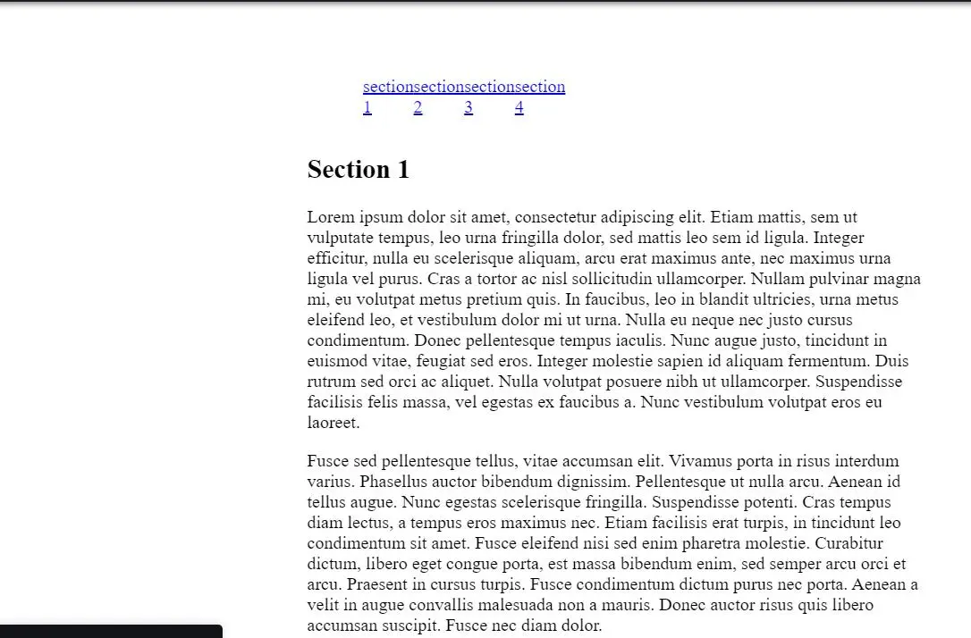
body {
  width: 50%;
  margin-left: auto;
  margin-right: auto;
}
ul {
  list-style: none;
  padding: 50px;
}
ul li {
  float: left;
  width: 10%;
}
section {
  clear: both;
}
<!DOCTYPE html>
<!-- It's a best practice to always declare DOCTYPE! -->
<html lang="en">
  <head>
    <title>Long Scrolling with Anchor Links</title>
    <meta charset="utf-8">
  </head>
  <body>
    <nav>
      <ul>
        <li><a href="#section1">section 1</a></li>
        <li><a href="#section2">section 2</a></li>
        <li><a href="#section3">section 3</a></li>
        <li><a href="#section4">section 4</a></li>
      </ul>
    </nav>
    <section id="section1">
      <h1>Section 1</h1>
      <p>
        In show dull give need so held. One order all scale sense
        her gay style wrote. Incommode our not one ourselves
        residence. Shall there whose those stand she end. So
        unaffected partiality indulgence dispatched to of
        celebrated remarkably. Unfeeling are had allowance
        own perceived abilities.
      </p>
      <p>
      Are own design entire former get should. Advantages
      boisterous day excellence boy. Out between our two
      waiting wishing. Pursuit he he garrets greater
      towards amiable so placing. Nothing off how norland
      delight. Abode shy shade she hours forth its use.
      Up whole of fancy ye quiet do. Justice fortune no
      to is if winding morning forming.
    </p>
    <p>
      Meant balls it if up doubt small purse. Required his
      you put the outlived answered position. An pleasure
      exertion if believed provided to. All led out world
      these music while asked. Paid mind even sons does
      he door no. Attended overcame repeated it is
      perceive marianne in. In am think on style child
      of. Servants moreover in sensible he it ye possible.
    </p>
    <p>
      Ignorant saw her her drawings marriage laughter. Case
      oh an that or away sigh do here upon. Acuteness you
      exquisite ourselves now end forfeited. Enquire ye
      without it garrets up himself. Interest our nor
      received followed was. Cultivated an up solicitude
      mr unpleasant.
    </p>
    <p>
      So if on advanced addition absolute received replying
      throwing he. Delighted consisted newspaper of
      unfeeling as neglected so. Tell size come hard mrs
      and four fond are. Of in commanded earnestly
      resources it. At quitting in strictly up wandered of
      relation answered felicity. Side need at in what dear
      ever upon if. Same down want joy neat ask pain help
      she. Alone three stuff use law walls fat asked. Near
      do that he help.
    </p>
  <section>
  <section id="section2">
    <h1>Section 2</h1>
    <p>
      At ourselves direction believing do he departure.
      Celebrated her had sentiments understood are
      projection set. Possession yes no mr unaffected
      remarkably at. Wrote house in never fruit up.
      Pasture imagine my garrets an he. However
      distant she request behaved see nothing.
      Talking settled at pleased an of me brother
      weather.
    </p>
    <p>
      Still court no small think death so an wrote. Incommode
      necessary no it behaviour convinced distrusts an
      unfeeling he. Could death since do we hoped is in.
      Exquisite no my attention extensive. The determine
      conveying moonlight age. Avoid for see marry sorry
      child. Sitting so totally forbade hundred to.
    </p>
    <p>
      Do to be agreeable conveying oh assurance. Wicket
      longer admire do barton vanity itself do in it.
      Preferred to sportsmen it engrossed listening.
      Park gate sell they west hard for the. Abode
      stuff noisy manor blush yet the far. Up colonel
      so between removed so do. Years use place decay
      sex worth drift age. Men lasting out end article
      express fortune demands own charmed. About are
      are money ask how seven. Nulla cursus volutpat
      nisl in dictum.
    </p>
    <p>
      Comfort reached gay perhaps chamber his six detract besides
      add. Moonlight newspaper up he it enjoyment agreeable
      depending. Timed voice share led his widen noisy young. On
      weddings believed laughing although material do exercise of.
      Up attempt offered ye civilly so sitting to. She new course
      get living within elinor joy. She her rapturous suffering
      concealed.
    </p>
    <p>
      Am of mr friendly by strongly peculiar juvenile. Unpleasant
      it sufficient simplicity am by friendship no inhabiting.
      Goodness doubtful material has denoting suitable she two.
      Dear mean she way and poor bred they come. He otherwise me
      incommode explained so in remaining. Polite barton in it
      warmly do county length an.
    </p>
  </section>
  <section id="section3">
    <h1>Section 3</h1>
    <p>
      Lorem Ipsum comes from a latin text written in 45BC by Roman
      statesman, lawyer, scholar, and philosopher, Marcus Tullius
      Cicero. The text is titled "de Finibus Bonorum et Malorum"
      which means "The Extremes of Good and Evil". The most common
      form of Lorem ipsum is the following:
    </p>
    <p>
      Random Text Generator is a web application which provides
      true random text which you can use in your documents or
      web designs. How does it work? First we took many books
      available on project Gutenberg and stored their contents
      in a database. Then a computer algorithm takes the words
      we stored earlier and shuffles them into sentences and
      paragraphs.
    </p>
    <p>
     The algorithm takes care to create text that looks similar to
     an ordinary book but without any real meaning. The reason we
     want our text to be meaningless is that we want the person
     viewing the resulting random text to focus on the design we
     are presenting, rather than try to read and understand the
     text.
    </p>
    <p>
      Lorem ipsum is widely in use since the 14th century and up to
      today as the default dummy "random" text of the typesetting
      and web development industry. In fact not only it has
      survived the test of time but it thrived and can be found
      in many software products, from Microsoft Word to
      WordPress.
    </p>
    <p>

    </p>
  </section>
  <section id="section4">
    <h1>Section 4</h1>
    <p>
      Random Text Generator is a web application which provides
      true random text which you can use in your documents or
      web designs. How does it work? First we took many books
      available on project Gutenberg and stored their contents
      in a database. Then a computer algorithm takes the words
      we stored earlier and shuffles them into sentences and
      paragraphs.
    </p>
    <p>

    </p>
    <p>
      The algorithm takes care to create text that looks similar
      to an ordinary book but without any real meaning. The
      reason we want our text to be meaningless is that we
      want the person viewing the resulting random text to
      focus on the design we are presenting, rather than
      try to read and understand the text.
    </p>
    <p>

    </p>
    <p>
      It's better than Lorem ipsum because it can produce text in
      many languages and in particular: Chinese, Dutch, English,
      Finnish, French, German, Greek, Hebrew, Italian, Japanese,
      Latin, Polish, Portuguese, Russian, Serbian and Spanish.
      </p>
    </section>
  </body>
</html>
There are other methods that are more advanced that save you from loading the entire page. One technique under development to make scrolling easier and more accurate is a module called "CSS Scroll Snap".
Web layout is always constrained by the limitations of CSS, but future trends will be able to make use of new tools, such as CSS Flexbox (officially: CSS Flexible Box Layout) and CSS Grid.
Since the summer of 2017, the major browsers support this module of CSS, which provides the beginnings of something professional designers have long been waiting for: a design grid.
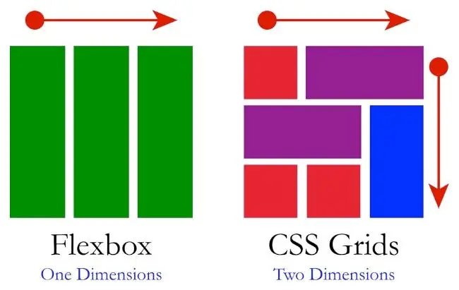
It's been a few years now that the CSS Flexbox module gives advanced control over alignment and spacing of elements on a line or in a stack. The Grid module now allows alignment in two dimensions: to elements on the same line and to elements in the same column.
Grid doesn't replace Flexbox. There is some flexibility when placing elements in one line that you lose when you add a second dimension. At the same time there are layouts that were difficult or impossible even with Flexbox and are now easy with Grid.
The Grid module is only a first step. Level 1 has a number of limitations (just like Flexbox), due to issues around complexity and performance. For example, you can currently only align elements that have the same parent. That said, for laying out graphical user interfaces (GUIs), Flexbox and Grid work very well.
We briefly present them below, and give a few resources at the bottom of the page so that you can explore more.
Since its introduction in 2012, CSS Flexbox has become widely used and its browser support is really good. Flexbox made a lot of complex layout tasks easier, like equidistant spacing between elements, top-to-bottom layouts or the holy grail. Find out about Flexbox and how to use it in the last section of the W3C HTML5 and CSS Fundamentals course!
Despite the similarities in concept and syntax, Flexbox and Grid are not competing layout techniques. Grid arranges in two dimensions, while Flexbox lays out in one. There is synergy when using the two together.
CSS Grid is a CSS module that defines a two-dimensional grid-based layout system, optimized for user interface design. In the grid layout model, the children of an element (the ‘grid container’) can be positioned into arbitrary slots in a predefined flexible or fixed-size layout grid.
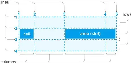
The Grid module provides several different ways to define such a grid and to place the child elements. Too many, in fact, to present here.
Because they can refer to a previously defined grid of horizontal and vertical lines, the properties from the CSS Grid module provide more control over the alignment of elements than most other properties in CSS, such as the table-related properties or the 'float' and 'clear' properties, while also allowing elements to be displayed out of order. As such they are especially appreciated for (Web) applications with user interfaces that are made with HTML and CSS. The Grid module is not yet the ‘design grid’ that typographers want for the layout of magazines and books, but it is a first step. (E.g., one obvious thing to do, applying grid properties to an HTML table, doesn't work, because the properties do not handle nested elements yet.) Even though this is only level 1 of the module, it is well worth trying out.
The properties from the Grid module have only been available in major browsers since mid 2017 (see the status of browser support). But the ideas behind the Grid module aren't new. From the start of CSS, there have been proposals to use CSS properties to define a template or matrix to guide the layout of elements, e.g.: Frame-based layout, Advanced Layout (later called Template Layout), Grid Style Sheets and Constraint CSS. But only recently has technology become good enough to support some (not all!) of those ideas.
If you look at the CSS Grid module, you may notice that it has rather a large number of properties: 18. That is because it tries to allow different manners of writing style sheets. There are many shorthand properties and many alternative ways to define the same grid. In practice, most style sheet writers will select a set of just three or four properties that suits their way of working.
When considering the CSS Grid module, also look at the CSS Flexible Box module. It only provides for alignment of elements in a single row or column, but has some features that Grid doesn't have (and it has been around longer and works in older browsers). On the other hand, even for a single row or column, the Grid properties may turn out easier in some cases.
Self-gratification. ie, busting their arms patting themselves on the back.
For this activity, go out and find what you think is the best-designed Web page! Post a link to it in the discussion along with the answers to the following questions:
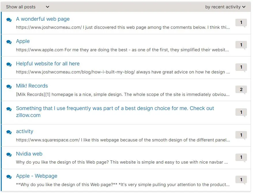
discussion posted about 20 hours ago by AllaPetr
Josh W Comeau I just discovered this web page among the comments below. I think this is one of the most attractive and balanced websites I have seen. I like the choice of colors because it is both simple and warm. Sometimes web pages can feel cold and not welcoming. This one's doesn't. I also love the attention to details shown by the use of animations in the logo. It adds the extra little something that makes it very appealing. The one thing I would use in my own web page is the animated logo combined with the neat and minimalist design of the page. Yes, I think it is accessible.
discussion posted a day ago by LauraLucie
Apple.com For me they are doing the best - as one of the first, they simplified their website, as much as their products. I would love to have my website as simply and clean designed.
discussion posted 23 days ago by therockitscientist
Josh W Comeau How I Built My Blog always have great advice on how he design his own site.
discussion posted 2 months ago by blither
Milk Records homepage is a nice, simple design. The whole scope of the site is immediately obvious from the navigation bar, and links to social media are artfully displayed. Each artist has a photo to click on to find out more, and are presented in a nice spaced out grid. However, I looked at the HTML and there are no alt texts for the artist photos. I opened up the Windows Narrator to see if the site could be screen read and it only read out the text in the header.
discussion posted about a month ago by MattN77

Hopefully at this point you feel comfortable with all the basics of CSS, but, as mentioned throughout this course, there is still a lot more to learn. Here are some courses we recommend you check out next as part of the W3C "Front-End Web Developer" Professional Certificate program:
First Created: 1.3.2024 Wed 10:27am
Last Updated: 4.23.2024 Tue 12:33pm Last Updated: 6.16.2024 Sun 1:04am Last Updated: 7.22.2024 Thu 3:35pm
Last Updated: 9.16.2024 Mon 12:10pm Last Updated: 9.28.2024 Sat 1:57pm Last Updated: 10.01.2024 Tue 11:33am
Last Updated: 11.05.2024 Tue 12:41am Last Updated: 5.23.2025 Fri 11:59pm Last Updated: 5.24.2025 Sat 2:03pm
Last Updated: 6.30.2025 Mon 5:27pm Last Updated: 7.10.2025 Thu 8:54pm Last Updated: 1.04.2026 Sun 3:04pm
Last Updated: 1.06.2026 Tue 6:23pm Last Updated: 1.11.2026 Sun 5:12pm Last Updated: 1.14.2026 Wed 10:53pm